Article directory
- Introduction
- Defines the status of the download
- Define the properties of the DownloadButton
- Let the properties of DownloadButton change dynamically
- define downloadController
- Define the details of DownloadButton
- Summarize
Introduction
We often use some animation effects to indicate the progress during the development of the app, such as a download button. We hope that the button can dynamically display the progress of the download, which can give users some intuitive impressions. Then a download button in flutter How should the animation be made?
Let’s take a look together.
Define the status of the download
Before we actually develop the download button, we first define several download states, because different download states lead to different button displays. We use the following enumeration class to set the download state of the button:
enum DownloadStatus {
  notDownloaded,
  fetchingDownload,
  downloading,
  downloaded,
}
Basically, there are 4 states, which are not downloaded, ready to download but have not yet obtained the downloaded resource link, obtained the downloaded resource is being downloaded, and finally the download is completed.
Define the properties of DownloadButton
Here we need to customize a DownloadButton component, which must be a StatelessWidget, and all state information is passed in from the outside.
We need to specify the style of DownloadButton according to the download status, so we need a status attribute. There is also a download progress bar during the download process, so we need a downloadProgress property.
In addition, the onDownload event will be triggered when the download button is clicked, the onCancel event can be triggered during the download process, and the onOpen event can be triggered after the download is complete.
Finally, because it is an animation component, it also needs an animation duration attribute transitionDuration.
So our DownloadButton needs the following properties:
class DownloadButton extends StatelessWidget {
  ...
  const DownloadButton({
    super.key,
    required this. status,
    this.downloadProgress = 0.0,
    required this. onDownload,
    required this. onCancel,
    required this. onOpen,
    this. transitionDuration = const Duration(milliseconds: 500),
  });
Let the properties of DownloadButton change dynamically
As mentioned above, DownloadButton is a StatelessWidget, all properties are passed in from the outside, but for an animated DownloadButton, the status, downloadProgress and other information will change dynamically, so how can the changed properties be passed to DownloadButton What about redrawing the component in it?
Because it involves complex state changes, the simple AnimatedWidget can no longer meet our needs. Here we need to use the AnimatedBuilder component in flutter.
AnimatedBuilder is a subclass of AnimatedWidget, it has two required parameters, animation and builder.
Where animation is a Listenable object, it can be Animation, ChangeNotifier or etc.
AnimatedBuilder will rebuild the components in the builder by monitoring the changes of animation. The buidler method can obtain the corresponding change properties from the animation.
In this way, we create a Listenable DownloadController object, and then encapsulate the DownloadButton with AnimatedBuilder, so that we can monitor the changes of downloadStatus and downloadProgress in real time.
As follows:
Widget build(BuildContext context) {
    return Scaffold(
      appBar: AppBar(title: const Text('download button')),
      body: Center(
        child: SizedBox(
          width: 96,
          child: AnimatedBuilder(
            animation: _downloadController,
            builder: (context, child) {
              return DownloadButton(
                status: _downloadController.downloadStatus,
                downloadProgress: _downloadController.progress,
                onDownload: _downloadController. startDownload,
                onCancel: _downloadController. stopDownload,
                onOpen: _downloadController. openDownload,
              );
            },
          ),
        ),
      ),
    );
  }
Define downloadController
downloadController is a Listenable object, here we let him implement the ChangeNotifier interface, and define two methods to obtain the download status and download progress, and also define three click trigger events:
abstract class DownloadController implements ChangeNotifier {
  DownloadStatus get downloadStatus;
  double get progress;

  void startDownload();
  void stopDownload();
  void openDownload();
}
Next, let’s implement this abstract method:
class MyDownloadController extends DownloadController
    with ChangeNotifier {
  MyDownloadController({
    DownloadStatus downloadStatus = DownloadStatus. notDownloaded,
    double progress = 0.0,
    required VoidCallback onOpenDownload,
  }) : _downloadStatus = downloadStatus,
        _progress = progress,
        _onOpenDownload = onOpenDownload;
The two methods startDownload and stopDownload are related to the download status and download progress. Let’s look at stopDownload first:
 void stopDownload() {
    if (_isDownloading) {
      _isDownloading = false;
      _downloadStatus = DownloadStatus. notDownloaded;
      _progress = 0.0;
      notifyListeners();
    }
  }
You can see that this method finally needs to call notifyListeners to notify AnimatedBuilder to redraw the component.
The startDownload method will be a little more complicated. We need to simulate changes in the download status and progress, as shown below:
 Future<void> _doDownload() async {
    _isDownloading = true;
    _downloadStatus = DownloadStatus. fetchingDownload;
    notifyListeners();

    // fetch takes 1 second
    await Future<void>.delayed(const Duration(seconds: 1));

    if (!_isDownloading) {
      return;
    }

    // transition to download state
    _downloadStatus = DownloadStatus.downloading;
    notifyListeners();

    const downloadProgressStops = [0.0, 0.15, 0.45, 0.8, 1.0];
    for (final progress in downloadProgressStops) {
      await Future<void>.delayed(const Duration(seconds: 1));
      if (!_isDownloading) {
        return;
      }
      //Update progress
      _progress = progress;
      notifyListeners();
    }

    await Future<void>.delayed(const Duration(seconds: 1));
    if (!_isDownloading) {
      return;
    }
    //Switch to download complete state
    _downloadStatus = DownloadStatus.downloaded;
    _isDownloading = false;
    notifyListeners();
  }
}
Because the download is a relatively long process, the asynchronous method is used here, and the notification is performed in the asynchronous method.
Define the details of DownloadButton
With the status and progress that can change dynamically, we can build a specific page display in the DownloadButton.
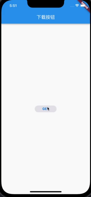
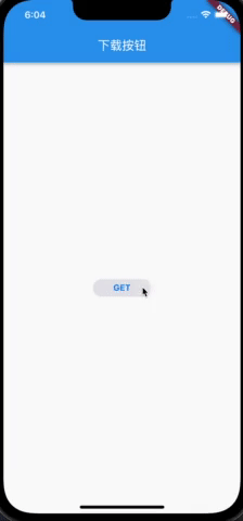
Before the download starts, we hope that the downloadButton is a long bar button, and the text on the button shows GET. During the download process, we hope that it will be an animation similar to CircularProgressIndicator, which can change dynamically according to the download progress.
At the same time, during the download process, we hope to hide the previous long bar button. After the download is complete, the long bar button is displayed again, and the text on the button is displayed as OPEN.
Because the animation is more complicated, we divide the animation component into two parts. The first part is to display and hide the long button. Here we use AnimatedOpacity to achieve the effect of text fading in and out, and encapsulate AnimatedOpacity in AnimatedContainer to realize the decoration. Animation effect:
 return AnimatedContainer(
      duration: transitionDuration,
      curve: Curves. ease,
      width: double.infinity,
      decoration: shape,
      child: Padding(
        padding: const EdgeInsets.symmetric(vertical: 6),
        child: AnimatedOpacity(
          duration: transitionDuration,
          opacity: isDownloading || isFetching ? 0.0 : 1.0,
          curve: Curves. ease,
          child: Text(
            isDownloaded? 'OPEN' : 'GET',
            textAlign: TextAlign. center,
            style: Theme.of(context).textTheme.button?.copyWith(
              fontWeight: FontWeight.bold,
              color: CupertinoColors. activeBlue,
            ),
          ),
        ),
      ),
    );
The realization effect is as follows:
Next, deal with the CircularProgressIndicator part:
 Widget build(BuildContext context) {
    return AspectRatio(
      aspectRatio: 1,
      child: TweenAnimationBuilder<double>(
        tween: Tween(begin: 0, end: downloadProgress),
        duration: const Duration(milliseconds: 200),
        builder: (context, progress, child) {
          return CircularProgressIndicator(
            backgroundColor: isDownloading
                ?CupertinoColors. lightBackgroundGray
                : Colors.white.withOpacity(0),
            valueColor: AlwaysStoppedAnimation(isFetching
                ?CupertinoColors. lightBackgroundGray
                : CupertinoColors.activeBlue),
            strokeWidth: 2,
            value: isFetching ? null : progress,
          );
        },
      ),
    );
  }
TweenAnimationBuilder is used here to realize the animation effect of CircularProgressIndicator according to different progress.
Because there is still a stop function during the download process, so we put another stop icon on the CircularProgressIndicator, and finally encapsulate the stack in AnimatedOpacity to realize an overall fade-in and fade-out function:
 Positioned.fill(
            child: AnimatedOpacity(
              duration: transitionDuration,
              opacity: _isDownloading || _isFetching ? 1.0 : 0.0,
              curve: Curves. ease,
              child: Stack(
                alignment: Alignment. center,
                children: [
                  ProgressIndicatorWidget(
                    downloadProgress: downloadProgress,
                    isDownloading: _isDownloading,
                    isFetching: _isFetching,
                  ),
                  if (_isDownloading)
                    const Icon(
                      Icons. stop,
                      size: 14,
                      color: CupertinoColors. activeBlue,
                    ),
                ],
              ),
            ),
Summary
In this way, we have completed an animated download button, and the effect is as follows:
Example of this article: https://github.com/ddean2009/learn-flutter.git