Control
1. Description
Control is the abstract base type for functionality common to all controls. It receives input events from the window system and draws itself on the screen.
2. Control layout

A control’s implicitWidth and implicitHeight are usually based on the implicit size of the background and contentItem and any insets and paddings. These properties determine the size of the control when no width or height is explicitly specified.
The geometry of the contentItem is determined by padding. The following example preserves 10px padding between the control’s bounds and its content:
Control {
padding: 10

contentItem: Text {
text: "Content"
}
}
The background item fills the entire width and height of the control unless it has been given an inset or an explicit size. Background insets can be used to extend the touchable/interactive area of a control without affecting its visual size. This is typically used on touch devices to ensure controls are not too small to interact with the user.
Negative inset can be used to make the background larger than the control. The following example uses negative inset to place a shadow outside the bounds of the control:
Control {
topInset: -2
leftInset: -2
rightInset: -6
bottomInset: -6

background: BorderImage {
source: ":/images/shadowed-background.png"
}
}
Three, attribute members
1. [read-only] availableHeight: real
[read-only] availableWidth: real
The available height/width for the content item after subtracting the vertical/horizontal padding from the control’s height.
2. background: Item
background item.
Note: If the background item does not explicitly specify a size, it will automatically follow the size of the control. In most cases, you don’t need to specify a width or height for background items.
Note: Most controls use the implicit size of the background item to calculate the implicit size of the control itself. If you replace the background item with a custom item, you should also consider giving it a reasonable implicit size (unless it’s an item like an Image, which has its own implicit size).
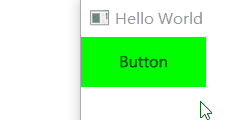
Button {
id: control
text: qsTr("Button")
background: Rectangle {
implicitWidth: 100
implicitHeight: 40
opacity: enabled? 1 : 0.3
color: control.down ? "#ff0000" : "#00ff00"
}
}
3. contentItem: Item
Visual content item. Content items are automatically positioned and sized to fit the padding of the control.
Most controls use the implicit size of the content item to calculate the implicit size of the control itself. If you replace a content item with custom content, you should consider giving it a reasonable implicit size (unless it’s an item like Text that has its own implicit size).
Button
{
id: control
text: qsTr("Button")
contentItem: Label
{
text: control.text
font: control.font
verticalAlignment: Text.AlignVCenter
}
}
4. focusPolicy: enumeration
This property determines how the control receives focus.
- Qt.TabFocus: Accept focus via the Tab key.
- Qt.ClickFocus: Accept focus by clicking.
- Qt.StrongFocus: Accepts focus by tabbing and clicking.
- Qt.WheelFocus: Accept focus by tabbing, clicking and using the mouse wheel.
- Qt.NoFocus: Does not accept focus.
5. [read-only] focusReason: enumeration
This property holds the reason for the last focus change.
Note: This property does not indicate whether the control has active focus, but rather the reason why the control gained or lost focus.
- Qt.MouseFocusReason: A mouse action occurs.
- Qt.TabFocusReason: Tab key is pressed.
- Qt.BacktabFocusReason: Backtab occurred. Input may include the Shift or Control keys; for example Shift + Tab.
- Qt.ActiveWindowFocusReason: The window system makes this window active or inactive.
- Qt.PopupFocusReason: The application opened/closed a popup window that popped/released the keyboard focus.
- Qt.ShortcutFocusReason: The user has entered a tagged friend shortcut
- Qt.MenuBarFocusReason: The menu bar gets the focus.
- Qt.OtherFocusReason: Other reasons, usually application-specific.
6. font: font
The font currently set for the control.
The default font depends on the system environment. ApplicationWindow maintains a system/theme font as the default font for all controls. Certain types of controls may also have special font defaults. A control’s default font can be set in any of the following ways:
Pass custom fonts to QGuiApplication::setFont() before loading QML
Specify the font in the qtquickcontrols2.conf file
Finally, the font is matched against Qt’s font database to find the best match.
Controls propagate explicit font properties from parent to child. If you change a specific property of a control’s font, that property propagates to all children of that control, overriding any system default value for that property.
7. horizontalPadding: real / verticalPadding: real
Horizontal/vertical padding. This value is equal to padding unless explicitly set.
import QtQuick 2.14
import QtQuick.Window 2.14
import QtQuick. Controls 2.14

Window {
visible: true
width: 640
height: 480
title: qsTr("Hello World")

Button {
text: qsTr("Button")

}
Button {
y:50
text: qsTr("Button")
padding: 50
}
Button {
y:190
text: qsTr("Button")
horizontalPadding: 50
}
Button {
y:260
text: qsTr("Button")
verticalPadding: 50
}
}
padding: real

Padding by default.
padding adds a space between each edge of the content item and the background item, effectively controlling the size of the content item. To specify a padding value for a specific edge of a control, set its related property:
- leftPadding
- rightPadding
- topPadding
- bottomPadding
Note: Different styles may specify default padding for certain controls in different ways, and these ways may change as the design guidelines on which the style is based evolve. To ensure that these changes do not affect the specified fill value, it is best to use the most specific property available. Instead of setting the padding property.
For example it should be set:
- leftPadding: 0
- rightPadding: 0
- topPadding: 0
- bottomPadding: 0
Instead of setting:
padding: 0
8. hoverEnabled: bool
Whether the control accepts hover events. The default value is Qt.styleHints.useHoverEffects.
Setting this property propagates the value to all child controls that have not explicitly set hoverEnabled.
Hover effects can also be enabled or disabled for all Qt Quick Controls applications by setting the QT_QUICK_CONTROLS_HOVER_ENABLED environment variable.
9. [read-only] hovered: bool
Whether the control is hovered.
10. [read-only] implicitContentHeight: real
Implicit content height.
For basic controls, the value is equal to contentItem ? contentItem. implicitHeight : 0. For types that inherit from Container or Pane, the value is calculated from the content children.
Usually used with implicit background height to calculate implicit height:
Control {
implicitHeight: Math.max(implicitBackgroundHeight + topInset + bottomInset,
implicitContentHeight + topPadding + bottomPadding)
}
[read-only] implicitContentWidth : real
Implicit content width. Similar to above.
11. locale: Locale
The locale of the control.
It contains locale-specific properties for formatting data and numbers. This is the parent or default locale unless a special locale is set.
Control propagates locale from parent to child. If you change a control’s locale, that locale propagates to all children of the control, overriding the system default locale.
12. [read-only] mirrored: bool
Whether the control is mirrored. This property is provided for convenience.
A control is said to be mirrored when its visual layout direction is right-to-left (when LayoutMirroring.enabled is true ).
The locale attribute no longer affects this property.
13. spacing: real
This property holds the spacing.
Spacing is useful for controls with multiple or repeating building blocks.
Spacing is not enforced by Control , so each style may interpret it differently, and some may ignore it entirely.
14. [read-only] visualFocus: bool
Whether the control has visual focus. This property is true when the control has active focus and the focus reason is Qt.TabFocusReason, Qt.BacktabFocusReason, or Qt.ShortcutFocusReason.
In general, this property is preferred over Item::activeFocus for visualizing key focus. This ensures that key focus is only visualized when interacting with the key, not via touch or mouse.
15. wheelEnabled: bool
Whether the control handles wheel events. The default value is false.
Welfare for this article,QT development learning package and technical video for fee, including (C++ language foundation, introduction to Qt programming, QT signal and slot mechanism, QT interface development-image drawing, QT network, QT database programming, QT project combat, QT embedded development, Quick module, etc.) strong>
ComboBox
1. Description
ComboBox is a combination button and popup list. It provides a way to present a list of options to the user in a way that takes up the least amount of screen real estate.
ComboBox is populated with data model. Data models are typically JavaScript arrays, ListModels, or integers, but other types of data models are also supported.
2. Attribute members
1. [read-only] acceptableInput: bool
Whether to include acceptable text in editable text fields.
2. count: int
The number of items in the combo box.
3. currentIndex: int
The index of the current item in the combo box. The default value is -1 when count is 0, otherwise the default value is 0.
4. [read-only] currentText: string
The text of the current item.
5. [read-only] currentValue: var
The value of the current item.
6. delegate: Component
A delegate used to display an item in a combo box popup.
It is recommended to use ItemDelegate (or any other AbstractButton derived class) as the delegate. This ensures that interactions work as expected and popups will automatically close when appropriate.
When using other types as delegates, popups must be closed manually. For example, if using MouseArea:
delegate: Rectangle {
//...
MouseArea {
//...
onClicked: comboBox.popup.close()
}
}
7. displayText: string
The text displayed on the button of the combo box.
By default, the display text shows the current selection. That is, the text that follows the current item. However, the default display text can be overridden with a custom value.
ComboBox {
currentIndex: 1
displayText: "Size: " + currentText
model: ["S", "M", "L"]
}
8. down: bool
Whether the combobox button is visually down.
Unless explicitly set otherwise, this property is true when pressed or when popup.visible is true. To return to the default value, set this property to undefined.
9. editText: string
The text in the text field of the editable combo box.
10. editable: bool
Whether the combo box is editable. The default value is false.
11. flat: bool
Whether the combobox button is flat. The default value is false.
Flat combobox buttons don’t paint the background unless interacted with. A flat combo box provides an appearance that makes it less prominent from the rest of the UI than a normal combo box. For example, when placing a combo box into a toolbar, you may want to make the combo box flat to better match the flat appearance of the tool buttons.
12. [read-only] highlightedIndex: int
The index of the highlighted item in the combo box’s popup list.
When the highlighted item is activated, the popup is closed, currentIndex is set to highlightIndex, and the value of this property is reset to -1 since there are no more highlighted items.
13. implicitContentWidthPolicy: enumeration
This property controls how the ComboBox’s implicit content width is calculated.
When the ComboBox is not wide enough to display the text, the text will be omitted, which may make it difficult for the end user to select an item. An effective way to ensure that the ComboBox is wide enough to avoid text being ignored is to set a width that is known to be large enough:
width: 300
implicitContentWidthPolicy: ComboBox.ContentItemImplicitWidth
However, it is often impossible to know whether a hardcoded value is large enough, because the size of the text depends on many factors, such as font family, font size, translation, etc.
The implicit content width policy provides an easy way to control how the implicit content width is calculated, which in turn affects the implicit width of the combo box and ensures that text is not ignored.
ContentItemImplicitWidth: implicitContentWidth will default to the width of the content item. This is the most efficient option because no additional text layout is done. Defaults.
WidestText: Every time the model changes, implicitContentWidth will be set to the implicit width of the largest text for the given textRole. This option should be used for smaller models as it can be expensive in performance.
WidestTextWhenCompleted: When the component completes, implicitContentWidth will be set to the implicit width of the largest text for the given textRole. This option should be used for smaller models as it can be expensive in performance.
Since this property only affects the ComboBox’s implicit width, setting an explicit width causes this property to be ignored.
Note: This functionality requires contentItem to be a type derived from TextInput.
14. [read-only] implicitIndicatorHeight: real / implicitIndicatorWidth: real
The privacy width and height of the indicator item.
15. indicator: Item
Indicator item (triangular item).
16. [read-only] inputMethod Composing: bool
Whether the editable combobox has partial text input from an input method.
While typing, an input method may rely on mouse or key events from the combo box to edit or submit parts of the text. This property can be used to determine when to disable event handlers that might interfere with the correct operation of the input method.
17. inputMethodHints: flags
Provides hints to the input method about the expected content of the combo box and how it should be manipulated.
The default is Qt.ImhNoPredictiveText. See: QML type: inputMethodHints property of TextEdit
18. model: model
The model that provides the data for the combo box.
ComboBox {
textRole: "key"
model: ListModel {
ListElement { key: "First"; value: 123 }
ListElement { key: "Second"; value: 456 }
ListElement { key: "Third"; value: 789 }
}
}
19. popup: Popup
pop up.
Popups can be manually opened or closed if necessary:
onSpecialEvent: comboBox.popup.close()
20. [read-only] pressed: bool
Whether the combobox button was physically pressed. Buttons can be pressed through touch or key events.
21. selectTextByMouse: bool
Is it possible to select the textfield of an editable ComboBox with the mouse. The default value is false.
22. textRole: string
The model role used to populate the combo box.
When a model has multiple roles, textRole can be set to determine which role should be displayed.
ApplicationWindow {
width: 640
height: 480
visible: true

QtObject {
id: backend
property int modifier
}

ComboBox {
textRole: "text"
valueRole: "value"
onActivated: backend. modifier = currentValue
Component.onCompleted: currentIndex = indexOfValue(backend.modifier)
model: [
{ value: Qt.NoModifier, text: qsTr("No modifier") },
{ value: Qt.ShiftModifier, text: qsTr("Shift") },
{ value: Qt.ControlModifier, text: qsTr("Control") }
]
}
}
23. Validator: Validator
Input text validator for editable combobox.
When a validator is set, the text field will only accept input that puts the text property in an intermediate state. Accept is signaled only if the text is acceptable when the Return or Enter key is pressed.
Currently supported validators are IntValidator, DoubleValidator, and RegularExpressionValidator. The following shows an example of using a validator that allows integers between 0 and 10 to be entered in a text field:
ComboBox {
model: 10
editable: true
validator: IntValidator {
top: 9
bottom: 0
}
}
24. valueRole: string
A model role that stores the values associated with each item in the model.
3. Signal member
1. void accepted()
This signal is emitted when the Return or Enter key is pressed on an editable combo box.
This signal can be handled to add newly entered items to the model, for example:
ComboBox {
editable: true
model: ListModel {
id: model
ListElement { text: "Banana" }
ListElement { text: "Apple" }
ListElement { text: "Coconut" }
}
onAccepted: {
if (find(editText) === -1)
model.append({text: editText})
}
}
Before emitting the signal, a check is made to see if the string exists in the model. If it is, then currentIndex will be set to its index, and currentText will be set to the string itself.
After the signal is emitted, if the first check fails (i.e. the item does not exist), another check is made to see if the item was added by the signal handler. If yes, currentIndex and currentText are updated accordingly. Otherwise, they are set to -1 and “” respectively.
If a validator is set on the combobox, the signal will only be emitted if the input is in an acceptable state.
2. void activated(int index)
This signal is emitted when the user activates the item at index.
Activated when an item is selected while the popup is open, causing the popup to close (and currentIndex to change), or when the popup is closed and the combobox is navigated by keyboard, causing currentIndex to change. The currentIndex property is set to index.
3. void highlighted(int index)
This signal is emitted when the user highlights the item at index in the popup list.
The highlighted signal is only emitted when the popup is open and the item is highlighted, but not necessarily activated (activated()).
4. Member functions
1. void decrementCurrentIndex()
Decrements the current index of the combo box or the highlighted index if the popup list is visible.
void incrementCurrentIndex()
Increments the current index of the combo box or the highlighted index if the popup list is visible.
2. int find(string text, enumeration flags)
Returns the index of the specified text, or -1 if no match is found.
The way the search is performed is defined by the specified match flags. By default, combo boxes perform case-sensitive exact matching (Qt.MatchExactly). All other match types are case-insensitive unless the Qt.MatchCaseSensitive flag is specified.
- Qt.MatchExactly: Search term matches exactly (default).
- Qt.MatchRegularExpression: The search term is matched as a regular expression.
- Qt.MatchWildcard: Search term matching using wildcards.
- Qt.MatchFixedString: The search term is matched as a fixed string.
- Qt.MatchStartsWith: The search term matches the beginning of the item.
- Qt.MatchEndsWidth: The end of the search term matching item.
- Qt.MatchContains: The search term is contained in items.
- Qt.MatchCaseSensitive: The search is case-sensitive.
This function can only be used after the ComboBox has issued Component.completed().
ComboBox {
model: ListModel {
ListElement { text: "Banana" }
ListElement { text: "Apple" }
ListElement { text: "Coconut" }
}
Component.onCompleted: currentIndex = find("Coconut")
}
3. int indexOfValue(object value)
Returns the index of the specified value, or -1 if no match is found.
This function can only be used after the ComboBox has issued Component.completed().
4. void selectAll()
Selects all text in the editable text field of the combo box.
5. string textAt(int index)
Returns the text at the specified index, or an empty string if the index is out of range.
This function can only be used after the ComboBox has issued Component.completed().
ComboBox {
model: ListModel {
ListElement { text: "Banana" }
ListElement { text: "Apple" }
ListElement { text: "Coconut" }
}
onActivated: (index) => { print(textAt(index)) }
}
5. Custom ComboBox Example
import QtQuick
import QtQuick. Controls
Window {
width: 640
height: 480
visible: true
title: qsTr("Hello World")
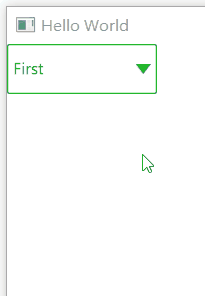
ComboBox {
id: control
model: ["First", "Second", "Third"]
delegate: ItemDelegate {
width: control.width
contentItem: Text {
text: modelData
color: "#21be2b"
font: control.font
elide: Text. ElideRight
verticalAlignment: Text.AlignVCenter
}
highlighted: control.highlightedIndex === index
required property int index
required property var modelData
}
indicator: Canvas {
id: canvas
x: control.width - width - control.rightPadding
y: control.topPadding + (control.availableHeight - height) / 2
width: 12
height: 8
contextType: "2d"
Connections {
target: control
function onPressedChanged() { canvas. requestPaint(); }
}
onPaint: {
context.reset();
context.moveTo(0, 0);
context.lineTo(width, 0);
context.lineTo(width / 2, height);
context. closePath();
context.fillStyle = control.pressed ? "#17a81a" : "#21be2b";
context. fill();
}
}
contentItem: Text {
leftPadding: 0
rightPadding: control.indicator.width + control.spacing
text: control.displayText
font: control.font
color: control.pressed ? "#17a81a" : "#21be2b"
verticalAlignment: Text.AlignVCenter
elide: Text. ElideRight
}
background: Rectangle {
implicitWidth: 120
implicitHeight: 40
border.color: control.pressed ? "#17a81a" : "#21be2b"
border.width: control.visualFocus? 2 : 1
radius: 2
}
popup: Popup {
y: control. height - 1
width: control.width
implicitHeight: contentItem.implicitHeight
padding: 1
contentItem: ListView {
clip: true
implicitHeight: contentHeight
model: control.popup.visible ? control.delegateModel : null
currentIndex: control.highlightedIndex
ScrollIndicator. vertical: ScrollIndicator { }
}
background: Rectangle {
border.color: "#21be2b"
radius: 2
}
}
}
}
Welfare for this article,QT development learning package and technical video for fee, including (C++ language foundation, introduction to Qt programming, QT signal and slot mechanism, QT interface development-image drawing, QT network, QT database programming, QT project combat, QT embedded development, Quick module, etc.) strong>