When we talk or discuss creating user interface components in Vue, reusability is often mentioned. Yes, one of Vue’s key principles is its component-based architecture, which promotes reusability and modularity. But what exactly does this mean?
Let’s say you create a reusable component:
-
Can you or your colleagues actually reuse it in another part of the system?
-
With new requirements, you may have to consider modifying “reusable components”.
-
What if you need to split a “reusable component” so that you can use the split component somewhere else?
Creating truly reusable components in Vue can be tricky. In this article, I’ll explore the concept of reusable components, the problems faced when applying them, and why these problems must be overcome whenever possible.
What are reusable components?
Reusable components are user interface building blocks that can be used in different parts of an application, or even across multiple projects. They encapsulate a specific functionality or user interface pattern that can be easily integrated into other parts of the application without extensive modification.
Advantages of reusable components
-
Efficiency: Allows developers to write code once and reuse it many times. This reduces redundancy and saves valuable development time.
-
Standardization: Promote consistency and standardization across the entire Vue project. They ensure that the same design patterns, styles, and functionality are maintained throughout the application.
-
Scalability: Make it easier to scale and scale your project as it grows. By breaking your application down into smaller, reusable components, it’s easier to handle complex functionality and add new functionality.
-
Collaboration: Facilitate collaboration among team members on Vue projects. They provide a shared vocabulary and set of user interface elements that everyone on the team can use and understand.
3 Questions When Applying Reusability Concepts
While reusability is a desirable feature of Vue components, there are several issues that can make it difficult to achieve:
-
Modify existing components: One issue is modifying existing components that are already used in the application. Components may need to be modified to support both existing and new requirements. Modifications to components that are already used by other parts of the application can have unintended side effects and break the functionality of other parts. Balancing the need for change with maintaining compatibility can be complex.
-
Design components for consistency and flexibility: Another issue is maintaining consistency across different instances of a reusable component while allowing for customization and flexibility. Reusable components should be versatile enough to accommodate different design requirements and styles. However, offering customization options without sacrificing the core functionality and consistency of your components can be tricky.
-
Manage component dependencies and state: Using reusable components requires managing dependencies and ensuring that each component remains self-sufficient and independent. Components should not rely closely on external resources or the application’s state management system. This allows for easy integration into different projects, reducing the possibility of conflicts or unintended side effects.
Case
Let’s say a client wants an internal employee directory system. The project used agile methods and it was not possible to collect all requirements before development. The project is divided into three phases (Prototype, Phase 1 and Phase 2). In this demo, I will focus on a card component, as shown below:

Prototype
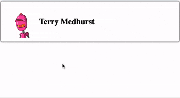
As part of the prototyping phase I need to provide a user profile page. The user profile will contain a basic user card component, which includes the user’s avatar and name.

// Prototype.vue
<script setup lang="ts">
    import { defineProps, computed, Teleport, ref } from "vue";

    interface Props {
        firstName: string;
        lastName: string;
        image?: string;
    }

    const props = defineProps<Props>();
</script>

<template>
    <div class="app-card">
        <img
            class="user-image"
            :src="image"
            alt="avatar" />
        <div>
            <div>
                <label> {<!-- -->{ firstName }} {<!-- -->{ lastName }} </label>
            </div>
        </div>
    </div>
</template>

<style scoped>
    .app-card {
        padding-left: 10px;
        padding-right: 10px;
        padding-top: 5px;
        padding-bottom: 5px;
        background: white;
        box-shadow: 0 0 5px;
        border-radius: 5px;
        border: none;
        font-size: 1.5em;
        transition: 0.3s;
        display: flex;
        align-items: center;
    }
    .app-card label {
        font-weight: 600;
    }
    .app-card:hover {
        background: rgba(128, 128, 128, 0.5);
    }
    .user-image {
        width: 100px;
    }
</style>
Phase 1
In the first phase, the client wants to add user details (birthday, age, phone number and email) in the user card component.

//Phase1.vue
<script setup lang="ts">
    import { defineProps, computed } from "vue";

    interface Props {
        firstName: string;
        lastName: string;
        image?: string;
        birthDay?: string;
        phone?: string;
        email?: string;
    }

    const props = defineProps<Props>();

    const age = computed(() => {
        if (!props.birthDay) {
            return "0";
        }
        const birthYear = new Date(props.birthDay).getFullYear();
        const currentYear = new Date().getFullYear();
        return currentYear - birthYear;
    });
</script>

<template>
    <div
        ref="cardRef"
        class="app-card">
        <img
            class="user-image"
            :src="image"
            alt="avatar" />
        <div>
            <div>
                <label> {<!-- -->{ firstName }} {<!-- -->{ lastName }} </label>
            </div>
            <div>
                <div>
                    <label> Birthday day: </label>
                    <span>
                        {<!-- -->{ birthDay }}
                    </span>
                </div>
                <div>
                    <label> Age: </label>
                    <span>
                        {<!-- -->{ age }}
                    </span>
                </div>
                <div>
                    <label> Phone number: </label>
                    <span>
                        {<!-- -->{ phone }}
                    </span>
                </div>
                <div>
                    <label> Email: </label>
                    <span>
                        {<!-- -->{ email }}
                    </span>
                </div>
            </div>
        </div>
    </div>
</template>

<style scoped>
    .app-card {
        padding-left: 10px;
        padding-right: 10px;
        padding-top: 5px;
        padding-bottom: 5px;
        background: white;
        box-shadow: 0 0 5px;
        border-radius: 5px;
        border: none;
        font-size: 1.5em;
        transition: 0.3s;
        display: flex;
        align-items: center;
    }
    .app-card label {
        font-weight: 600;
    }
    .app-card:hover {
        background: rgba(128, 128, 128, 0.5);
        color: black;
    }
    .user-image {
        width: 100px;
    }
</style>
Additionally, the client wanted to add an employee directory page and display user profiles in card format.

// SearchPage
<template>
    <div>
        <SearchInput v-model:value="searchValue" />
        <template
            :key="item.id"
            v-for="item of list">
            <div style="margin-bottom: 5px; margin-top: 5px">
                <UserCard v-bind="item" />
            </div>
        </template>
    </div>
</template>

<script lang="ts">
    import SearchInput from "../components/SearchInput.vue";
    import UserCard from "../components/Phase1.vue";
    import { ref, watch } from "vue";

    export default {
        name: "Search",
        components: {
            SearchInput,
            UserCard,
        },
        setup() {
            const searchValue = ref<string>();
            const list = ref();
            fetch("https://dummyjson.com/users")
                .then((res) => res.json())
                .then((res) => (list.value = res.users));

            watch(searchValue, (v) => {
                fetch(`https://dummyjson.com/users/search?q=${v}`)
                    .then((res) => res.json())
                    .then((res) => (list.value = res.users));
            });

            watch(list, (v) => console.log(v));

            return {
                searchValue,
                list,
            };
        },
    };
</script>
At this stage, the user card component is reusable on both pages.
Second stage
Users reported that the “Employee Directory” page is cluttered. Too much information makes the page difficult to use. So the client wanted to display user details in the form of tooltip on mouseover. The requirements for the user settings page remain unchanged.
//Phase 2
<script setup lang="ts">
import {
  defineProps,
  computed,
  Teleport,
  ref,
  onMounted,
  onBeforeUnmount,
} from "vue";

interface Props {
  firstName: string;
  lastName: string;
  image?: string;
  birthDate?: string;
  phone?: string;
  email?: string;
  address?: string;
}

const props = defineProps<Props>();

const targetRef = ref<HTMLDiveElement>();
const isMouseOver = ref(false);
const dropdownRef = ref<HTMLDivElement>();
const dropdownStyle = ref({});

// add modal element in body to prevent overflow issue
const modalElement = document.createElement("div");
modalElement.id = "modal";
document.body.appendChild(modalElement);

const age = computed(() => {
  if (!props.birthDate) {
    return "0";
  }
  const birthYear = new Date(props.birthDate).getFullYear();
  const currentYear = new Date().getFullYear();
  return currentYear - birthYear;
});

const onMouseOver = () => {
  if (isMouseOver.value) {
    return;
  }
  isMouseOver.value = true;
  const dimension = targetRef.value.getBoundingClientRect();
  dropdownStyle.value = {
    width: `${dimension.width}px`,
    left: `${dimension.x}px`,
    top: `${window.scrollY + dimension.y + dimension.height + 5}px`,
  };
};

const onMouseLeave = () => {
  isMouseOver.value = false;
};
</script>

<template>
  <div
    ref="targetRef"
    @mouseover="onMouseOver"
    @mouseleave="onMouseLeave"
    class="app-card"
  >
    <img class="user-image" :src="image" alt="avatar" />
    <div>
      <div>
        <label> {<!-- -->{ firstName }} {<!-- -->{ lastName }} </label>
      </div>
    </div>
  </div>
  <Teleport to="#modal">
    <div
      ref="dropdownRef"
      :style="dropdownStyle"
      style="position: absolute"
      v-show="isMouseOver"
    >
      <div class="app-card">
        <div>
          <div>
            <label> Birthday day: </label>
            <span>
              {<!-- -->{ birthDate }}
            </span>
          </div>
          <div>
            <label> Age: </label>
            <span>
              {<!-- -->{ age }}
            </span>
          </div>
          <div>
            <label> Phone number: </label>
            <span>
              {<!-- -->{ phone }}
            </span>
          </div>
          <div>
            <label> Email: </label>
            <span>
              {<!-- -->{ email }}
            </span>
          </div>
        </div>
      </div>
    </div>
  </Teleport>
</template>

<style scoped>
.app-card {
  padding-left: 10px;
  padding-right: 10px;
  padding-top: 5px;
  padding-bottom: 5px;
  background: white;
  box-shadow: 0 0 5px;
  border-radius: 5px;
  border: none;
  font-size: 1.5em;
  transition: 0.3s;
  display: flex;
  align-items: center;
}
.app-card label {
  font-weight: 600;
}
.app-card:hover {
  background: rgba(128, 128, 128, 0.5);
  color: black;
}
.user-image {
  width: 100px;
}
</style>
This new requirement is a headache:
-
Do I modify the existing user card component to support the tooltip requirement and risk affecting the user card component in the user settings page? or
-
Do you want to copy the existing user card component and add tooltip functionality?
Since we don’t want to disrupt a project that’s already in production, we tend to choose the latter option. At first, this may make sense, but it can cause considerable damage, especially for large and continuous projects:
-
Large code base: Causes the code base to grow because each duplicate component adds unnecessary lines of code. Becomes difficult to maintain as developers need to make changes in multiple places whenever an update or bug fix is required. This also increases the likelihood of inconsistencies.
-
Short term gain, long term pain: In the short term, especially when dealing with tight deadlines or urgent needs, this may seem like a quick and easy solution. However, as projects grow, maintaining duplicate components becomes increasingly difficult and time-consuming. Modifications or updates to duplicate components need to be replicated across multiple instances, increasing the chance of errors.
-
System Performance: Can negatively impact system performance. Redundant code increases the size of your application, resulting in slower rendering times and increased memory usage. This results in poor user experience and reduced system efficiency.
How to overcome the above problems
Be prepared that reusable components may not always remain the same throughout the project. This may sound cliché, but if you think about it, needs are always changing. You can’t control the future, you can only do the best you can. Of course, experience will help you design better components, but it takes time
Refactor reusable components
Based on my experience, I will redesign and refactor components into reusable components. Refactoring is a process of reorganizing code without changing its original functionality. I believe there are many ways to refactor, for me I refactor and break components into smaller components. Smaller components can be used flexibly throughout the system. Let’s see how I would apply the above case study.
Note: Refactoring user interface components requires serious attitude. Additionally, it can be challenging at times because of the need to balance project delivery deadlines with cleaner code.
Apply solutions to case studies
First, I’ll split the existing user card component into 4 components:
-
Card component Card component
-
Avatar component avatar component
-
Name component Name component
-
User detail component User detail component

**Card.vue**
// Card.vue
<template>
    <div class="app-card">
        <slot></slot>
    </div>
</template>

<style scoped>
    .app-card {
        padding-left: 15px;
        padding-right: 15px;
        padding-top: 10px;
        padding-bottom: 10px;
        border-radius: 5px;
        border: none;
        background: white;
        color: black;
        font-size: 1.5em;
        transition: 0.3s;
        display: flex;
        align-items: center;
        box-shadow: 0 0 5px;
    }
    .app-card:hover {
        background: rgba(128, 128, 128, 0.5);
        color: black;
    }
</style>
Avatar.vue
// Avatar.vue
<script setup lang="ts">
    import { defineProps } from "vue";

    interface Props {
        image: string;
    }

    const props = defineProps<Props>();
</script>

<template>
    <img
        class="user-image"
        :src="image"
        alt="avatar" />
</template>

<style scoped>
    .user-image {
        width: 100px;
    }
</style>
UserName.vue
// UserName.vue
<script setup lang="ts">
    import { defineProps } from "vue";

    interface Props {
        firstName: string;
        lastName: string;
    }

    const props = defineProps<Props>();
</script>

<template>
    <label> {<!-- -->{ firstName }} {<!-- -->{ lastName }} </label>
</template>
Description Item
efineProps } from "vue";

    interface Props {
        label: string;
        value: string | number;
    }

    const props = defineProps<Props>();
</script>

<template>
    <div>
        <label> {<!-- -->{ label }}: </label>
        <span>
            {<!-- -->{ value }}
        </span>
    </div>
</template>

<style scoped>
    label {
        font-weight: 600;
    }
</style>
UserDescription.vue
// UserDescription.vue
<script setup lang="ts">
    import DescriptionItem from "./DescriptionItem.vue";
    import { defineProps, computed } from "vue";

    interface Props {
        birthDate: string;
        phone: string;
        email: string;
    }

    const props = defineProps<Props>();

    const age = computed(() => {
        if (!props.birthDate) {
            return "0";
        }
        const birthYear = new Date(props.birthDate).getFullYear();
        const currentYear = new Date().getFullYear();
        return currentYear - birthYear;
    });
</script>

<template>
    <div>
        <DescriptionItem
            label="Birth day"
            :value="birthDate" />
        <DescriptionItem
            label="Age"
            :value="age" />
        <DescriptionItem
            label="Phone number"
            :value="phone" />
        <DescriptionItem
            label="Email"
            :value="email" />
    </div>
</template>
After that, I will create a tooltip component. Creating a separate tooltip allows me to reuse it in other parts of the system.

Tooltip.vue
// Tooltip.vue
<script setup lang="ts">
import {
  Teleport,
  computed,
  ref,
  onMounted,
  onBeforeUnmount,
  watch,
} from "vue";

const isMouseOver = ref(false);
const targetRef = ref<HTMLDivElement>();
const dropdownStyle = ref({});
const dropdownRef = ref<HTMLDivElement>();

const existModalElement = document.getElementById("modal");

if (!existModalElement) {
  // add modal element in body to prevent overflow issue
  const modalElement = document.createElement("div");
  modalElement.id = "modal";
  document.body.appendChild(modalElement);
}

const onMouseOver = () => {
  if (isMouseOver.value) {
    return;
  }
  isMouseOver.value = true;
  const dimension = targetRef.value.getBoundingClientRect();
  dropdownStyle.value = {
    width: `${dimension.width}px`,
    left: `${dimension.x}px`,
    top: `${window.scrollY + dimension.y + dimension.height + 5}px`,
  };
};

const onMouseLeave = () => {
  isMouseOver.value = false;
};
</script>

<template>
  <div @mouseover="onMouseOver" @mouseleave="onMouseLeave" ref="targetRef">
    <slot name="default" />
  </div>
  <Teleport to="#modal">
    <div
      ref="dropdownRef"
      :style="dropdownStyle"
      style="position: absolute"
      v-show="isMouseOver"
    >
      <Card>
        <slot name="overlay" />
      </Card>
    </div>
  </Teleport>
</template>
Finally, I’ll put the components together as shown below.
In the user settings page, I will use the user card component, which consists of a card, avatar, name component, and user details component.

// UserWithDescription.vue
<script setup lang="ts">
import AppCard from "./Card.vue";
import DescriptionItem from "./DescriptionItem.vue";
import Avatar from "./Avatar.vue";
import UserName from "./UserName.vue";
import UserDescription from "./UserDescription.vue";
import { defineProps } from "vue";

interface Props {
  firstName: string;
  lastName: string;
  image?: string;
  birthDate?: string;
  phone?: string;
  email?: string;
  address?: string;
}

const props = defineProps<Props>();
</script>

<template>
  <AppCard>
    <Avatar :image="image" />
    <div>
      <div>
        <UserName :firstName="firstName" :lastName="lastName" />
      </div>
      <UserDescription v-bind="props" />
    </div>
  </AppCard>
</template>
As for the “Employee Directory” page, I plan to consist of two parts
-
The basic user card component consists of card, avatar and name components.
-
The user tooltip component consists of card, tooltip, and user details components.

UserCard.vue
// UserCard.vue
<script setup lang="ts">
    import AppCard from "./Card.vue";
    import DescriptionItem from "./DescriptionItem.vue";
    import Avatar from "./Avatar.vue";
    import UserName from "./UserName.vue";
    import { defineProps } from "vue";

    interface Props {
        firstName: string;
        lastName: string;
        image?: string;
    }

    const props = defineProps<Props>();
</script>

<template>
    <AppCard>
        <Avatar :image="image" />
        <div>
            <div>
                <UserName
                    :firstName="firstName"
                    :lastName="lastName" />
            </div>
        </div>
    </AppCard>
</template>
**UserCardWithTooltip.vue**
// UserCardWithTooltip.vue
<script setup lang="ts">
    import ToolTip from "./Tooltip.vue";
    import UserDescription from "./UserDescription.vue";
    import UserCard from "./UserCard.vue";
    import Card from "./Card.vue";
    import { defineProps } from "vue";

    interface Props {
        firstName: string;
        lastName: string;
        image?: string;
        birthDate?: string;
        phone?: string;
        email?: string;
    }

    const props = defineProps<Props>();
</script>

<template>
    <ToolTip>
        <UserCard v-bind="props" />
        <template #overlay>
            <Card>
                <UserDescription v-bind="props" />
            </Card>
        </template>
    </ToolTip>
</template>
Note: You may notice that the solution provided is based on atomic design concepts. This concept minimizes “reusability” challenges in the first place. If you’re interested in how to apply this to Vue.js, check out my colleague’s article.
Do unit tests help?
Some might think that writing unit tests for reusable components would alleviate this problem. Indeed, comprehensive test coverage helps ensure that modifications and enhancements to components do not accidentally break functionality.
However, unit testing does not make components more reusable. It just makes the component more robust. In fact, refactoring into smaller components breaks down tasks into specific parts, making unit test writing more manageable.
Conclusion
Creating actual reusable components in Vue can be challenging because of the issues associated with modifying existing components, maintaining consistency, and managing dependencies and state. However, the benefits of reusable components make overcoming these problems worthwhile. Reusable components enhance code organization, improve development efficiency, and help create consistent user interfaces. As we face new needs or tasks, we will continue to improve to better design reusable components.
Welcome to long press the picture to add dishwasher as a friend and share Vue React Ts regularly.

at last:
vue2 and vue3 skills collection
VueUse source code interpretation

The knowledge points of the article match the official knowledge files, and you can further learn relevant knowledge. Vue entry-level skills treeVue componentsGlobal and local components 39333 people are learning the system