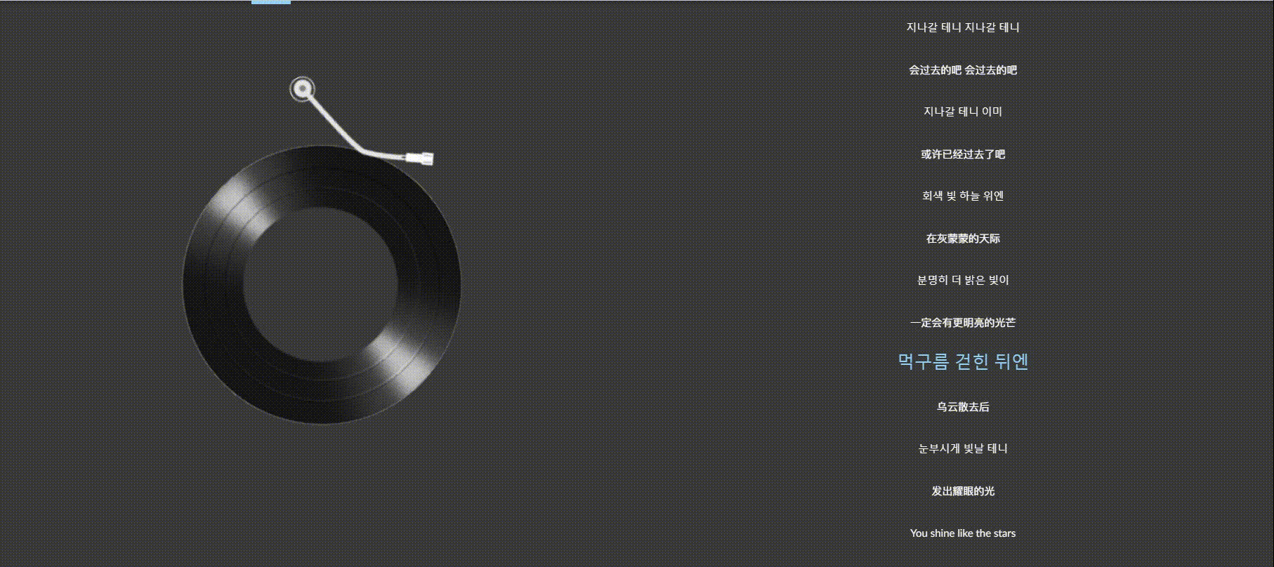
Look at the effect first:
Code: I will draw the main parts with red lines


css:section:

Source code:
vue part:
<template>

<div class="song-lyric">

<div>
<div class="type">
<div class="right">
<div class="right-center" :class="{ 'rotates': isplay }">
<div>
<img src="//i2.wp.com/imagesone.oss-cn-beijing.aliyuncs.com/imagebishe/player_bar.png"
class="right-top" :class="{rotated: isplay}">
</div>
<div>
<img src="//i2.wp.com/imagesone.oss-cn-beijing.aliyuncs.com/imagebishe/disc.png"
class="tight-bottm" :style="{ transform: 'rotate(' + rotationAngle + 'deg)' }">
</div>
</div>
</div>
<div class="lyric-title">
<!-- With lyrics -->
<!-- <el-input v-model="input" placeholder="Please enter"></el-input>
<el-input v-model="input" placeholder="Almost"></el-input> -->
<ul class="has-lyric" v-if="lyr.length" key="index">
<li v-for="(item,index) in lyr" v-bind:key="index">
{<!-- -->{item[1]}}
\t\t\t\t\t\t</li>
\t\t\t\t\t</ul>
<!-- No lyrics -->
<div v-else class="no-lyric" key="no-lyric">
<span>No lyrics yet</span>
</div>
</div>
</div>

</div>


</div>


</template>
<script>
import {
mixin
} from '../mixins';
import {
mapGetters
} from 'vuex';

export default {
name: 'lyric',
mixins: [mixin],
data() {
return {
// input: '',
lyr: [], //The lyrics of the current song
isplay: undefined, //Get the song switch status
rotationAngle: 0 //Record the current rotation angle of the box
}
},
computed: {
\t\t\t
...mapGetters([
'curTime', //The position where the current song is played
'id', //The id of the currently playing song
'lyric', //lyrics
'listIndex', //The position of the current song in the playlist
'listOfSongs', //Current song list
'isPlay' //Playing status
])
},
created() {
this.isplay = this.isPlay//Get switch
console.log('data', this.isplay);//Get the switch status of clicking the picture to enter the lyrics page
this.lyr = this.lyric;
this.rotateBox();

console.log('this.lyr', this.lyr)
console.log('this.mapGetters', this.mapGetters)
},
watch: {
isPlay() {
this.isplay = this.isPlay
console.log('data', this.isplay);
this.rotateBox();
},
id: function() {
this.lyr = this.parseLyric(this.listOfSongs[this.listIndex].lyric)
},
curTime: function() {
if (this.lyr.length > 0) {
for (let i = 0; i <this.lyr.length; i + + ) {
if (this.curTime >= this.lyr[i][0]) {
for (let j = 0; j <this.lyr.length; j + + ) {
document.querySelectorAll('.has-lyric li')[j].style.color = '#ffffff';
document.querySelectorAll('.has-lyric li')[j].style.fontSize = '15px';
}
if (i >= 0) {
document.querySelectorAll('.has-lyric li')[i].style.color = '#95d2f6';
document.querySelectorAll('.has-lyric li')[i].style.fontSize = '25px';
}
}
}
}
}
},
methods:{
\t\t
rotateBox(){
if(this.isplay){
this.rotationAngle + =1;
// if(this.rotationAngle >= 360){
// this.rotationAngle = this.rotationAngle % 360;
// }
setTimeout(this.rotateBox, 20);
// console.log('this.rotateBox',this.rotationAngle)
}
}
\t\t\t
}
}
</script>
<style lang="scss" scoped>
@import '../assets/css/lyric.scss';
</style>
css part:
@import "var.scss";


.song-lyric {
  // margin: auto;
  // margin-top: $header-height + 20px;
  width: 100%;
  height: 100%;
  // background-color: $color-white;
  border-radius: 12px;
  display: block;
  background-color: rgb(167, 167, 167);
  // padding: 0 20px 50px 20px;
  // background-color: rgba(0,0,0,.55);
  font-family: $font-family;

  // background-size: cover;
  // filter: blur(30px);
  z-index: 1;

  .lyric-title {
    text-align: center;
width: 50%;
    height: 100vh;
overflow-y: scroll;
    line-height: 60px;
    border-bottom: 2px solid $color-black;
margin-top: 50px;
// background: rgba(21, 21, 21, 0.6);
background-color: rgba(0,0,0,.65);

z-index: 2;
  }

  .type{
display: flex;
text-align: center;
width: 100%;
height: 100vh;
overflow: hidden;
line-height: 60px;
border-bottom: 2px solid $color-black;
z-index: 2;
  }
  .right{
text-align: center;
width: 50%;
height: 100vh;
overflow: hidden;
line-height: 60px;
border-bottom: 2px solid $color-black;
margin-top: 50px;
    display: flex;
    justify-content: center;
    align-items: center;
    flex-direction: column;
    flex-wrap: wrap;
// background: rgba(21, 21, 21, 0.6);
background-color: rgba(0,0,0,.65);
// backdrop-filter: blur(4px);
// box-shadow: inset 0px 1px 6px rgba(255,255,255,0.6), 2px 2px 15px rgba(0,0,0,0.5);
z-index: 2;
  }

  .right-top{ //Pointer
    position: absolute;
z-index: 1;
width: auto;
left:45%;
top:117px;
height:200px;
\t
transition: transform 0.7s linear; transform: rotate(-30deg) translate(35px, -10px);
  }

  .rotated {
    transform: rotate(0deg);
  }


  .right-center{
    position: relative;
    width: 600px;
    height: 1000px;
    // background-color: rgb(206, 198, 198);
  }

  .has-lyric {
    font-size: 18px;
    width: 100%;
    min-height: 100%;
    text-align: center;
padding-top: 120px;
    li {
      width: 100%;
      height: 40px;
      line-height: 40px;
    }
  }

  .no-lyric {
    // margin: 200px 0;
padding: 200px 0 0 0;
    width: 100%;
    text-align: center;

    span {
      font-size: 18px;
      text-align: center;
    }
  }
}

.lyric-fade-enter,
.lyric-fade-leave-to {
  transform: translateX(30px);
  opacity: 0;
}

.lyric-fade-enter-active,
.lyric-fade-leave-active {
  transition: all 0.3s ease;
}

.tight-bottm{ //circle
    position: absolute;
    top:225px;
    width: 400px;
    left:18%;
    height:400px;
    border-radius: 50%;
transition: transform 0.7s linear;
\t
  }

  .active {
animation: none !important;
    // animation: spin 5s linear infinite;
  }

  // @keyframes spin {
  // 100% {
  // transform: rotate(360deg);
  // }
  // }
The knowledge points of the article match the official knowledge files, and you can further learn relevant knowledge. Vue entry skill treeHomepageOverview 39840 people are learning the system