Python has powerful data analysis and processing capabilities. To use Python for data analysis, you need to master the three Python packages pandas, matplotlib, and seaborn. Mastering the knowledge of Python data analysis can help us better discover what is behind the data. laws and trends to provide support for business decisions.
Reading data using Pandas
First, import the pandas library. The pandas library has powerful data processing capabilities. Use the read_excel function to import data. Just import the file path to import the data. Head can preview the first 5 rows of data.
import pandas as pd
df=pd.read_excel(r'C:\Desktop\E-commerce sales data-August 23.xlsx')
df.head()#Preview the first 5 rows of data

The info function can look at the information of each field, including non-null value count and data type. For example, the date here is date data, the area is character data, and the customer’s age is numeric data.
df.info()#Data information preview

Use the describe function to perform descriptive statistics on the data. The descriptive statistics include counts, averages, standard deviations, minimum values, maximum values, etc. For example, if you perform descriptive statistics on customer age, the average customer age is 42 years old, and the youngest customer is 22 years old. , the oldest customer is 62 years old.
df.describe()#Data description statistics

Using Pandas data sorting
The sort_values function can be used to sort data by importing the sorted data column. The default sorting is ascending order.
df.sort_values(by='sales',inplace=True)#Default ascending order
df

The ascending=False parameter can be sorted in descending order.
df.sort_values(by='sales',inplace=True,ascending=False)#Descending order
df

If you want to customize the sorting, such as ascending order by product category, descending order by sales volume, by importing custom data columns, ascending setting parameters, True ascending order, False descending order.
df.sort_values(by=['Product Category','Sales'], ascending=[True,False],inplace=True)#Custom sorting
df

Use Pandas data filtering
Data filtering uses data frame [] to filter. Write conditions in the data frame for data filtering. & Filter when all conditions are met. == Filter when specific conditions are met. This means filtering data where the customer’s gender is male and the customer’s age is greater than 60. .
df[(df['Customer gender']=='Male') & amp;(df['Customer age']>60)]#Data filtering & amp;

The following filter area is the data of “Northwest-Gansu Province-Silver” or the product category is “Computer Hardware”, & amp; filters the data when all conditions are met, | filters the data when one of the conditions is met.
df[(df['region']=='Northwest-Gansu Province-Baiyin')|(df['commodity category']=='computer hardware')]#Data filtering|or

isin can filter the data of specific tags. Just write the specific filtering tag within (). For example, the following filters the data of specific order numbers.
df[df['Order number'].isin(['10021296335','10021669688','10021250896','10021434444','10021412817'])]

Data splitting using Pandas
Use the str.split method to split the data in the column, and set the expand parameter to True to return a DataFrame object containing the split data. The region is split into two columns: “province” and “city” as follows.
df_split=df['area'].str.split(pat='-',expand=True)#Data splitting

df['area']=df_split.iloc[:,0]
df['province']=df_split.iloc[:,1]
df['city']=df_split.iloc[:,2]

df

Using Pandas statistical operations
Perform statistical operations on the data. Count is used for counting. For example, the order number is counted here. The counting result is 7409 orders.
df['Order Number'].count()#Count
7409
If you want to count non-duplicate product categories, you can first use unique to return a non-duplicate list, and then use len to count the list. The returned product category has 8 unique values.
len(df['Product category'].unique())#unique counting
8
To sum the sales numbers, sum is used for the sum. The result here shows that the total number of sales is 48354.
df['Sales'].sum()#Sum
48354
To count the number of orders for each product category, use groupby to count the orders to get the number of orders for each product category.
df.groupby(['Product category'])['Order number'].count().reset_index()#Group count

Using Python data graphing
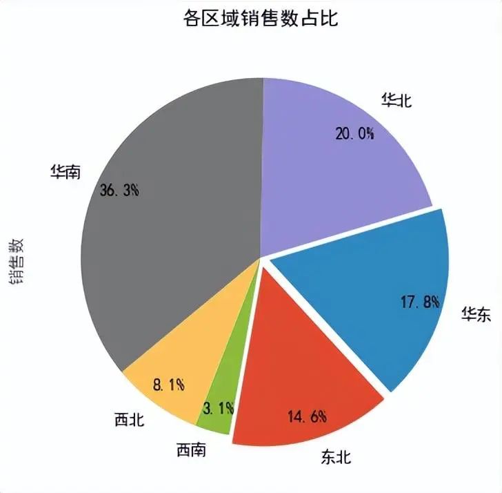
The matplotlib and seaborn libraries in Python have powerful data visualization functions. They can count the sales in each region, import the matplotlib package, pass in the sales data column, and calculate specific sales data. After setting the chart parameters, it can be concluded that the sales volume in the South China region accounts for a maximum of 36.3%, and the sales volume in the Southwest region accounts for a minimum of 3.1%.
import matplotlib.pyplot as plt
import matplotlib.style as psl

plt.rcParams['font.sans-serif']=['SimHei'] #Used to display Chinese labels normally
plt.rcParams['axes.unicode_minus']=False #Used to display negative signs normally

psl.use('ggplot')

df_QY=df.groupby(['Area'])['Sales'].count().reset_index()

#piechart
labels = df_QY['area'].tolist()
explode = [0.05,0.05,0,0,0,0] # Used to highlight data
df_QY['Sales'].plot(kind='pie',figsize=(9,6),
                         autopct='%.1f%%',#data label
                         labels=labels,
                         startangle=260, #Initial angle
                         explode=explode, # Highlight data
                         pctdistance=0.87, # Set the distance between the percentage label and the center of the circle
                         textprops = {<!-- -->'fontsize':12, 'color':'k'}, # Set the attribute value of the text label
                        )
plt.title("Sales proportion of each region")

plt.show()
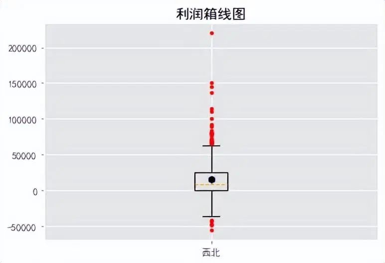
Make a boxplot of profits, use the boxplot function, and set the parameters of the boxplot chart to get the data distribution of profits. Most of the profit data in the boxplot exceeds the upper and lower limits of the boxplot.
import matplotlib.pyplot as plt
import matplotlib.style as psl

plt.rcParams['font.sans-serif']=['SimHei'] #Used to display Chinese labels normally
plt.rcParams['axes.unicode_minus']=False #Used to display negative signs normally

psl.use('ggplot')
plt.title('Profit box plot')

df_XB=df[df['region']=='northwest']

#boxplot
plt.boxplot(x=df_XB['profit'],#Specify the data to draw the box plot
            whis=1.5, #Specify 1.5 times the interquartile difference
            widths=0.1, #Specify the width of the box in the boxplot to be 0.3
            showmeans=True, #Show mean
            #patch_artist=True, #Color of filling box
            #boxprops={'facecolor':'RoyalBlue'}, #Specify the fill color of the box to be royal blue
            flierprops={<!-- -->'markerfacecolor':'red','markeredgecolor':'red','markersize':3}, #Specify the fill color, border color and size of outliers
            meanprops={<!-- -->'marker':'h','markerfacecolor':'black','markersize':8}, #Specify the mark symbol (dashed line) and color of the median
            medianprops={<!-- -->'linestyle':'--','color':'orange'}, #Specify the marking symbol (hexagon), fill color and size of the mean point
            labels=['Northwest']
           )

plt.show()
Make a line chart of the sales number and import it into the seaborn library. The date column is used as the X-axis and the sales number is used as the Y-axis. From the line chart, you can see the fluctuation trend of the sales number with the date.
import seaborn as sns
import matplotlib.pyplot as plt

plt.rcParams['font.sans-serif']=['SimHei'] #Used to display Chinese labels normally
plt.rcParams['axes.unicode_minus']=False #Used to display negative signs normally

plt.figure(figsize=(10,6))

# Use Seaborn to draw a line chart
sns.lineplot(data=df, x='date', y='sales', color='blue')

# Set chart title and axis labels
plt.title('Sales number line chart')
plt.xlabel('Date')
plt.ylabel('sales')

# Display graphics
plt.show()

For word cloud analysis of product categories, the wordcloud library can be used to make word cloud charts. Use a dictionary to count the number of product categories. After creating a word cloud object, matplotlib can draw a word cloud chart. From the word cloud chart, it can be seen that bedding sets have the most categories, including office furniture. Furniture has the least variety.
from wordcloud import WordCloud
import matplotlib.pyplot as plt

# Product category list
product_categories = df['Product categories'].tolist()

# Use dictionary to count the number of product categories
category_counts = dict()
for category in product_categories:
    if category in category_counts:
        category_counts[category] + = 1
    else:
        category_counts[category] = 1

#Create word cloud object
wordcloud = WordCloud(font_path='simhei.ttf', background_color='white').generate_from_frequencies(category_counts)

# Use matplotlib to draw word cloud graphs
plt.figure(figsize=(9, 6))
plt.imshow(wordcloud, interpolation='bilinear')
plt.axis("off")

plt.show()

Using Python for data analysis requires proficiency in pandas, matplotlib, seaborn and other Python libraries, as well as basic skills in programming and data analysis. If you want to learn more Python data analysis knowledge, you can follow me and continue to share data analysis knowledge to help you better master Python!
Finally:
I have prepared some very systematic Python materials. In addition to providing you with a clear and painless learning path, I have also selected the most practical learning resources and a huge library of mainstream crawler cases< /strong>. After a short period of study, you will be able to master the crawler skill well and obtain the data you want. Friends who need it can scan the QR code at the end of the article to obtain it.
01 is specially designed for 0 basic settings, and even beginners can learn it easily
We have interspersed all the knowledge points of Python into the comics.
In the Python mini-class, you can learn knowledge points through comics, and difficult professional knowledge becomes interesting and easy to understand in an instant.


Just like the protagonist of the comic, you travel through the plot, pass the levels, and complete the learning of knowledge unknowingly.
02 No need to download the installation package yourself, detailed installation tutorials are provided

03 Plan detailed learning routes and provide learning videos


04 Provide practical information to better consolidate knowledge

05 Provide interview information and side job information to facilitate better employment


This complete version of Python learning materials has been uploaded to CSDN. If you need it, you can scan the official QR code of csdn below or click on the WeChat card at the bottom of the homepage and article to get the method. [Guaranteed 100% free]
