Recently, everyone has been using Douyin. Have you seen the new landmark “Sphere” in Las Vegas:

The visual effects inside the venue are amazing, and one of them shocked me:
My first thought was, does it seem like this can be achieved using CSS? Is there anything that CSS can’t do?
In this article, we will try to use CSS to roughly restore this effect.
Disassembly animation effect
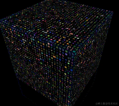
In fact, the above animation effect is essentially a 3D cube.
At the same time, there are text with different colors on each face of the 3D cube, and the text and color change randomly.
That is, we need to implement a 3D cube:
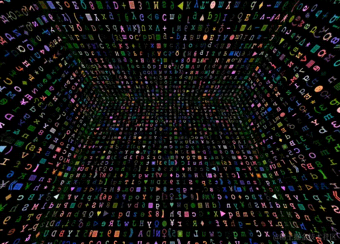
At the same time, we also need to implement such an animation effect – a plane effect in which text and color are randomly changing:

By combining the two and moving the depth of field distance of the 3D elements, we can achieve the effect we want!
Okay, let’s implement it one by one.
Implement a 3D cube
Implementing a 3D cube is a very, very simple step compared to another plane effect where text and color are randomly changing.
We have also talked about specific implementation methods in many articles:
The most common 3D shape is a 3D cube.
If there are no upper and lower faces, and it is just a 4-faced figure, it probably looks like this:

How to quickly implement such a graphic using CSS 3D?
First, construct a structure like this:
<div class="perspective">
        <div class="container">
                <div class="img">3</div>
                <div class="img">D</div>
                <div class="img">View</div>
                <div class="img">Picture</div>
        </div>
</div>
The 4 faces are the innermost 4 .img. First, you need to set the 3D attributes for the two parent containers:
.perspective {
  perspective: 3000px;
}
.container {
  width: 400px;
  height: 400px;
  transform-style: preserve-3d;
}
Just explain it briefly:
perspectivecan act on the descendants of elements, just set it on the top level;transform-style: preserve-3dis set above the parent container of the element that ultimately requires 3D space, since there are ultimately 4.imgcode> requires 3D space, so set it to.container.
Next, the most important thing is how to set the 3D transformation of the four .img elements to form a 3D cube.
The trick is: Rotate first, then shift.
Here is a top-down rendering:

Taking the cube in the above Demo as an example, the height and width of the div block with class .img are 400px*400px. Then to use 4 such divs to splice them into a cube, you need to rotate the 4 divs around the Y axis [90°, 180°, 270°, 360°], and then translateY(200px) .
It is worth noting that the rotation angle must be done first, and then the offset distance. This order is very important.
code show as below:
.img {
        position: absolute;
        top: 0;
        left: 0;
        width: 400px;
        height: 400px;
}
@for $i from 1 through $imgCount {
        .img:nth-child(#{$i}) {
                transform: rotateY(($i * 90deg)) translateZ(200px);
        }
}
The effect is as follows: 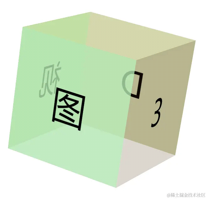
At this point, you may feel that the image is too big. At this time, we can adjust the visual size by setting an appropriate translateZ for the middle layer .container.
.container {
    transform: translateZ(-3000px);
}
In this way, you can get the effect of appropriately sized cube elements:

For the complete code, you can click here: CodePen Demo -- 3D Cube
Of course, for our effect, we need five faces (front, back, left, right and top). Therefore, based on the above basic knowledge, we re-implement a framework structure we need:
<div class="perspective">
  <div class="container">
    <div class="g-panel"></div>
    <div class="g-panel"></div>
    <div class="g-panel"></div>
    <div class="g-panel"></div>
    <div class="g-panel"></div>
  </div>
</div>
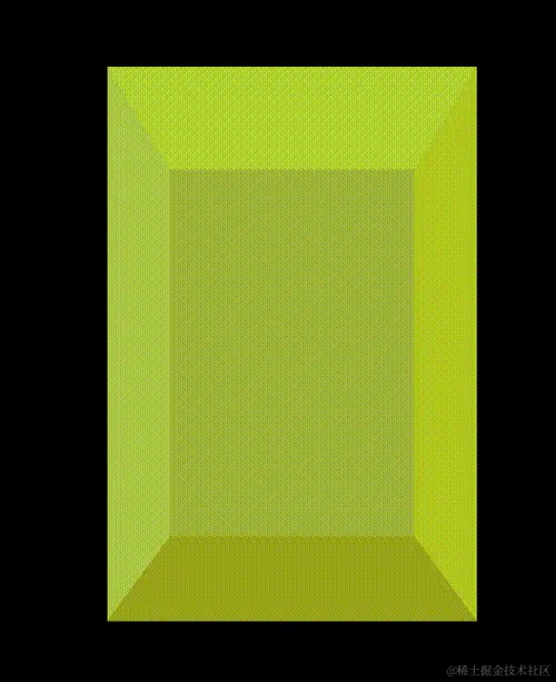
Moreover, we want our graphic to be a cube, and we only need to slightly modify the length, width and translateZ(). In this way, we can get a cube element with 5 sides, front, rear, left, right and top.
The schematic effect is as follows:
Realize text animation effects
OK, let’s put the cube aside first.
Next, we try to achieve this effect:
This effect is very easy to achieve if a text is carried by a DIV, but this will inevitably cause too many elements, and setting animation effects will cause the page to be too stuck.
So, we need to find another way. Here, we can use multi-layer gradient with background-clip: text.
First, we use a fixed-width font to randomly implement a column of text:
<div>ABCDEFGHIJKLMN</div>
div {
    font-family: monospace;
    text-align: center;
    font-size: 25px;
    width: 25px;
    line-height: 25px;
    color: #fff;
}
The effect is roughly as follows:

At this point, if we use linear gradients to give each character the corresponding space (that is, 25px x 25px) and set different colors, it will probably look like this:
@function randomLinear($count) {
    $value: '';

    @for $i from 0 through ($count - 1) {
        $value: $value + randomColor() + string.unquote(" 0 #{$i * 25}px,");
    }

    @return linear-gradient(string.unquote(#{$value}) randomColor() 0 100%);
}
@function randomColor() {
    @return rgb(randomNum(255), randomNum(255), randomNum(255));
}
div {
    // ...
    background: randomLinear(14);
}
Among them, randomLinear(14) is a SASS function. Parameter 14 means generating 14 layers of linear gradients. The color of each text area is random. After compilation, One result is as follows:
div {
    // ...
    background: linear-gradient(#feea96 0 25px, #edde42 0 50px, #e2344a 0 75px, #cdab7e 0 100px, #e16c8b 0 125px, #dcdc7d 0 150px, #dcb42a 0 175px, #d6a587 0 200 px, #984f71 0 225px , #221e34 0 250px, #5e9a69 0 275px, #a955e4 0 300px, #4e908f 0 325px, #8d177e 0 350px);
}
Above, we used a linear gradient to randomly set a color according to the height of each 25px interval. Finally, we can get this effect:

At this time, we only need to set background-clip: text and match the transparent text color color: transparent, You can achieve a single column of text in a single div, and the color of each font is different:
div {
    // ...
    background: randomLinear(14);
    background-clip: text;
    color: transparent;
}
At this time, the effect is as follows:
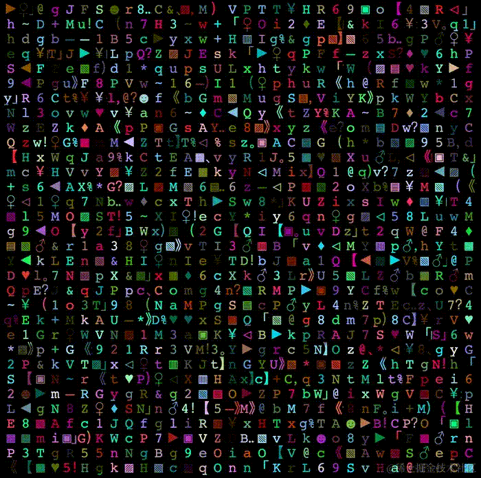
Of course, the text color can be random, then the text itself should also be random. This is not difficult. We can also use the SASS function to write a random character function and set it through the pseudo-element content of the element.
So at this point, the complete code may look like this:
<div></div>
$str: 'QWERTYUIOPASDFGHJKLZXCVBNMabcdefghigklmnopqrstuvwxyz123456789';
$length: str-length($str);

@function randomLinear($count) {
    $value: '';

    @for $i from 0 through ($count - 1) {
        $value: $value + randomColor() + string.unquote(" 0 #{$i * 25}px,");
    }

    @return linear-gradient(string.unquote(#{$value}) randomColor() 0 100%);
}
@function randomColor() {
    @return rgb(randomNum(255), randomNum(255), randomNum(255));
}
@function randomChar() {
    $r: random($length);
    @return str-slice($str, $r, $r);
}
@function randomChars($number) {
    $value: '';

    @if $number > 0 {
        @for $i from 1 through $number {
            $value: $value + randomChar();
        }
    }
    @return $value;
}

div {
    position: relative;
    width: 25px;
    height: 350px;

     & amp;::before {
        content: randomChars(14);
        position: absolute;
        font-family: monospace;
        background: randomLinear(14);
        background-clip: text;
        color: transparent;
        text-align: center;
        font-size: 25px;
        width: 25px;
        line-height: 25px;
    }
}
In this way, each time the text in the div is randomly selected from the $str variable in the SASS function above:
Next, we need to implement random jumping of text, which is also easy to do. We need to randomly generate multiple different contents at the beginning, and then use CSS animation to switch.
div {
    & amp;::before {
        content: randomChars(14);
        --content1: "#{randomChars(14)}";
        --content2: "#{randomChars(14)}";
        --content3: "#{randomChars(14)}";
        --content4: "#{randomChars(14)}";
        animation: contentChange 1s infinite;
    }
}

@keyframes contentChange {
    20% {
        content: var(--content1);
    }
    40% {
        content: var(--content2);
    }
    60% {
        content: var(--content3);
    }
    80% {
        content: var(--content4);
    }
}
Here, we generated 5 pieces of content at a time, 4 of which were saved with CSS variables. Then, in the CSS animation, we used the content generated in advance to replace the character content. At this time, the entire effect is as follows:
We have random content and different font colors. What is missing is the random jump animation of color. This is also very easy to do. We have also mentioned it in many articles. Use filter: hue- rotate() can quickly switch the color of content.
div {
    animation: colorChange 1s steps(12) infinite;
}
@keyframes colorChange {
    100% {
        filter: hue-rotate(360deg);
    }
}
We used filter: hue-rotate() to add step animation (steps) and successfully realized the color jump! The effect is as follows:
Of course, what we ultimately want to achieve is the random color of the entire surface plus the jump animation of random text. We only need to use the SASS function on the basis of the above to repeat the multi-column operation in a loop. Based on all the above, our final animation effect code under a single surface is as follows:
  <div></div>
  // ... a 32 child div
  <div></div>
@use "sass:string";

$str: 'QWERTYUIOPASDFGHJKLZXCVBNMabcdefghigklmnopqrstuvwxyz123456789';
$length: str-length($str);
$size: 25;
$count: 41;

@function randomNum($max, $min: 0, $u: 1) {
    @return ($min + random($max)) * $u;
}

@function randomLinear($count) {
    $value: '';

    @for $i from 0 through ($count - 1) {
        $value: $value + randomColor() + string.unquote(" 0 #{$i * 25}px,");
    }

    @return linear-gradient(string.unquote(#{$value}) randomColor() 0 100%);
}

@function randomColor() {
    @return rgb(randomNum(255), randomNum(255), randomNum(255));
}

@function randomChar() {
    $r: random($length);
    @return str-slice($str, $r, $r);
}

@function randomChars($number) {
    $value: '';

    @if $number > 0 {
        @for $i from 1 through $number {
            $value: $value + randomChar();
        }
    }
    @return $value;
}

body,
html {
    width: 100%;
    height: 100%;
    background: #000;
    font-family: monospace;
}

.g-container {
    position: relative;
    width: 800px;
    height: 800px;
    display: flex;
    animation: colorChange 1s steps(12) infinite;

    div {
        position: relative;
        width: #{$size}px;
        height: 800px;
        flex-shrink: 0;

         & amp;::before {
            position: absolute;
            inset: 0;
            text-align: center;
            font-size: #{$size}px;
            width: #{$size}px;
            text-align: center;
            line-height: #{$size}px;
            color: transparent;
        }
    }

    @for $i from 1 to $count {
        div:nth-child(#{$i}) {
             & amp;::before {
                content: randomChars(32);
                --content1: "#{randomChars(32)}";
                --content2: "#{randomChars(32)}";
                --content3: "#{randomChars(32)}";
                --content4: "#{randomChars(32)}";
                animation: contentChange 1s infinite;
                background: randomLinear(32);
                background-clip: text;
            }
        }
    }
}
@keyframes colorChange {
    100% {
        filter: hue-rotate(360deg);
    }
}
@keyframes contentChange {
    20% {
        content: var(--content1);
    }
    40% {
        content: var(--content2);
    }
    60% {
        content: var(--content3);
    }
    80% {
        content: var(--content4);
    }
}
In this way, we have successfully achieved a single plane with random colors, random text, and constantly changing animation effects:

For the complete code under a single plane, you can click here: CodePen Demo -- Single Panel Random Text
Achieve three-dimensional effect
With the cube and single plane effects above, it is not difficult to achieve a three-dimensional effect. We try to combine the two.
Transform the original cubic structure into the following form:
.perspective
    .container
        .g-panel
            -for(var i=0; i<32; i + + )
                div
        .g-panel
            -for(var i=0; i<32; i + + )
                div
        .g-panel
            -for(var i=0; i<32; i + + )
                div
        .g-panel
            -for(var i=0; i<32; i + + )
                div
        .g-panel
            -for(var i=0; i<32; i + + )
                div
The PUG template engine is used above to simplify the code. The compiled effect is as follows:
<div></div> // ... 32 <div></div><div></div> // ... 32 <div></div><div></div> // ... 32 <div></div><div></div> // ... 32 <div></div><div></div> // ... 32 <div></div>Here, we only need to implement a cube with 5 faces (front, back, left, right and top).
Each
.g-panelimplements the single-sided text jump effect we laid out above. In this way, we can get such a three-dimensional 3D cube animation effect:
Next, we only need to debug a little, control the visual depth by controlling
perspectiveandtransform: translateZ(), and place the perspective of the picture within the entire cube. You can get this effect:
Okay, finally, we simulate the effect of the Las Vegas ball at the beginning of the article, and let the top plane move downward to achieve an animation effect of the ceiling falling down. Finally, we can use pure CSS to roughly simulate the entire Effect:
Due to GIF recording issues, the actual effect will be more shocking than the GIF display effect.
You can click here to view the complete code and the entire effect implemented using CSS: CodePen Demo -- Las Vegas Sphere Cube Random Text
Finally
This concludes this article, I hope it is helpful to you 🙂
If you still have any questions or suggestions, you can communicate more. It is an original article. The writing style is limited and the knowledge is shallow. If there is anything wrong in the article, please let me know.