Directory
1. About Sliver
2. SliverList
1. SliverChildListDelegate
2. SliverChildBuilderDelegate
3. SliverGrid
1.count constructor sets SliverGrid
2. Extent constructor sets SliverGrid
3. The default constructor sets SliverGrid
4. SliverAppBar
Preface
Sliver in Flutter is some Widgets related to Widget scrolling. In the development process of the app, the use of scrolling can be seen everywhere, the list display of product information, the pull-down of the stock to refresh the latest market prices, etc. To sum it up: when the length of the content to be displayed exceeds the display range of the current screen, we will use the scrolling component. The most common ones are ListView and GridView. In most cases, the common ListView and GridView can basically meet the needs of users. When we want to implement some complex animations, the Sliver component comes in handy. For example, the following animation effect, we can use Slivers to achieve it easily.

Today’s article is mainly to explain and analyze the usage of Sliver.
1. About Sliver
During development, most scrollable views, such as ListView and GridView, are actually implemented using Slivers. Study the source code, such as the definition of ListView, the screenshot below is from the definition of ListView.

Figure 3. Definition of ListView
GridView is also:

Figure 4. Definition of GridView
Sliver’s official explanation is: We can regard Slivers as a lower-level interface. Using Slivers, we can control the scrolling area more finely, so as to achieve various effects. Because the views in Slivers are built and rendered when needed, Slivers are particularly efficient when there are many views in the scrollable area.
All sliver components in Flutter are used with CustomScrollView, and sliver components are used as sub-controls of CustomScrollView. Commonly used Slivers are SliverList, SliverGridView, SliverAppBar. Their usage will be introduced in detail below.
2. SliverList
SliverList has a mandatory parameter of delegate. There are two types of delegates: SliverChildListDelegate and SliverChildBuilderDelegate. The difference is whether to build child controls at one time.
We can use a simple example to see the difference between the two delegates:
1.SliverChildListDelegate
For example, we want to use SliverList to display three (or other numbers) Containers of different colors, similar to the following rendering:

Figure 5. Simple SliverList
We can do this with the following code:
class SliverForListPage extends StatefulWidget {
  const SliverForListPage({Key? key}) : super(key: key);

  @override
  State<SliverForListPage> createState() => _SliverForListPageState();
}

class _SliverForListPageState extends State<SliverForListPage> {
  Color getRandomColor({int r = 255, int g = 255, int b = 255, a = 255}) {
    if (r == 0 || g == 0 || b == 0) return Colors. black;
    if (a == 0) return Colors.white;
    return Color.fromARGB(
      a,
      r != 255 ? r : math.Random.secure().nextInt(r),
      g != 255 ? g : math.Random.secure().nextInt(g),
      b != 255 ? b : math.Random.secure().nextInt(b),
    );
  }

  @override
  Widget build(BuildContext context) {
    return Scaffold(
      appBar: AppBar(
        title: const Text('Sliver Usage', style: TextStyle(fontWeight: FontWeight.bold, fontSize: 12),),
      ),
      body: CustomScrollView(
        slivers: [

          SliverList(delegate: SliverChildListDelegate([
            Container(color: getRandomColor(), height: 150,),
            Container(color: getRandomColor(), height: 150,),
            Container(color: getRandomColor(), height: 150,),
          ])),
        ],

      ),
    );
  }
}
In the above code, the outer layer uses a CustomScrollView to wrap a SliverList. If you have used Row and Column, you will find that the usage of the two is similar. The difference is that the array name of the child controls to be displayed in Column and Row is called children, while the Slivers series components use slivers to represent the array of controls to be displayed. The efficiency of SliverList to create controls here is not high, because SliverChildListDelegate creates Container once.
2.SliverChildBuilderDelegate
When there are many controls to be displayed, we can use SliverChildBuilderDelegate to efficiently create a list of controls. We can use the following code to create an infinite list: only when the control is visible, it will be created, so it is very efficient.
class SliverForListPage extends StatefulWidget {
  const SliverForListPage({Key? key}) : super(key: key);

  @override
  State<SliverForListPage> createState() => _SliverForListPageState();
}

class _SliverForListPageState extends State<SliverForListPage> {
  Color getRandomColor({int r = 255, int g = 255, int b = 255, a = 255}) {
    if (r == 0 || g == 0 || b == 0) return Colors. black;
    if (a == 0) return Colors.white;
    return Color.fromARGB(
      a,
      r != 255 ? r : math.Random.secure().nextInt(r),
      g != 255 ? g : math.Random.secure().nextInt(g),
      b != 255 ? b : math.Random.secure().nextInt(b),
    );
  }

  @override
  Widget build(BuildContext context) {
    return Scaffold(
      appBar: AppBar(
        title: const Text('Sliver Usage', style: TextStyle(fontWeight: FontWeight.bold, fontSize: 12),),
      ),
      body: CustomScrollView(
        slivers: [
          SliverList(delegate: SliverChildBuilderDelegate((context, index) => Container(color: getRandomColor(), height: 150,))),
        ],

      ),
    );
  }
}

Figure 6. Create SliverList by lazy loading
3. SliverGrid
SliverGridView, like SliverList, can display or use a delegate to specify a list. There are three ways to configure SliverGridView:
1.count constructor sets SliverGrid
We can use the code below to create a list of 100 Containers of different colors.
class SliverForGridViewPage extends StatefulWidget {
  const SliverForGridViewPage({Key? key}) : super(key: key);

  @override
  State<SliverForGridViewPage> createState() => _SliverForGridViewPageState();
}

class _SliverForGridViewPageState extends State<SliverForGridViewPage> {
  Color getRandomColor({int r = 255, int g = 255, int b = 255, a = 255}) {
    if (r == 0 || g == 0 || b == 0) return Colors. black;
    if (a == 0) return Colors.white;
    return Color.fromARGB(
      a,
      r != 255 ? r : math.Random.secure().nextInt(r),
      g != 255 ? g : math.Random.secure().nextInt(g),
      b != 255 ? b : math.Random.secure().nextInt(b),
    );
  }

  List<Widget> generateWidgetList(){
    List<Widget> list = [];
    for(var i = 0;i<100;i ++ ){
      Container container = Container(
        color: getRandomColor(),
        height: 150,
      );
      list. add(container);
    }
    return list;
  }
  @override
  Widget build(BuildContext context) {
    return Scaffold(
      appBar: AppBar(
        title: const Text('SliverGrid.extent',style: TextStyle(fontWeight: FontWeight.bold,fontSize: 12),),
      ),
      body: CustomScrollView(
        slivers: [
          SliverGrid.extent(maxCrossAxisExtent: 100, children: generateWidgetList(),),
        ],

      ),
    );
  }
}

Figure 7. The count constructor implements SliverGrid
2.Extent constructor sets SliverGrid
We can use the following code to create 100 Containers of different colors, the effect is shown in Figure 8:
class SliverForGridViewPage extends StatefulWidget {
  const SliverForGridViewPage({Key? key}) : super(key: key);

  @override
  State<SliverForGridViewPage> createState() => _SliverForGridViewPageState();
}

class _SliverForGridViewPageState extends State<SliverForGridViewPage> {
  Color getRandomColor({int r = 255, int g = 255, int b = 255, a = 255}) {
    if (r == 0 || g == 0 || b == 0) return Colors. black;
    if (a == 0) return Colors.white;
    return Color.fromARGB(
      a,
      r != 255 ? r : math.Random.secure().nextInt(r),
      g != 255 ? g : math.Random.secure().nextInt(g),
      b != 255 ? b : math.Random.secure().nextInt(b),
    );
  }

  List<Widget> generateWidgetList(){
    List<Widget> list = [];
    for(var i = 0;i<100;i ++ ){
      Container container = Container(
        color: getRandomColor(),
        height: 150,
      );
      list. add(container);
    }
    return list;
  }
  @override
  Widget build(BuildContext context) {
    return Scaffold(
      appBar: AppBar(
        title: const Text('SliverGrid.extent',style: TextStyle(fontWeight: FontWeight.bold,fontSize: 12),),
      ),
      body: CustomScrollView(
        slivers: [
          // Different containers for infinite scrolling are built here
          SliverGrid.extent(maxCrossAxisExtent: 100, children: generateWidgetList(),),
        ],

      ),
    );
  }
}

Figure 8. The count constructor implements SliverGrid
3. Default constructor setting SliverGrid
We can create the invalid scrolling SliverGrid grid view shown in Figure 9 using the code below.
class SliverForGridViewPage extends StatefulWidget {
  const SliverForGridViewPage({Key? key}) : super(key: key);

  @override
  State<SliverForGridViewPage> createState() => _SliverForGridViewPageState();
}

class _SliverForGridViewPageState extends State<SliverForGridViewPage> {
  Color getRandomColor({int r = 255, int g = 255, int b = 255, a = 255}) {
    if (r == 0 || g == 0 || b == 0) return Colors. black;
    if (a == 0) return Colors.white;
    return Color.fromARGB(
      a,
      r != 255 ? r : math.Random.secure().nextInt(r),
      g != 255 ? g : math.Random.secure().nextInt(g),
      b != 255 ? b : math.Random.secure().nextInt(b),
    );
  }

  @override
  Widget build(BuildContext context) {
    return Scaffold(
      appBar: AppBar(
        title: const Text('SliverGrid.extent',style: TextStyle(fontWeight: FontWeight.bold,fontSize: 12),),
      ),
      body: CustomScrollView(
        slivers: [
          // Different containers for infinite scrolling are built here
          SliverGrid(gridDelegate: const SliverGridDelegateWithFixedCrossAxisCount(crossAxisCount: 4), delegate: SliverChildBuilderDelegate((context, index) => Container(
            color: getRandomColor(),
            height: 150,
          ))),
        ],

      ),
    );
  }
}

Figure 9. count constructor specifying SliverGrid
4. SliverAppBar
Here we look at how to realize the animation effect of AppBar realized at the beginning of the article.
Taking the above infinite scrolling Container list as an example, we use SliverAppBar instead of AppBar, and set the flexibleSpace parameter and expandedHeight parameter at the same time to achieve the effect at the beginning of the article. The code is as follows:
class SliverForListPage extends StatefulWidget {
  const SliverForListPage({Key? key}) : super(key: key);

  @override
  State<SliverForListPage> createState() => _SliverForListPageState();
}

class _SliverForListPageState extends State<SliverForListPage> {
  Color getRandomColor({int r = 255, int g = 255, int b = 255, a = 255}) {
    if (r == 0 || g == 0 || b == 0) return Colors. black;
    if (a == 0) return Colors.white;
    return Color.fromARGB(
      a,
      r != 255 ? r : math.Random.secure().nextInt(r),
      g != 255 ? g : math.Random.secure().nextInt(g),
      b != 255 ? b : math.Random.secure().nextInt(b),
    );
  }

  @override
  Widget build(BuildContext context) {
    return Scaffold(
      body: CustomScrollView(
        slivers: [
          SliverAppBar(
            title: const Text('SliverList', style: TextStyle(fontWeight: FontWeight.bold, fontSize: 12),),
            backgroundColor: Colors.blue,
            flexibleSpace: FlexibleSpaceBar(
              background: Image.asset('images/header.jpeg', fit: BoxFit.cover,),
            ),
          ),
          SliverList(delegate: SliverChildBuilderDelegate((context, index) => Container(color: getRandomColor(), height: 150,))),
        ],

      ),
    );
  }
}
The effect achieved is as follows:
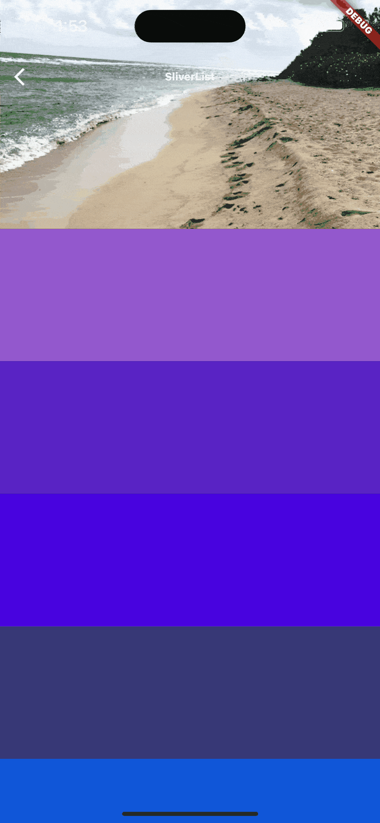
Figure 10. SliverApp effect
At this time, we can see that SliverAppBar scrolls along with the list below. When pulling down, when the expandedHeight parameter is exceeded, the SliverAppBar is displayed. When sliding up, the SliverAppBar will slide along with the list until it disappears.
We can also customize the AppBar animation effect by setting some parameters.
When we set the floating parameter to true, look at the changes (Figure 11). We found that when scrolling down in time, SliverAppBar will also appear if it is not at the top of the list.

Figure 11. SliverAppBar
When we set the snap and float parameters to true at the same time, when scrolling down, SliverAppBar automatically pops back into view (Figure 12).
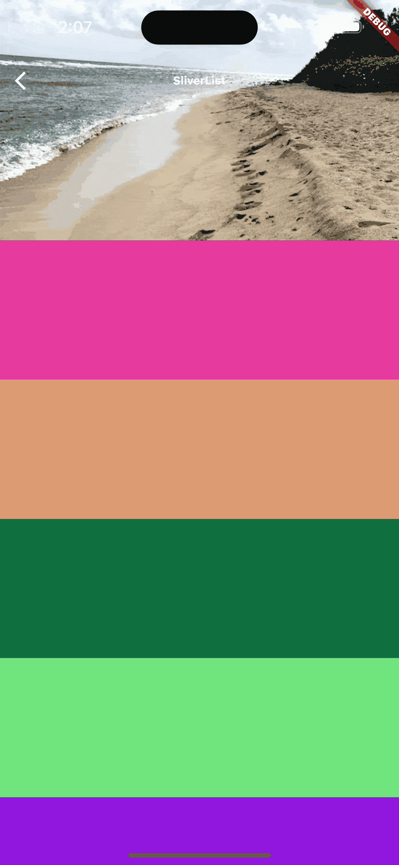
Figure 13. SliverAppBar
Of course, you can set different parameters according to your own needs to realize your own AppBar animation effect.
After reading this article, you can also combine SliverList, SliverGrid, and SliverAppBar to think about how to achieve the grouping effect at the beginning of the article. Good luck!