1. Brief explanation
A NavigationBar custom control that supports landscape and portrait orientation
Adapted based on this big guy’s article: https://blog.csdn.net/qq910689331/article/details/81941887
Added vertical support and some comments based on the original code
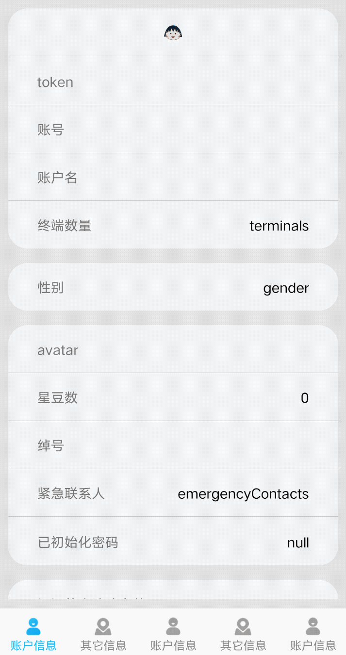
Usage effect: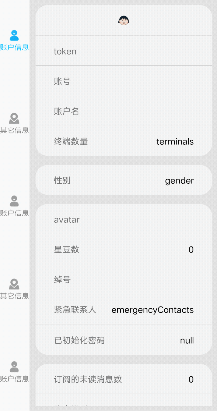
2. Upload the code
The code is only 400 lines long, so it is very convenient to just copy it and use it. But one thing to note: the compatible fragment in the control is the AndroidX version. If you need to use it on an older version, you need to modify it yourself.
package com.example.lxt.View

import android.annotation.SuppressLint
import android.content.Context
import android.graphics.*
import android.graphics.drawable.BitmapDrawable
import android.util.AttributeSet
import android.util.Log
import android.view.MotionEvent
import android.view.View
import androidx.appcompat.app.AppCompatActivity
import androidx.fragment.app.Fragment

class BottomBar: View {

    val TAG = "BottomBar";

    constructor(context: Context, attrs: AttributeSet?) : super(context, attrs) {}

    companion object{
        @JvmField
        val HORIZONTAL = 0;
        @JvmField
        valVERTICAL = 1;
    }

    var containerId = 0 //The control id that stores the fragment
    var firstCheckedIndex = 0 //Default page item (first)
    var itemCount = 0 //Number of pages

    var fragmentList: MutableList<Fragment> = ArrayList() // fragment list
    var titleList: MutableList<String> = ArrayList() // title list
    var iconResBeforeList: MutableList<Int> = ArrayList() // Icon resource list (before selection)
    var iconResAfterList: MutableList<Int> = ArrayList() // Icon resource list (after selection)
    val iconBitmapBeforeList: MutableList<Bitmap> = ArrayList() // Icon image list (before selection)
    val iconBitmapAfterList: MutableList<Bitmap> = ArrayList() // Icon image list (after selection)

    var fragmentClassList: MutableList<Class<*>> = ArrayList() // fragment class list

    var buttomOrientation = HORIZONTAL // Orientation
    var titleSizeInDp = 12 // title size
    var iconWidth = 22 // icon width
    var iconHeight = 22 // icon height
    var titleIconMargin = 2 // Spacing between icon and title
    var titleColorBefore = Color.parseColor("#515151") //The color of the title before it is selected
    var titleColorAfter = Color.parseColor("#ff2704") //The color of the title after it is selected
    var currentCheckedIndex = 0 //The number of currently selected items

    val paint = Paint() // Draw a picture
    val iconRectList: MutableList<Rect> = ArrayList() // Image space of the icon


    //Set the control id (FrameLayout) where the fragment is stored
    fun setContainer(containerId: Int): BottomBar {
        this.containerId = containerId
        return this
    }

    fun getCurrentFragmentByIndex(index: Int): Fragment {
        return fragmentList[index]
    }

    @JvmName("getCurrentFragment1")
    fun getCurrentFragment(): Fragment? {
        return currentFragment
    }

    @JvmName("getCurrentCheckedIndex1")
    fun getCurrentCheckedIndex(): Int {
        return currentCheckedIndex
    }

//Interface -----------------------------------------------
    var switchListener: OnSwitchListener? = null
    interface OnSwitchListener {
        fun result(currentFragment: Fragment?)
    }
    fun setOnSwitchListener(listener:OnSwitchListener) {
        this.switchListener=listener
    }

    //Set direction
    fun setOrientation(orientation:Int):BottomBar{
        this.buttomOrientation=orientation
        return this
    }

    //Set the title color of selected/unselected
    fun setTitleBeforeAndAfterColor(beforeResCode: String?, AfterResCode: String?): BottomBar { //Supports the form "#333333"
        titleColorBefore = Color.parseColor(beforeResCode)
        titleColorAfter = Color.parseColor(AfterResCode)
        return this
    }

    //Set title size
    fun setTitleSize(titleSizeInDp: Int): BottomBar? {
        this.titleSizeInDp = titleSizeInDp
        return this
    }

    //Set the width of the icon
    fun setIconWidth(iconWidth: Int): BottomBar? {
        this.iconWidth = iconWidth
        return this
    }

    //Set the height of the icon
    fun setIconHeight(iconHeight: Int): BottomBar? {
        this.iconHeight = iconHeight
        return this
    }

    //Set the spacing between the icon and title
    fun setTitleIconMargin(titleIconMargin: Int): BottomBar? {
        this.titleIconMargin = titleIconMargin
        return this
    }

    //Add page (initialize fragment first and then add)
    fun addItem(fragment: Fragment, title: String, iconResBefore: Int, iconResAfter: Int): BottomBar {
        fragmentList.add(fragment) // Add fragment
        titleList.add(title) //Add title
        iconResBeforeList.add(iconResBefore) //Add the icon resource before selection
        iconResAfterList.add(iconResAfter) //Add icon resource after selection
        return this
    }

    //Add page (add fragment class)
    fun addItem(fragmentClass: Class<*>, title: String, iconResBefore: Int, iconResAfter: Int): BottomBar? {
        fragmentClassList.add(fragmentClass)
        titleList.add(title)
        iconResBeforeList.add(iconResBefore)
        iconResAfterList.add(iconResAfter)
        return this
    }

    //Set preferences
    fun setFirstChecked(firstCheckedIndex: Int): BottomBar {
        this.firstCheckedIndex = firstCheckedIndex
        return this
    }

    //Construction (used to initialize the fragment before adding it)
    fun buildWithEntity() {
        itemCount = fragmentList.size
        // Pre-create bitmap Rect and cache it
        // Pre-create the Rect of the icon and cache it
        for (i in 0 until itemCount) {
            val beforeBitmap: Bitmap = getBitmap(iconResBeforeList[i])!!
            iconBitmapBeforeList.add(beforeBitmap)
            val afterBitmap: Bitmap = getBitmap(iconResAfterList[i])!!
            iconBitmapAfterList.add(afterBitmap)
            val rect = Rect() // Create a rectangular space
            iconRectList.add(rect)
        }
// initParamHorizontal()
        currentCheckedIndex = firstCheckedIndex
        switchFragment(currentCheckedIndex)
        invalidate()
    }

    //Construction (used to add fragment classes and create objects through reflection. This does not apply if parameters need to be passed for fragment initialization)
    fun buildWithClass() {
        itemCount = fragmentClassList.size
        // Pre-create bitmap Rect and cache it
        // Pre-create the Rect of the icon and cache it
        for (i in 0 until itemCount) {
            val beforeBitmap: Bitmap = getBitmap(iconResBeforeList[i])!!
            iconBitmapBeforeList.add(beforeBitmap)
            val afterBitmap: Bitmap = getBitmap(iconResAfterList[i])!!
            iconBitmapAfterList.add(afterBitmap)
            val rect = Rect()
            iconRectList.add(rect)

            val clx = fragmentClassList[i]
            try {
                val fragment = clx.newInstance() as Fragment
                fragmentList.add(fragment)
            } catch (e: Exception) {
                e.printStackTrace()
            }
        }
// initParamHorizontal()
        currentCheckedIndex = firstCheckedIndex
        switchFragment(currentCheckedIndex)
        invalidate()
    }

    // Get the image from the resource
    private fun getBitmap(resId: Int): Bitmap? {
        val bitmapDrawable = context!!.resources.getDrawable(resId) as BitmapDrawable
        return bitmapDrawable.bitmap
    }

    private var parentItemWidth = 0 // width of a single option
    private var titleBaseLine = 0 // Baseline of the first title (same when horizontal)
    private val titleXList : MutableList<Int> = ArrayList() // The starting point of the x-axis for each title

    private var parentItemHeight = 0 //Height of a single option
    private val titleBaseLines : MutableList<Int> = ArrayList() // Baseline of each title (when vertical)

    // Initialization parameters
    private fun initParamHorizontal() {
        if (itemCount != 0) {
            //Single option width and height
            parentItemWidth = getWidth() / itemCount // Calculate the width of a single option: the total width of the view/number of pages
            parentItemHeight = getHeight() // The height of the view is the height of the item
            //Icon width and height
            val iconWidth: Int = dp2px(iconWidth.toFloat())
            val iconHeight: Int = dp2px(iconHeight.toFloat())
            //Icon and title margin
            val textIconMargin: Int = dp2px(titleIconMargin.toFloat() / 2) // Specify 5dp first. Divide it by half here to get the normal margin. I don’t know why. It may be because of the picture.
            // title height
            val titleSize: Int = dp2px(titleSizeInDp.toFloat())

            paint.textSize = titleSize.toFloat()
            val rect = Rect()
            paint.getTextBounds(titleList[0], 0, titleList[0].length, rect) // Determine the space occupied by the text before drawing the text
            val titleHeight = rect.height()

            // Calculate the starting top coordinates of the icon and the baseLine of the text
            val iconTop = (parentItemHeight - iconHeight - textIconMargin - titleHeight) / 2 // Total height - icon height - icon title spacing - title height
            titleBaseLine = parentItemHeight - iconTop

            //Assign values to the parameters of icon's rect
            val firstRectX = (parentItemWidth - iconWidth) / 2 // The left starting point of the first icon
            // Calculate the upper left and lower right of each icon in turn
            for (i in 0 until itemCount) {
                val rectX = i * parentItemWidth + firstRectX
                val temp = iconRectList[i]
                temp.left = rectX
                temp.top = iconTop
                temp.right = rectX + iconWidth
                temp.bottom = iconTop + iconHeight
            }
            titleXList.clear()
            // Calculate the x-axis starting point of each title in turn
            for (i in 0 until itemCount) {
                val title = titleList[i]
                paint.getTextBounds(title, 0, title.length, rect) // Determine the space occupied by the text before drawing the text, and store the spatial data in rect
                titleXList.add( ((parentItemWidth - rect.width())/2) + (parentItemWidth*i) ) // (total width - text length)/2
            }
        }
    }

    private fun initParamVertical() {
        if (itemCount != 0) {
            //Single option width and height
            parentItemHeight = getHeight() / itemCount // Calculate the height of a single option: the total width of the view/number of pages
            parentItemWidth = getWidth() // The width of the view is the width of the item
            //Icon width and height
            val iconWidth: Int = dp2px(iconWidth.toFloat())
            val iconHeight: Int = dp2px(iconHeight.toFloat())
            //Icon and title margin
            val textIconMargin: Int = dp2px(titleIconMargin.toFloat() / 2) // Specify 5dp first. Divide it by half here to get the normal margin. I don’t know why. It may be because of the picture.
            // title height
            val titleSize: Int = dp2px(titleSizeInDp.toFloat())

            paint.textSize = titleSize.toFloat()
            val rect = Rect()
            paint.getTextBounds(titleList[0], 0, titleList[0].length, rect) // Determine the space occupied by the text before drawing the text
            val titleHeight = rect.height()

            // Calculate the baseline for each title in turn
            val iconTop = (parentItemHeight - iconHeight - textIconMargin - titleHeight) / 2 // Total height - icon height - icon title spacing - title height
            titleBaseLine = parentItemHeight - iconTop
            titleBaseLines.clear()
            for (i in 0 until itemCount){
                titleBaseLines.add(titleBaseLine + (i*parentItemHeight))
            }
            //Assign values to the parameters of icon's rect
            val firstRectX = (parentItemWidth - iconWidth) / 2 // The left starting point of the first icon
            // Calculate the upper left and lower right of each icon in turn
            for (i in 0 until itemCount) {
                val temp = iconRectList[i]
                temp.left = firstRectX
                temp.top = iconTop + (i*parentItemHeight)
                temp.right = firstRectX + iconWidth
                temp.bottom = iconTop + (i*parentItemHeight) + iconHeight
            }
            titleXList.clear()
            // Calculate the x-axis starting point of each title in turn
            for (i in 0 until itemCount) {
                val title = titleList[i]
                paint.getTextBounds(title, 0, title.length, rect) // Determine the space occupied by the text before drawing the text, and store the spatial data in rect
                titleXList.add( (parentItemWidth - rect.width())/2) // (total width - text length)/2
            }
        }
    }

    fun dp2px(dp: Float): Int {
        val scale = context.resources.displayMetrics.density
        return (dp * scale + 0.5f).toInt()
    }

    override fun onLayout(changed: Boolean, left: Int, top: Int, right: Int, bottom: Int) {
        super.onLayout(changed, left, top, right, bottom)
        if(buttomOrientation== HORIZONTAL){
            initParamHorizontal()
        }else{
            initParamVertical()
        }
    }

    override fun onDraw(canvas: Canvas) {
        super.onDraw(canvas) //Here let the view draw the background for us if specified.
        if (itemCount != 0) {
            // draw icon
            paint.isAntiAlias = false // Turn off anti-aliasing
            for (i in 0 until itemCount) {
                var bitmap: Bitmap? = if (i==currentCheckedIndex) { iconBitmapAfterList[i] } else { iconBitmapBeforeList[i] }
                val rect = iconRectList[i]
                bitmap?.let { canvas.drawBitmap(it, null, rect, paint) } // Fill the image resources to the corresponding position
            }
            // draw title
            paint.isAntiAlias = true // Turn on anti-aliasing
            for (i in 0 until itemCount) {
                val title = titleList[i]
                if (i == currentCheckedIndex) { paint.color = titleColorAfter } else { paint.color = titleColorBefore }
                if (titleXList.size == itemCount) {
                    val x = titleXList[i]
                    var y = if(buttomOrientation== HORIZONTAL) titleBaseLine.toFloat() else titleBaseLines[i].toFloat()
                    canvas.drawText(title, x.toFloat(), y, paint)
                }
            }
        }
    }

    // I observed Weibo and Zhangmeng and found that the response is only when pressing and releasing in the same area. If you press this area and then move your finger out and then release it, there will be no response.
    var target = -1
    @SuppressLint("ClickableViewAccessibility")
    override fun onTouchEvent(event: MotionEvent): Boolean {
        when (event.action) {
            // press
            MotionEvent.ACTION_DOWN -> {
                var x = event.x.toInt()
                var y = event.y.toInt()
                var number = if(buttomOrientation== HORIZONTAL) withinWhichArea(x) else withinWhichArea(y)
                Log.i(TAG, "Click on the x-axis: " + x + " / Click on the y-axis: " + y + "/" + number)
                target=number
            }
            // Release
            MotionEvent.ACTION_UP -> {
                // Make sure it is within this view
                if ( if(buttomOrientation== HORIZONTAL) event.y > 0 else event.x > 0 ) {
                    // Still in this button when released
                    if (if(buttomOrientation== HORIZONTAL) target == withinWhichArea(event.x.toInt()) else target == withinWhichArea(event.y.toInt()) ) {
                        switchFragment(target) //Switch page
                        currentCheckedIndex = target //Modify the currently selected item
                        invalidate() // refresh
                    }
                    target=-1
                }
            }
        }
        return true
        // Why can't up execute return super here? It's because the value of return super all depends on whether you are clickable. When the down event comes, it is not clickable, so return false. In other words, you have not set onTouchListener, and the control is ENABLE, so the return value of dispatchTouchEvent is also false. , so the dispatchTransformedTouchEvent in the view group also returns false. In this way, the first touch target in the view group is empty, so the intercept flag is decisively false, and then the step of looping to get the children can no longer be entered. Directly Calling dispatch-TransformedTouchEvent and passing in the child item is null, so the view group's own dispatch-TouchEvent is called directly.
    }

    // Calculate the currently clicked area through the x-axis coordinate of the click
// private fun withinWhichArea(x: Int): Int { return x / parentItemWidth }
    val withinWhichArea = { x: Int -> if(buttomOrientation== HORIZONTAL) x / parentItemWidth else x / parentItemHeight}

    var currentFragment: Fragment? = null //The current fragment page
    // Note that only the AndroidX version is supported here. Old versions can be modified by yourself.
    private fun switchFragment(whichFragment: Int) {
        val fragment = fragmentList[whichFragment]
        var transactionx = (context as AppCompatActivity).supportFragmentManager.beginTransaction()
        if (fragment.isAdded) {
            if (currentFragment != null) {
                transactionx.hide(currentFragment!!).show(fragment)
            } else {
                transactionx.show(fragment)
            }
        } else {
            if (currentFragment != null) {
                transactionx.hide(currentFragment!!).add(containerId, fragment)
            } else {
                transactionx.add(containerId, fragment)
            }
        }
        currentFragment = fragment
        transactionx.commit()
        switchListener?.result(currentFragment)
    }

    // Initialization parameters
    fun clear() {
        firstCheckedIndex = 0
        itemCount = 0
        titleList.clear()
        iconResBeforeList.clear()
        iconResAfterList.clear()
        iconBitmapBeforeList.clear()
        iconBitmapAfterList.clear()
        fragmentClassList.clear()
        buttomOrientation = HORIZONTAL
        titleSizeInDp = 12
        iconWidth = 22
        iconHeight = 22
        titleIconMargin=2
        currentCheckedIndex = 0
        iconRectList.clear()
        parentItemWidth = 0
        titleBaseLine = 0
        titleXList.clear()
        parentItemHeight = 0
        titleBaseLines.clear()
        target=-1

        if (fragmentList.size > 0) {
            val transaction = (context as AppCompatActivity?)!!.supportFragmentManager.beginTransaction()
            for (fragment in fragmentList) {
                transaction.remove(fragment)
            }
            transaction.commit()
        }
        fragmentList.clear()
    }

}
3. Usage examples
xml layout file:
<?xml version="1.0" encoding="utf-8"?>
<LinearLayout xmlns:android="http://schemas.android.com/apk/res/android"
    android:layout_width="match_parent"
    android:layout_height="match_parent"
    android:orientation="vertical">
    <!-- Portrait -->
<!-- <LinearLayout-->
<!-- android:layout_width="match_parent"-->
<!-- android:layout_height="match_parent"-->
<!-- android:orientation="horizontal">-->
<!-- <com.example.lxt.View.BottomBar-->
<!-- android:id="@ + id/bottomBar"-->
<!-- android:layout_width="50dp"-->
<!-- android:layout_height="match_parent"/>-->
<!-- <FrameLayout-->
<!-- android:id="@ + id/fragment"-->
<!-- android:layout_width="match_parent"-->
<!-- android:layout_height="match_parent"-->
<!-- android:orientation="vertical">-->
<!-- </FrameLayout>-->
<!-- </LinearLayout>-->

    <!-- Horizontal -->
    <FrameLayout
        android:id="@ + id/fragment"
        android:layout_width="match_parent"
        android:layout_height="0dp"
        android:layout_weight="1"
        android:orientation="vertical">
    </FrameLayout>
    <LinearLayout
        android:layout_width="match_parent"
        android:layout_height="wrap_content"
        android:orientation="vertical">
        <com.example.lxt.View.BottomBar
            android:id="@ + id/bottomBar"
            android:layout_width="match_parent"
            android:layout_height="50dp"/>

    </LinearLayout>
</LinearLayout>
java:
public void init_fragment(){
        accountInfoFrag = new AccountInformationFragment();
        liveInfoFrag = new LiveInformationFragment();
        bottomBar.setContainer(R.id.fragment) //Set the container control
                .setOrientation(BottomBar.HORIZONTAL) //Set the direction
                .setFirstChecked(0) // Set preferences
                .setTitleBeforeAndAfterColor("#7f7f7f", "#00BFFF") //Set the color of selected and unselected titles
                .addItem(accountInfoFrag,"Account Information",R.mipmap.account_info_keyup, R.mipmap.account_info_keydown) //Add page: fragment object, title name, icon before selection, icon after selection
                .addItem(liveInfoFrag,"Other information",R.mipmap.other_info_keyup, R.mipmap.other_info_keydown) //Add page
                .addItem(accountInfoFrag,"Account Information",R.mipmap.account_info_keyup, R.mipmap.account_info_keydown) // Add page
                .addItem(liveInfoFrag,"Other information",R.mipmap.other_info_keyup, R.mipmap.other_info_keydown) //Add page
                .addItem(accountInfoFrag,"Account Information",R.mipmap.account_info_keyup, R.mipmap.account_info_keydown) // Add page
                .buildWithEntity(); // Build
    }
Finish spreading flowers