Table of Contents
-
- translateTranslate
- rotaterotate
- scale scaling
- transform-origin specifies the transformation center
- transform transform comprehensive writing
- Transform conversion summary
Two-dimensional transformations include translation, rotation, scaling, reflection, and miscutting
transform is an element transformation attribute, and its attribute value is a transformation function. Using this attribute can make the element move in the specified direction, zoom in and out, rotate, etc.
Here are three commonly used conversion functions:
- Rotation function (rotate)
- Move function (translate)
- scaling function (scale)
translate translation
The two-dimensional coordinate system in CSS is as follows (note that the positive direction of the y-axis is different from the positive direction of the y-axis in the common two-dimensional coordinate system in mathematics)

- grammar
transform: translate(x,y); // or write separately
transform: translateX(n); // Along the x-axis direction, the parameter is positive along the x-axis positive direction, and negative along the x-axis negative direction
transform: translateY(n); // Along the y-axis direction, the parameter is positive along the y-axis, and negative along the y-axis
- features
- The biggest advantage of translate: it will not affect the position of other elements
- The parameter can be a value with a unit or a percentage, and the percentage is relative to the size of its own element
- Does not work for inline tags
<head>
    <style>
        /* The position of the mobile box: positioning the outer margin of the box 2d transformation movement */
        div {<!-- -->
            width: 200px;
            height: 200px;
            background-color: pink;
            /* x is the moving position on the x-axis, y is the moving position on the y-axis, separated by commas*/
            /* transform: translate(x, y); */
            /* transform: translate(100px, 100px); */
            /* 1. If we only move the x coordinate */
            /* transform: translate(100px, 0); */
            /* transform: translateX(100px); */
            /* 2. If we only move the y coordinate */
            /* transform: translate(0, 100px); */
            /* transform: translateY(100px); */
        }
        .div1 {<!-- -->
            transform: translate(30px, 30px);
        }
        .div2 {<!-- -->
            background-color: purple;
        }
        span{<!-- -->
// translate has no effect on inline tags
            transform: translate(30px, 30px);
        }
    </style>
</head>

<body>
    <div class="div1"></div>
    <div class="div2"></div>
    <span>123</span>
</body>

Tip: You can use translate to center the child box relative to the parent box
<head>
    <meta charset="UTF-8">
    <meta name="viewport" content="width=device-width, initial-scale=1.0">
    <meta http-equiv="X-UA-Compatible" content="ie=edge">
    <title>Document</title>
    <style>
        div {<!-- -->
            position: relative;
            width: 500px;
            height: 500px;
            background-color: pink;
        }

        p {<!-- -->
            position: absolute;
            top: 50%;
            left: 50%;
            width: 200px;
            height: 200px;
            background-color: purple;
// Old method: use margin to make the box go up and left half of its length in this direction
            /* margin-top: -100px;
            margin-left: -100px; */
            /* The box goes up and left half of its length in this direction */
            transform: translate(-50%, -50%);
        }

    </style>
</head>

<body>
    <div>
        <p></p>
    </div>
</body>
rotate rotation
In CSS3, use the rotate function to rotate the specified element object around a point, mainly in two-dimensional space.
- grammar
transform:rotate(degrees) // unit is deg(degrees) - focus
- Rotate is followed by degrees, the unit is deg, such as rotate(45deg)
- When the angle is positive, it is clockwise, when it is negative, it is counterclockwise
- The default rotation center point is the center point of the element
transform-origin can specify the rotation point
- grammar
transform-origin: x y;// x, y are relative to the upper left corner of the element

- focus

- Parameters can be values with units, percentages, keywords (left|right|bottom|top|center)
- Note that the following parameters x and y are separated by spaces
- x y The center point of the default transformation is the center point of the element (50% 50%)
Exercise 1: Using rotation to make a drop-down triangle
Previous practice: use a font icon in the shape of a triangle
Now you can achieve the drop-down triangle effect through rotate
Reference Code
- This is the tutorial idea: I think this is more beautiful and flexible


<!DOCTYPE html>
<html lang="en">
<head>
    <meta charset="UTF-8">
    <meta http-equiv="X-UA-Compatible" content="IE=edge">
    <meta name="viewport" content="width=device-width, initial-scale=1.0">
    <title>Document</title>
    <style>
        div{<!-- -->
            position: relative;
            width: 230px;
            height: 30px;
            border: 1px solid #000;
        }
        div::after{<!-- -->

            content: "";/* Must have the attribute of setting content, otherwise the pseudo-element box will not be displayed */
            position: absolute;
            top: 6px;
            right: 10px;
            width: 10px;
            height: 10px;
            border-right: 2px solid #000;
            border-bottom: 2px solid #000;
            transform: rotate(45deg);
            transition: all .3s;
        }
        div:hover::after{<!-- -->
            /* Note that the angle is relative to the initial state of the element, that is, the state without any rotation */
            transform: rotate(-135deg);
        }
    </style>
</head>
<body>
    <div id="box"></div>
</body>
</html>
- This is my initial idea. I feel that although the amount of code is less, it is not flexible enough and not very good-looking (the angle of the sharp corner is relatively small)


<!DOCTYPE html>
<html lang="en">
<head>
    <meta charset="UTF-8">
    <meta http-equiv="X-UA-Compatible" content="IE=edge">
    <meta name="viewport" content="width=device-width, initial-scale=1.0">
    <title>Document</title>
    <style>
        div{<!-- -->
            width: 230px;
            height: 30px;
            border: 1px solid #000;
        }
        div>span{<!-- -->
            float: right;
            margin-top: 5px;
            margin-right: 5px;
            transform: rotate(90deg);
            transition: all .3s;
        }
        div:hover>span{<!-- -->
            /* Note that the angle is relative to the initial state of the element, that is, the state without any rotation */
            transform: rotate(-90deg);
        }
    </style>
</head>
<body>
    <div id="box">
        <span>></span>
    </div>
</body>
</html>
Exercise 2: When the mouse hovers over the box, the box moves into the box. After the mouse leaves the box, the box turns back out of sight

Reference Code
<!DOCTYPE html>
<html lang="en">
<head>
    <meta charset="UTF-8">
    <meta http-equiv="X-UA-Compatible" content="IE=edge">
    <meta name="viewport" content="width=device-width, initial-scale=1.0">
    <title>Document</title>
    <style>
        div{<!-- -->
            width: 100px;
            height: 100px;
            margin:100px auto;
            border: 2px solid green;
            /* hide the overflow */
            overflow: hidden;
        }
        div::before{<!-- -->
            /* Pseudo-elements are inline elements by default, and need to be converted into inline-block or block-level elements to specify width and height */
            display: block;
            content: "hello!";/* Must have the attribute of setting content, otherwise the pseudo-element box will not be displayed */
            width: 100%;
            height: 100%;
            background-color: green;
            transform-origin: left bottom;
            transform: rotate(90deg);
            transition: all .3s;
        }
        div:hover::before{<!-- -->
            transform: rotate(0deg);

        }
    </style>
</head>
<body>
    <div></div>
</body>
</html>
scale zoom
Adding this attribute to the element can control whether it zooms in or out
- grammar
transform: scale(x,y) | scale(a); /*The element is scaled along the X-axis and Y-axis according to the specified value. There is only one parameter that represents proportional scaling, and the parameter represents the multiple of the original size, so when the parameter When it is 1, it means that the size has not changed*/
transform: scaleX(zoom value); /*The element is scaled along the X axis according to the specified value*/
transform: scaleY(zoom value); /*The element is scaled along the Y axis according to the specified value*/
- Notice
- transform:scale(1,1) : the width and height are doubled, which is equivalent to no enlargement
- transform:scale(2,2) : the width and height are enlarged by 2 times
- transform:scale(2) : write only one parameter, then the second parameter is the same as the first parameter, which is equivalent to scale(2,2)
- transform:scale(0.5,0.5): A parameter less than 1 means zooming out
- The biggest advantage of sacle zoom: you can set the zoom center point, which is zoomed by the center point by default, and does not affect other boxes
<!DOCTYPE html>
<html lang="en">

<head>
    <meta charset="UTF-8">
    <meta name="viewport" content="width=device-width, initial-scale=1.0">
    <meta http-equiv="X-UA-Compatible" content="ie=edge">
    <title>Document</title>
    <style>
        div {<!-- -->
            width: 200px;
            height: 200px;
            background-color: pink;
            margin: 100px auto;
            /* You can set the zoom center point */
            /* transform-origin: left bottom; */
        }

        div:hover {<!-- -->
            /* 1. The number written in it does not follow the unit, it means a multiple, 1 means 1 times, 2 means 2 times */
            /* transform: scale(x, y); */
            /* transform: scale(2, 2); */
            /* 2. Modify the width to twice the original height unchanged */
            /* transform: scale(2, 1); */
            /* 3. Proportional scaling Modify the width and height at the same time, we have a simple way of writing the following is the width and height are modified by 2 times*/
            transform: scale(2);
            /* 4. We can zoom out, less than 1 is zoom */
            /* transform: scale(0.5, 0.5); */
            /* transform: scale(0.5); */
            /* 5. Advantages of scale: It will not affect other boxes and you can set the center point of scaling*/
        }
    </style>
</head>

<body>
    <div></div>
    123123
</body>

</html>

Exercise 1: Realize the zoom-in effect of hovering the mouse
<head>
    <style>
        div {<!-- -->
            overflow: hidden;
            margin: 100px auto;
        }

        div img {<!-- -->
            transition: all .4s;
        }

        div img:hover {<!-- -->
            transform: scale(1.1);
        }
    </style>
</head>

<body>
    <div>
        <a href="#"><img src="media/scale.jpg" alt=""></a>
    </div>
</body>

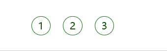
Exercise 2: Zooming in on mouse over paging buttons
<head>
    <style>
        li {<!-- -->
            float: left;
            width: 30px;
            height: 30px;
            border: 1px solid green;
            margin: 10px;
            text-align: center;
            line-height: 30px;
            list-style: none;
            border-radius: 50%;
            cursor: pointer;
            transition: all .4s;
        }

        li:hover {<!-- -->
            transform: scale(1.2);
        }
    </style>
</head>

<body>
    <ul>
        <li>1</li>
        <li>2</li>
        <li>3</li>
    </ul>
</body>
transform-origin specifies the transformation center
For rotate it is the center of rotation, for scale it is the center of scaling, in short it is the center of transformation. (Because the translation effect is the same relative to any point, there is no such thing as a translation center)
- grammar
transform-origin: x y;// x, y are relative to the upper left corner of the element
- focus
- Parameters can be values with units, percentages, keywords (left|right|bottom|top|center)
- Note that the following parameters x and y are separated by spaces
- x y The center point of the default transformation is the center point of the element (50% 50%)
transform transformation comprehensive writing method
transform is a compound attribute, all transformation functions can be written in this attribute, CSS will execute these functions in order, so pay attention to the order of writing
Notice:
- Use multiple transformations at the same time, the format is: transform: translate() rotate() scale() …etc,
- Their order affects the effect of the transition. (Rotating first will change the axis direction)
- When we have displacement and other attributes at the same time, remember to put the displacement first
- If there are displacement and rotation attributes at the same time, it is best to put the displacement first, because the rotation will cause the coordinate system of the box itself (similar to the object coordinate system) to also rotate, and translation after rotation is prone to errors
transform conversion summary
- The simple understanding of transform transform is deformation, which can be divided into 2D and 3D
- We have learned three for the time being, namely displacement rotation and scaling
- The transform transformation will not affect the layout of other elements