Article directory
- Preface
- related resources
- MD framework usage
-
- Start environment configuration
-
- Install Nuget package
- Test whether the import is successful
- MD component usage test
-
- Button
- Card
- ComboBoxes: single box
-
- data binding version
- Data Grids: tables
- Dialogs: Pop-up windows
-
- Simple explanation
- Drawer: sidebar
- Tabs
- Pickers: time picker
- Progress Indicators: Progress bar
Foreword
Material Design in xaml is an open source and free UI framework. The main focus of industrial control software is simple interfaces.
Hereinafter referred to as MD
Related resources
MaterialDesignInXamlToolkit Github address
MD quick start
MD case compressed package
MD framework usage
Startup environment configuration
Install Nuget package

App.xaml configuration
<Application x:Class="WpfApp1.App"
        xmlns="http://schemas.microsoft.com/winfx/2006/xaml/presentation"
        xmlns:x="http://schemas.microsoft.com/winfx/2006/xaml"
        xmlns:materialDesign="http://materialdesigninxaml.net/winfx/xaml/themes"
        StartupUri="MainWindow.xaml">
    <Application.Resources>
        <ResourceDictionary>
            <!--Add MD resource package-->
            <ResourceDictionary.MergedDictionaries>
                <materialDesign:BundledTheme BaseTheme="Light"
                        PrimaryColor="DeepPurple" SecondaryColor="Lime" />
                <ResourceDictionary
                        Source="pack://application:,,,/MaterialDesignThemes.Wpf;component/Themes/MaterialDesignTheme.Defaults.xaml" />
            </ResourceDictionary.MergedDictionaries>
        </ResourceDictionary>
    </Application.Resources>
</Application>
Test whether the import is successful
MainWindow.xmal
<Window x:Class="WpfApp1.MainWindow"
xmlns="http://schemas.microsoft.com/winfx/2006/xaml/presentation"
xmlns:x="http://schemas.microsoft.com/winfx/2006/xaml"
xmlns:d="http://schemas.microsoft.com/expression/blend/2008"
xmlns:mc="http://schemas.openxmlformats.org/markup-compatibility/2006"
xmlns:local="clr-namespace:WpfApp1"
xmlns:MD="http://materialdesigninxaml.net/winfx/xaml/themes"
xmlns:Views="clr-namespace:WpfApp1.Views" mc:Ignorable="d"
Title="MainWindow" Height="450" Width="800">
<Window.Resources>
<Style x:Key="my_text" TargetType="TextBlock">
<Setter Property="FontSize" Value="30" />
<Setter Property="Margin" Value="8" />
</Style>
</Window.Resources>
<Window.DataContext>
<!--Need to name to specify the data source-->
<local:MainWindowViewModel x:Name="viewModel" />
</Window.DataContext>
<Grid>
<!--TitleValue cannot be written directly, there will be problems with the Binding data source-->
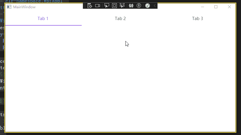
<MD:Card>
<TabControl MD:ColorZoneAssist.Mode="PrimaryLight"
>
<TabItem Header="Tab 1">
</TabItem>
<TabItem Header="Tab 2">
</TabItem>
<TabItem Header="Tab 3">
</TabItem>
</TabControl>
</MD:Card>
</Grid>
</Window>
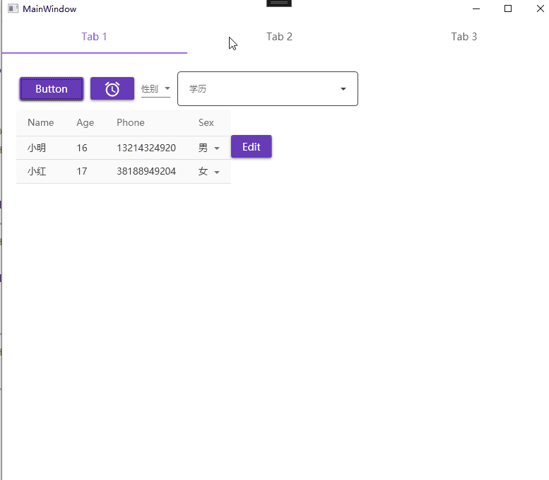
MD component usage test
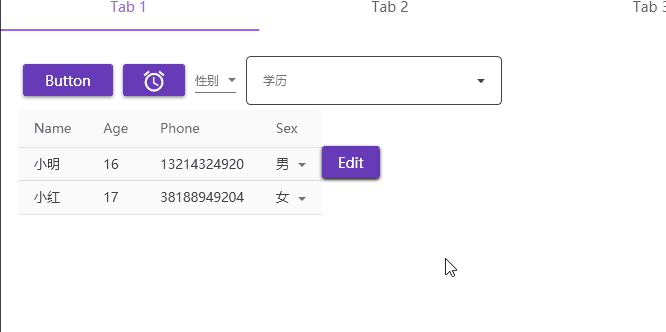
Button
Card
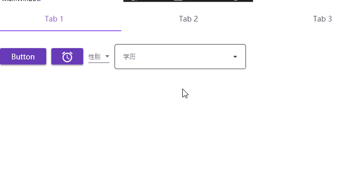
<WrapPanel Margin="10">
    <Button Width="90" Content="Button" Margin="5"/>
    <Button Margin="5" >

        <MD:PackIcon Kind="Alarm" Width="30" Height="25"/>
    </Button>
</WrapPanel>

I wanted to change the button a little later, such as rounding the corners, but I found it very troublesome and may need to overwrite the control template. Think about it or forget it and use the official solution first. First learn routines and solve problems, and then understand the underlying and expansion methods.
ComboBoxes: single box
<ComboBox MD:HintAssist.Hint="Gender" Margin="5" Cursor="">
    <ComboBoxItem Content="Male" />
    <ComboBoxItem Content="Female" />
    <ComboBoxItem Content="Confidential" />
</ComboBox>

Data binding version
<ComboBox MD:HintAssist.Hint="Education" Margin="5" Cursor="" Width="256"
        ItemsSource="{Binding StrLists}"
        Style="{<!-- -->StaticResource MaterialDesignOutlinedComboBox}">
</ComboBox>
data:
StrLists = new List<string>()
{<!-- -->
    "elementary school","junior high school","high school","university"
};
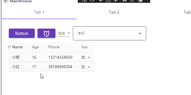
Data Grids: tables
Here we only use the simplest and simplest automatic generation
<DataGrid CanUserAddRows="False" ItemsSource="{Binding Templates}"
        SelectionMode="Extended" SelectionUnit="Cell" />
data source
//Class definition
public class TemplateDate
{<!-- -->
    public string Name {<!-- --> get; set; }

    public int Age {<!-- --> get; set; }

    public long Phone {<!-- --> get; set; }

    public enum SexEnum {<!-- --> male, female, confidential}

    public SexEnum Sex {<!-- --> get; set; }
}
//data source definition
Templates = new List<TemplateDate>() {<!-- -->
    new TemplateDate(){<!-- -->Name="Xiao Ming",Age = 16,Phone = 13214324920,Sex = TemplateDate.SexEnum.Male},
    new TemplateDate(){<!-- -->Name="小红",Age = 17,Phone = 38188949204,Sex = TemplateDate.SexEnum.Female}
};
Dialogs: Pop-up window
Simple pop-up function
<MD:DialogHost>
    <Button
            Command="{x:Static MD:DialogHost.OpenDialogCommand}">
        <Button.CommandParameter>
            <StackPanel Margin="16">
                <ProgressBar
                        Style="{<!-- -->DynamicResource MaterialDesignCircularProgressBar}"
                        HorizontalAlignment="Center" Margin="16"
                        IsIndeterminate="True" Value="0" />
                <Button IsCancel="True" Margin="8 0 0 0"
                        Command="{x:Static MD:DialogHost.CloseDialogCommand}"
                        Content="Save" />
            </StackPanel>
        </Button.CommandParameter>
        Edit
    </Button>
</MD:DialogHost>
Simple explanation
Dialogs generally have three types of pop-up windows:
- Notice: Notice, it will disappear after a while
- Confrim: Confirm the pop-up window, click OK or Cancel
- Input, pop-up window input
Generally there are 4 states: Debug, Info, Warning, Error
I won’t expand on this. I’ll study it when I have the opportunity in the future.
There are two more points to note:
- DialogHost: The pop-up content needs to be placed in DialogHost
- DialogHost gives general button events, OpenDialogCommand opens the pop-up window, and CloseDialogCommand closes the pop-up window. If you need to control these two events, you need to rewrite a method yourself.
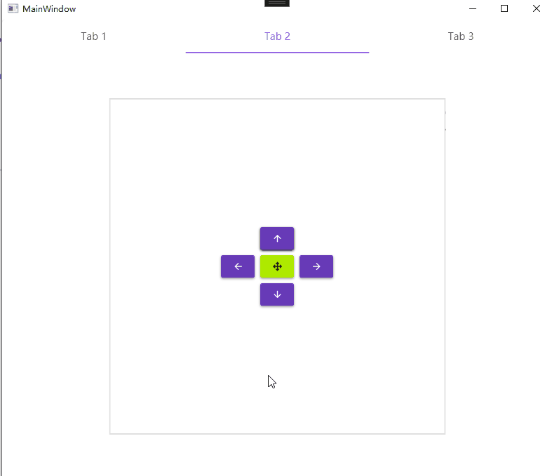
Drawer: Sidebar
The code is more complicated
<DockPanel>

    <materialDesign:DrawerHost x:Name="DrawerHost" Width="480" Height="480"
            Margin="32" HorizontalAlignment="Center"
            VerticalAlignment="Center"
            BorderBrush="{DynamicResource MaterialDesignDivider}"
            BorderThickness="2"
            BottomDrawerCornerRadius="20 20 0 0">
            <!--Sidebar area-->
        <materialDesign:DrawerHost.LeftDrawerContent>
            <TextBlock Text="Left" FontSize="50" />

        </materialDesign:DrawerHost.LeftDrawerContent>
        <materialDesign:DrawerHost.TopDrawerContent>
            <TextBlock Text="upper side" FontSize="50"/>
        </materialDesign:DrawerHost.TopDrawerContent>
        <materialDesign:DrawerHost.RightDrawerContent>
            <TextBlock Text="right" FontSize="50"/>

        </materialDesign:DrawerHost.RightDrawerContent>
        <materialDesign:DrawerHost.BottomDrawerContent>
            <TextBlock Text="Bottom" FontSize="50"/>

        </materialDesign:DrawerHost.BottomDrawerContent>
        <!--Button event area-->
        <Grid HorizontalAlignment="Center" VerticalAlignment="Center">
            <Grid.RowDefinitions>
                <RowDefinition />
                <RowDefinition />
                <RowDefinition />
            </Grid.RowDefinitions>
            <Grid.ColumnDefinitions>
                <ColumnDefinition />
                <ColumnDefinition />
                <ColumnDefinition />
            </Grid.ColumnDefinitions>
            <Button Grid.Row="1" Grid.Column="0" Margin="4"
                    Command="{x:Static materialDesign:DrawerHost.OpenDrawerCommand}"
                    CommandParameter="{x:Static Dock.Left}"
                    Content="{materialDesign:PackIcon Kind=ArrowLeft}" />
            <Button Grid.Row="0" Grid.Column="1" Margin="4"
                    Command="{x:Static materialDesign:DrawerHost.OpenDrawerCommand}"
                    CommandParameter="{x:Static Dock.Top}"
                    Content="{materialDesign:PackIcon Kind=ArrowUp}" />
            <Button Grid.Row="1" Grid.Column="2" Margin="4"
                    Command="{x:Static materialDesign:DrawerHost.OpenDrawerCommand}"
                    CommandParameter="{x:Static Dock.Right}"
                    Content="{materialDesign:PackIcon Kind=ArrowRight}" />
            <Button Grid.Row="2" Grid.Column="1" Margin="4"
                    Command="{x:Static materialDesign:DrawerHost.OpenDrawerCommand}"
                    CommandParameter="{x:Static Dock.Bottom}"
                    Content="{materialDesign:PackIcon Kind=ArrowDown}" />
            <Button Grid.Row="1" Grid.Column="1" Margin="4"
                    Command="{x:Static materialDesign:DrawerHost.OpenDrawerCommand}"
                    Content="{materialDesign:PackIcon Kind=ArrowAll}"
                    Style="{<!-- -->StaticResource MaterialDesignRaisedSecondaryButton}" />
        </Grid>
    </materialDesign:DrawerHost>
</DockPanel>
Tabs
<MD:Card>
    <TabControl MD:ColorZoneAssist.Mode="PrimaryLight">
        <TabItem Header="Tab 1" Cursor="">
            <Grid Margin="10">

            </Grid>
        </TabItem>
        <TabItem Header="Tab 2">
            <Grid Margin="10">
            </Grid>


        </TabItem>
        <TabItem Header="Tab 3">

        </TabItem>
    </TabControl>
</MD:Card>
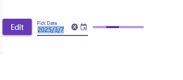
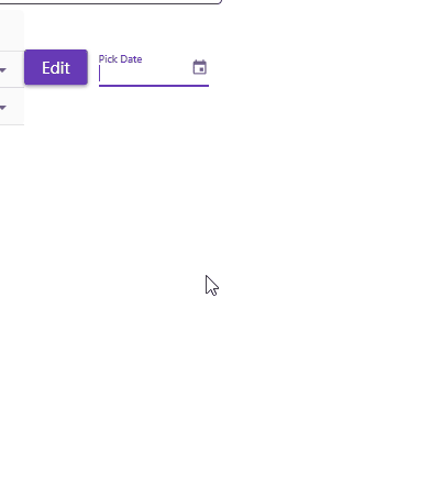
Pickers:Time picker
<DatePicker Margin="10" Width="100" MD:HintAssist.Hint="Pick Date"
        MD:TextFieldAssist.HasClearButton="True"
        Style="{<!-- -->StaticResource MaterialDesignFloatingHintDatePicker}" />
Progress Indicators: Progress bar
<ProgressBar Width="100" IsIndeterminate="True" />