import matplotlib.pyplot as plt
import numpy as np
Pictures displayed inside #Jupter Notebook
%matplotlib inline
#1.1.1 Line graph
np.random.seed(42) #Generate random seeds
y = np.random.randn(30) #Generate random numbers
plt.plot(y, "r--o")#Plot: red--dashed line--circle

# 1.1.2 Line color, line type, mark shape
x = np.random.randn(30)
y = np.random.randn(30)

plt.title("Example")
plt.title("Example")

y1 = np.random.randn(30)#Generate random numbers
y2 = np.random.randn(30)#Generate random numbers

print(y1,y2)

plt.title("Example")#Chart title
plt.xlabel("X")#Set the horizontal axis title
plt.ylabel("Y")#Set vertical axis title

y1,= plt.plot(y1,"r--o")
y2, = plt.plot(y2,"b-*")
plt.legend([y1,y2],["Y1","Y2"])#Set the corresponding legend text description

#1.1.4 Sub-picture
a = np.random.randn(30)#Generate random numbers
b = np.random.randn(30)#Generate random numbers
c = np.random.randn(30)#Generate random numbers
d=np.random.randn(30)#Generate random numbers

fig=plt.figure()#Define canvas
ax1=fig.add_subplot(2,2,1)#-th subplot canvas
ax2=fig.add_subplot(2,2,2)#Second subplot canvas
ax3=fig.add_subplot(2,2,3)#The third subplot canvas
ax4=fig.add_subplot(2,2,4)#The third subplot canvas

A,=ax1.plot(a,"r-o")#Draw the -th subgraph
ax1.legend([A],["A"])

B,=ax2.plot(b,"b-*")#Draw the second subgraph
ax2.legend([B],["B"])

C,=ax3.plot(c,"g-. + ")#Draw the third subgraph
ax3.legend([C],["C"])

D,=ax4.plot(d,"m:x")#Draw the fourth subgraph
ax4.legend ([D],["D"])

#1,1,5 scatter plot drawing
x = np.random.randn(30)
#Generate random numbers
y = np.random.randn(30)
#Generate random numbers
plt.scatter(x,y,c="g",marker="o",label="(X,Y)") #c: color; marker: mark shape; label: legend
plt.title("Example")#Chart title
plt.xlabel("X")
#Set horizontal axis title
plt.ylabel("Y")
#Set vertical axis title
plt.legend(loc=1) #Legend position setting
                    #10c=0: The best place to use the legend
                    #10c=1: Force the legend to use the upper right corner of the figure
                    #L0C=2: Force the legend to use the upper left corner of the figure
                    #10c=3: Force the legend to use the lower left corner of the figure
                    #10c=4: Force the legend to use the lower right corner of the figure
plt.show()

#1.1.6 Histogram drawing
X=np.random.randn(1000)#Generate random numbers
plt.hist(x,bins=20,color="g")#X: data; bins: number of stripes; color: color
plt.title("Example")#Chart title
plt.xlabel("X")
#Set horizontal axis title
plt.ylabel("Y")
#Set vertical axis title
plt.show()

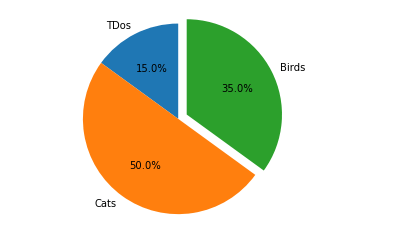
#1.1.7 Pie chart drawing
labels =["TDos","Cats","Birds"]
sizes=[15,50,35]
plt.pie(sizes,explode=(0,0,0.1),labels=labels,autopct="%1.1f%%",startangle=90)#explode: The interval between each part of the data series: autopct: Data is in floating point precision
plt.axis('equal')
plt.show()
import random
x = ["20{}year".format(i) for i in range(18,23)]
y = [random.randint(1,20) for i in range(5)]
for i in range(len(x)):
    plt.bar(x[i],y[i])

plt.title("title")
plt.xlabel("year")
plt.ylabel("number")
plt.show()

for i in range(len(x)):
                plt.bar(x[i],y[i],color=(0.2*i,0.2*i,0.2*i),linestyle="--",hatch="o",edgecolor=\ "r")
        #i=0,color = (0,0,0); i=1,color=(0.2,0.2,0.2)
        #color = (R,G,B)

x = ["20{}year".format(i)for i in range(18,23)]
y = list(random.randint(1,20)for i in range(5))
#y = [random.randint(1,20)for i in range(5)]
y2 = list(random.randint(1,20)for i in range(5))
plt.bar(x,y,lw=0.5,fc="r")
# lw:length wide,fc:face color
plt.bar(x,y2,Lw=0.5,fc="b",bottom=y)
# bottom: Control which image is displayed at the bottom

x = ["20{}year".format(i)for i in range(18,23)]
y = list(random.randint(1,20)for i in range(5))
y2 = list(random.randint(1,20)for i in range(5))

x_width = range(0,len(x))
x2_width = [i + 0.3 for i in x_width]

plt.bar(x_width,y,lw=0.5,fc="r",width=0.3)
plt.bar(x2_width,y2,lw=0.5,fc="b",width=0.3)

plt.xticks(range(0,5),x)
#(scale position, label)

x = ["20{}year".format(i)for i in range(18,23)]
y = list(random.randint(1,20)for i in range(5))
y2 = list(random.randint(1,20)for i in range(5))
x_width = range(0,len(x))
x2_width = [i + 0.3 for i in x_width]
plt.barh(x_width,y,lw=0.5,fc="r",height=0.3,label="cat")
plt.barh(x2_width,y2,Lw=0.5,fc="b",height=0.3,label="dog")
plt.yticks(range(0,5),x)
plt.legend()
plt.title("title")
plt.ylabel("year")
plt.xlabel("number")
plt.show()

x = ["20{}year".format(i)for i in range(18,23)]
y = list(random.randint(1,20)for i in range(5))
y2 = list(random.randint(1,20)for i in range(5))

plt.plot(x,y,color="pink",linestyle="--")
plt.plot(x,y2,color="skyblue",linestyle="-.")

#Histogram
plt.bar(x,y,lw=0.5,fc="r",width=0.3,alpha=0.5)
plt.bar(x,y2,lw=0.5,fc="b",width=0.3,alpha=0.5,bottom=y)
#alpha: control transparency, [0,1]
for i,j in zip(x,y):
    plt.text(i,j,"%d"%j,ha="center",va="bottom")

for i2,j2 in zip(x,y2):
    plt.text(i2,j2,"%d"%j2,ha="center",va="bottom")

x = ["20{}year".format(i)for i in range(18,23)]
y = list(random.randint(1,20)for i in range(5))
y2 = list(random.randint(-20,-1)for i in range(5))

ax = plt.gca()
# Get the current axes
ax.spines ["bottom"].set_position(('data',0))
# ax.spinesp["bottom"]: bottom boundary line (x-axis)
# ax.spines["bottom"].set_position(): Set the x-axis position
plt.bar(x,y,lw=0.5,fc="r",width=0.3)
plt.bar(x,y2,lw=0.5,fc="b",width=0.3)
for i,j in zip(x,y):
    plt.text(i,j,"%d"%j,ha="center",va="top")
for i2,j2 in zip(x,y2):
    plt.text(12,-j2,"%d"%j2,ha="center",va="bottom")

import matplotlib.pyplot as plt#Import drawing library

from sklearn.linear_model import LogisticRegression
#logistic regression model
from sklearn import metrics
from sklearn.datasets import load_breast_cancer#dataset
from sklearn.model_selection import train_test_split

import warnings
warnings.filterwarnings('ignore')
#Read data
breast_cancer = load_breast_cancer()
X = breast_cancer.data
y = breast_cancer.target
model = LogisticRegression()

trainx,testx,trainy,testy = train_test_split(X,y,test_size=0.2,random_state=42)
model.fit(trainx,trainy)#Train the training set
#Model prediction
prey=model.predict(testx)#Predicted class label--O or 1
preproba=model.predict_proba(testx)#preproba contains the probability that the sample is 0 and the probability that it is l
p,r,th = metrics.precision_recall_curve(testy,preproba[:,1])
plt.xlabel('Recall')
plt.ylabel('Precision')
plt.title('PR')
plt.plot(r,p)
plt.show()

fpr,tpr,threshold = metrics.roc_curve(testy,preproba[:,1]) # roc_curve:ROC
#TPR:true positive rate=recall rate
#FPR:
roc_auc = metrics.auc(fpr,tpr)
plt.plot(fpr,tpr,label='Val AUC =%0.3f'%roc_auc)
plt.xlabel('FPR')
plt.ylabel('TPR')
plt.title('ROC')
plt.legend(loc='lower right')


