Article directory
-
- Create a draggable control
- Create binding service class
-
- Drag
- Drag to hover and pass (DragOver)
- Drop
- Create page elements
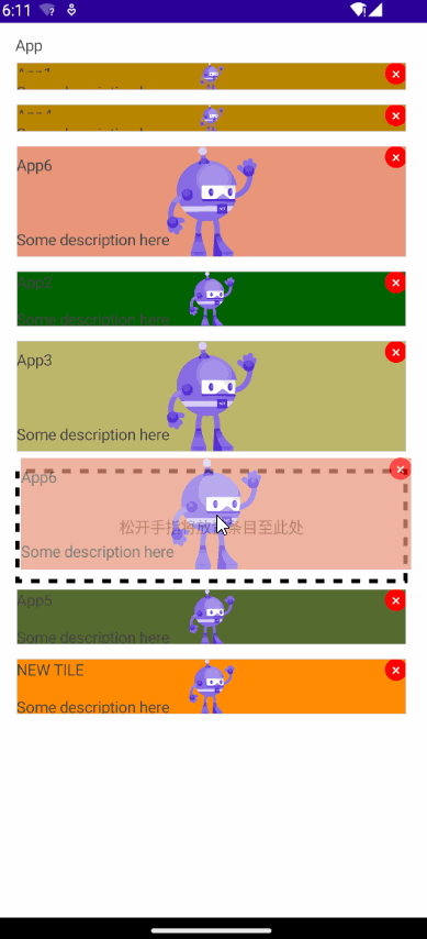
- final effect
- project address
.NET MAUI provides a drag-drop gesture recognizer, allowing users to move controls through dragging gestures. In this article, we will learn how to implement a draggable sorted list using a drag-and-drop gesture recognizer. In this example, tiles of different sizes are displayed in the list and can be sorted by dragging.
Using .NET MAU to achieve cross-platform support, this project can run on Android and iOS platforms.
Create drag-and-drop controls
Create a new .NET MAUI project and name it Tile
When the finger touches the draggable area for more than a certain period of time (the duration may not be the same on different platforms, such as 1s in Android), the drag gesture will be triggered.
When your finger leaves the screen, the placement gesture is triggered.
Enable dragging
Create a drag gesture recognizer (DragGestureRecognizer) for the page view control, which defines the following properties:
| attribute | type | description |
|---|---|---|
| CanDrag | bool | Indicates whether the control the gesture recognizer is attached to can be a drag source. The default value of this property is true. |
| CanDrag | bool | Indicates whether the control the gesture recognizer is attached to can be a drag source. The default value of this property is true. |
| DragStartingCommand | ICommand | is executed when the drag gesture is recognized for the first time. |
| DragStartingCommandParameter | object | is the parameter passed to DragStartingCommand. |
| DropCompletedCommand | ICommand | Is executed when the drag source is dropped. |
| DropCompletedCommandParameter | object | is the parameter passed to the DropCompletedCommand. |
Enable placement
Create a drop gesture recognizer (DropGestureRecognizer) for the page view control, which defines the following properties:
| attribute | type | description |
|---|---|---|
| AllowDrop | bool | Indicates whether the element the gesture recognizer is attached to can be a drop target. The default value of this property is true. |
| DragOverCommand | ICommand | Is executed when the drag source is dragged over the drop target. |
| DragOverCommandParameter | object | is the parameter passed to DragOverCommand. |
| DragLeaveCommand | ICommand | Executed when the drag source is dragged onto the drop target. |
| DragLeaveCommandParameter | object | is the parameter passed to DragLeaveCommand. |
| DropCommand | ICommand | Executed when the drag source is dropped on the drop target. |
| DropCommandParameter | object | is the parameter passed to DropCommand. |
Create a binding class for the draggable control, implement the IDraggableItem interface, and define drag-related properties and commands.
public interface IDraggableItem
{
    bool IsBeingDraggedOver { get; set; }
    bool IsBeingDragged { get; set; }
    Command Dragged { get; set; }
    Command DraggedOver { get; set; }
    Command DragLeave { get; set; }
    Command Dropped { get; set; }
    object DraggedItem { get; set; }
    object DropPlaceHolderItem { get; set; }
}
Dragged: Command triggered when dragging starts.
DraggedOver: A command triggered when a drag control is hovering over the current control.
DragLeave: A command triggered when a drag control leaves the current control.
Dropped: A command triggered when a drag control is placed above the current control.
When IsBeingDragged is true, it notifies that the current control is being dragged.
When IsBeingDraggedOver is true, it notifies the current control that a drag control is hovering above it.
DraggedItem: The control being dragged.
DropPlaceHolderItem: The control when hovering over it, that is, the placeholder control of the current control.
At this point, the draggable control is a tile segment (TileSegment), and a class is created to describe the properties that the tile can display, such as title, description, icon, color, etc.
public class TileSegment
{
    public string Title { get; set; }
    public string Type { get; set; }
    public string Desc { get; set; }
    public string Icon { get; set; }
    public Color Color { get; set; }
}
Create binding service class
Create a binding service class TileSegmentService for draggable controls, inherit ObservableObject, and implement the IDraggableItem interface.
public class TileSegmentService : ObservableObject, ITileSegmentService
{
    ...
}
Drag
When dragging starts, set IsBeingDragged to true to notify that the current control is being dragged, and set DraggedItem as the current control.
private void OnDragged(object item)
{
    IsBeingDragged=true;
    DraggedItem=item;
}
Drag and hover, pass (DragOver)
When the drag control hovers over the current control, set IsBeingDraggedOver to true to notify the current control that a drag control is hovering over it, and at the same time look for the service being dragged in the service list, and set DropPlaceHolderItem to the current controls.
private void OnDraggedOver(object item)
{
    if (!IsBeingDragged & amp; & amp; item!=null)
    {
        IsBeingDraggedOver=true;

        var itemToMove = Container.TileSegments.First(i => i.IsBeingDragged);
        if (itemToMove.DraggedItem!=null)
        {
            DropPlaceHolderItem=itemToMove.DraggedItem;

        }
    }

}
IsBeingDraggedOver is set to false when leaving the top of the control
private void OnDragLeave(object item)
{
    IsBeingDraggedOver = false;
}
Drop
When the dragging is completed, get the control currently being dragged, remove it from the service list, and then insert it into the position of the current control, and notify the current control that the dragging is complete.
private void OnDropped(object item)
{
    var itemToMove = Container.TileSegments.First(i => i.IsBeingDragged);

    if (itemToMove == null || itemToMove == this)
        return;


    Container.TileSegments.Remove(itemToMove);

    var insertAtIndex = Container.TileSegments.IndexOf(this);

    Container.TileSegments.Insert(insertAtIndex, itemToMove);
    itemToMove.IsBeingDragged = false;
    IsBeingDraggedOver = false;
    DraggedItem=null;

}
The complete TileSegmentService code is as follows:
public class TileSegmentService : ObservableObject, ITileSegmentService
{

    public TileSegmentService(
        TileSegment tileSegment)
    {
        Remove = new Command(RemoveAction);
        TileSegment = tileSegment;

        Dragged = new Command(OnDragged);
        DraggedOver = new Command(OnDraggedOver);
        DragLeave = new Command(OnDragLeave);
        Dropped = new Command(i => OnDropped(i));

    }

    private void OnDragged(object item)
    {
        IsBeingDragged=true;
    }

    private void OnDraggedOver(object item)
    {
        if (!IsBeingDragged & amp; & amp; item!=null)
        {
            IsBeingDraggedOver=true;

            var itemToMove = Container.TileSegments.First(i => i.IsBeingDragged);
            if (itemToMove.DraggedItem!=null)
            {
                DropPlaceHolderItem=itemToMove.DraggedItem;

            }
        }

    }


    private object _draggedItem;

    public object DraggedItem
    {
        get { return _draggedItem; }
        set
        {
            _draggedItem = value;
            OnPropertyChanged();
        }
    }

    private object _dropPlaceHolderItem;

    public object DropPlaceHolderItem
    {
        get { return _dropPlaceHolderItem; }
        set
        {
            _dropPlaceHolderItem = value;
            OnPropertyChanged();
        }
    }

    private void OnDragLeave(object item)
    {

        IsBeingDraggedOver = false;
        DraggedItem = null;

    }

    private void OnDropped(object item)
    {
        var itemToMove = Container.TileSegments.First(i => i.IsBeingDragged);

        if (itemToMove == null || itemToMove == this)
            return;


        Container.TileSegments.Remove(itemToMove);

        var insertAtIndex = Container.TileSegments.IndexOf(this);

        Container.TileSegments.Insert(insertAtIndex, itemToMove);
        itemToMove.IsBeingDragged = false;
        IsBeingDraggedOver = false;
        DraggedItem=null;

    }

    private async void RemoveAction(object obj)
    {
        if (Container is ITileSegmentServiceContainer)
        {
            (Container as ITileSegmentServiceContainer).RemoveSegment.Execute(this);
        }
    }


    public IReadOnlyTileSegmentServiceContainer Container { get; set; }


    private TileSegment tileSegment;

    public TileSegment TileSegment
    {
        get { return tileSegment; }
        set
        {
            tileSegment = value;
            OnPropertyChanged();

        }
    }


    private bool _isBeingDragged;
    public bool IsBeingDragged
    {
        get { return _isBeingDragged; }
        set
        {
            _isBeingDragged = value;
            OnPropertyChanged();

        }
    }

    private bool _isBeingDraggedOver;
    public bool IsBeingDraggedOver
    {
        get { return _isBeingDraggedOver; }
        set
        {
            _isBeingDraggedOver = value;
            OnPropertyChanged();

        }
    }

    public Command Remove { get; set; }


    public Command Dragged { get; set; }

    public Command DraggedOver { get; set; }

    public Command DragLeave { get; set; }

    public Command Dropped { get; set; }
}
Create page elements
Create tile controls of different sizes in the Controls directory, as shown in the figure below.

Create CollectionView in MainPage to display tile elements in list form.
<CollectionView Grid.Row="1"
                x:Name="MainCollectionView"
                ItemsSource="{Binding TileSegments}"
                ItemTemplate="{StaticResource TileSegmentDataTemplateSelector}">
    <CollectionView.ItemsLayout>
        <LinearItemsLayout Orientation="Vertical" />
    </CollectionView.ItemsLayout>
</CollectionView>
Create MainPageViewModel, create a collection of bound service classes, TileSegments, add some tiles of different colors and sizes during initialization, and set TileSegementService.Container to yourself (this).
Tiles of different sizes are displayed using different data templates by binding corresponding data. Please read the blog post [MAUI Programming]Interface polymorphism and implementation to learn how to realize the polymorphism of list Item.

Create a tile segment data template selector (TileSegmentDataTemplateSelector) in MainPage to select different data templates based on the size of the tile segments.
<DataTemplate x:Key="SmallSegment">
    <controls1:SmallSegmentView Margin="0,5"
                                    ControlTemplate="{StaticResource TileSegmentTemplate}">
    </controls1:SmallSegmentView>
</DataTemplate>
<DataTemplate x:Key="MediumSegment">
    <controls1:MediumSegmentView Margin="0,5"
                                    ControlTemplate="{StaticResource TileSegmentTemplate}">

    </controls1:MediumSegmentView>
</DataTemplate>
<DataTemplate x:Key="LargeSegment">
    <controls1:LargeSegmentView Margin="0,5"
                                ControlTemplate="{StaticResource TileSegmentTemplate}">

    </controls1:LargeSegmentView>
</DataTemplate>
<controls1:TileSegmentDataTemplateSelector x:Key="TileSegmentDataTemplateSelector"
                                            ResourcesContainer="{x:Reference Main}" />
Create a tile control template TileSegmentTemplate and specify DropGestureRecognizer here
<ControlTemplate x:Key="TileSegmentTemplate">
    <ContentView>
        <StackLayout>
            <StackLayout.GestureRecognizers>
                <DropGestureRecognizer AllowDrop="True"
                                        DragLeaveCommand="{TemplateBinding BindingContext.DragLeave}"
                                        DragLeaveCommandParameter="{TemplateBinding}"
                                        DragOverCommand="{TemplateBinding BindingContext.DraggedOver}"
                                        DragOverCommandParameter="{TemplateBinding}"
                                        DropCommand="{TemplateBinding BindingContext.Dropped}"
                                        DropCommandParameter="{TemplateBinding}" />
            </StackLayout.GestureRecognizers>

        </StackLayout>
    </ContentView>
</ControlTemplate>
Create a tile control appearance Layout, and the content of the tile fragment will be presented at
<Border x:Name="ContentLayout"
        Margin="0">
    <Grid>
        <Grid. GestureRecognizers>
            <DragGestureRecognizerCanDrag="True"
                                    DragStartingCommand="{TemplateBinding BindingContext.Dragged}"
                                    DragStartingCommandParameter="{TemplateBinding}" />
        </Grid. GestureRecognizers>

        <Content Presenter />
        <Button CornerRadius="100"
                HeightRequest="20"
                WidthRequest="20"
                Padding="0"
                BackgroundColor="Red"
                TextColor="White"
                Command="{TemplateBinding BindingContext.Remove}"
                Text="×"
                HorizontalOptions="End"
                VerticalOptions="Start"></Button>
    </Grid>
</Border>

Create a placeholder control to indicate the area where the control will be placed when your finger is released, and bind the height and width of the DropPlaceHolderItem here.
<Border StrokeThickness="4"
        StrokeDashArray="2 2"
        StrokeDashOffset="6"
        Stroke="black"
        HorizontalOptions="Center"
        IsVisible="{TemplateBinding BindingContext.IsBeingDraggedOver}">
    <Grid HeightRequest="{TemplateBinding BindingContext.DropPlaceHolderItem.Height}"
            WidthRequest="{TemplateBinding BindingContext.DropPlaceHolderItem.Width}">
        <Label HorizontalTextAlignment="Center"
                VerticalOptions="Center"
                Text="Release your finger to place the entry here"></Label>


    </Grid>
</Border>
Final effect
Project address
Github: maui-samples
Follow me and learn more about .NET MAUI development!