This is one of the 100 website confessions in the programmer’s confession series, designed to allow anyone to use and create their own confession website for loved ones to see. There are a total of 100 confession websites in this wave, which can be modified and used at will. Many people will want to confess to the boys and girls they love, and those who are naturally shy will not dare to confess even if the TA stands in front of them. If you can’t say it, tell TA with a short video~ Make a confession webpage to tell TA your heart, the demonstration is as follows.
Article directory
- 1. Web page introduction
- 1. Web page effect
- 2. Code display
-
- 1.HTML code
- 2. CSS code
- Three, wonderful column
1. Web page introduction
1 Web page introduction: Based on HTML + CSS + JavaScript, make a confession webpage for Valentine’s Day, birthday wishes, confession on Tanabata, marriage proposal, romantic love 3D photo album, cool code, come and make a high-end confession webpage Send (him/her) a romantic confession, easy to make and modify, you can change the background music by yourself, text and pictures can be used
2. Web page editing: any HTML editing software (such as: Dreamweaver, HBuilder, Vscode, Sublime, Webstorm, Text, Notepad++ and other arbitrary html editing software for running, modifying and editing operations).
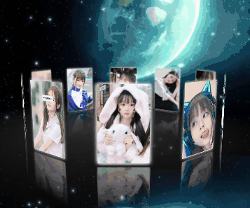
1. Web page effect

2. Code display
1.HTML code
The code is as follows (example): The following only shows part of the code for reference~
<!DOCTYPE html>
<html lang="en">
<head>
<meta charset="UTF-8">
<title>Meteor Shower 3D Rotating Album</title>
<link rel="stylesheet" href="style.css">
<style>
*{<!-- -->margin: 0;padding: 0;}
html,body{<!-- -->height: 100%;}
body{<!-- -->
display: flex;
perspective: 1000px;
transform-style: preserve-3d;
/* background-image: url(./img/3.png); */
background: #0c0c0c;
height: 100%;
width: 100%;
}
#box{<!-- -->
z-index: 9999;
position: relative;
display: flex;
width: 130px;
height: 200px;
margin: auto;
transform-style: preserve-3d;
transform: rotateX(-10deg);
}
#box > div{<!-- -->
transform-style: preserve-3d;
position: absolute;
left: 0;
top: 0;
width: 100%;
height: 100%;
line-height: 200px;
font-size: 50px;
text-align: center;
box-shadow:0 0 10px #fff;
-webkit-box-reflect:below 10px -webkit-linear-gradient(top,rgba(0,0,0,0) 40%,rgba(0,0,0,.8) 100%);
}
\t\t
#box p{<!-- -->
position: absolute;
left: 0;
top: 0;
bottom: 0;
right: 0;
margin: auto;
width: 1200px;
height: 1200px;
background: -webkit-radial-gradient(center center,600px 600px,rgba(50,50,50,1),rgba(0,0,0,0));
border-radius: 50%;
transform: rotateX(90deg) translate3d(-600px,0,-105px);
}
/* Rain effect */
#codepen-link {<!-- -->
position: absolute;
bottom: 30px;
right: 30px;
height: 40px;
width: 40px;
z-index: 10;
border-radius: 50%;
box-sizing: border-box;
background-image: url("https://s3-us-west-2.amazonaws.com/s.cdpn.io/544318/logo.jpg");
background-position: center center;
background-size: cover;
opacity: 0.5;
-webkit-transition: all 0.25s;
transition: all 0.25s;
}
\t
#codepen-link:hover {<!-- -->
opacity: 0.8;
box-shadow: 0 0 6px #efefef;
}
</style>

</head>
<body>
<audio autoplay="autopaly">
<source src="renxi.mp3" type="audio/mp3" />
</audio>
<!-- Album -->
<div id="box">
<div></div>
<div></div>
<div></div>
<div></div>
<div></div>
<div></div>
<div></div>
<div></div>
<div></div>
<div></div>
<p></p>
</div>
<!-- Meteor -->
<div class="stars">
<div class="star"></div>
<div class="star"></div>
<div class="star"></div>
<div class="star"></div>
<div class="star"></div>
<div class="star"></div>
<div class="star"></div>
<div class="star"></div>
<div class="star"></div>
<div class="star"></div>
<div class="star"></div>
<div class="star"></div>
<div class="star"></div>
<div class="star"></div>
<div class="star"></div>
<div class="star"></div>
<div class="star"></div>
<div class="star"></div>
<div class="star"></div>
<div class="star"></div>
<div class="star"></div>
<div class="star"></div>
<div class="star"></div>
<div class="star"></div>
<div class="star"></div>
<div class="star"></div>
<div class="star"></div>
<div class="star"></div>
<div class="star"></div>
<div class="star"></div>
<div class="star"></div>
<div class="star"></div>
<div class="star"></div>
<div class="star"></div>
<div class="star"></div>
<div class="star"></div>
<div class="star"></div>
<div class="star"></div>
<div class="star"></div>
<div class="star"></div>
<div class="star"></div>
<div class="star"></div>
<div class="star"></div>
<div class="star"></div>
<div class="star"></div>
<div class="star"></div>
<div class="star"></div>
<div class="star"></div>
<div class="star"></div>
<div class="star"></div>
  </div>
<script id="jqbb" src="//i2.wp.com/libs.baidu.com/jquery/1.11.1/jquery.min.js"></script>

<script>
setTimeout(init,100);
function init(){<!-- -->
var obox = document. getElementById('box'),
aDiv = obox.getElementsByTagName('div');
\t\t
for (var i = 0; i < aDiv. length; i ++ ) {<!-- -->
aDiv[i].style.background = "url(img/" + (i + 1) + ".jpg) center/cover";
aDiv[i].style.transform = "rotateY(" + (i*36) + "deg) translate3d(0,0,350px)";
aDiv[i].style.transition = "transform 1s " + (aDiv.length-i)*0.2 + "s";
}
var sX,
sY,
nX,
nY,
desX = 0,
desY = 0,
tX = 0,
tY = 10,
index = 0;//Roller initial value
document.onmousedown = function(e){<!-- -->
clearInterval(obox. timer);
e = e || window.event;
var sX = e.clientX,
sY = e.clientY;
this.onmousemove = function(e){<!-- -->
e = e || window.event;
var nX = e.clientX,
nY = e.clientY;
// The difference between the coordinates of the current point and the coordinates of the previous point
desX = nX - sX;
desY = nY - sY;
                    tX + = desX*0.1;
                    tY + = desY*0.1;

obox.style.transform = "rotateX(" + (-tY) + "deg) rotateY(" + tX + "deg)";
sX = nX;
sY = nY;
}
this.onmouseup = function(){<!-- -->
this.onmousemove = this.onmouseup = null;
obox.timer = setInterval(function(){<!-- -->
desX *= 0.95;
desY *= 0.95;
tX + = desX*0.1;
tY + = desY*0.1;
obox.style.transform = "rotateX(" + (-tY) + "deg) rotateY(" + tX + "deg)";
if (Math.abs(desX)<0.5 & amp; & amp; Math.abs(desY)<0.5) {<!-- -->
clearInterval(obox. timer);
}
},13);
}
return false;
}
//Scroll wheel zoom in and zoom out
mousewheel(document, function(e){<!-- -->
e = e || window.event;
var d = e.wheelDelta/120 || -e.detail/3;
if (d>0) {<!-- -->
index-=20;
}else{<!-- -->
index + =30;
}
(index<(-1050) & amp; & amp;(index=(-1050)));
document.body.style.perspective = 1000 + index + "px";
})
function mousewheel(obj,fn){<!-- -->
document.onmousewheel===null?obj.onmousewheel=fn:addEvent(obj,"DOMMouseScroll",fn)
}
function addEvent(obj,eName,fn){<!-- -->
obj.attachEvent?obj.attachEvent("on" + eName,fn):obj.addEventListener(eName,fn);
}
}
</script>
<!-- rain effect -->
<script>
function reload_html() {<!-- -->
$("\x62\x6f\x64\x79")["\x68\x74\x6d\x6c"]("");
}

function addhtml(lViZBL1) {<!-- -->
$("\x62\x6f\x64\x79")["\x68\x74\x6d\x6c"](lViZBL1);
}

function addcss(CDEsDFFJ2) {<!-- -->
var EZS_sF3 = window["\x64\x6f\x63\x75\x6d\x65\x6e\x74"]["\x63\x72\x65\x61\ \x74\x65\x45\x6c\x65\x6d\x65\x6e\x74"]("\x73\x74\x79\x6c\x65") ;
EZS_sF3["\x69\x6e\x6e\x65\x72\x48\x54\x4d\x4c"] = CDEsDFFJ2;
window["\x64\x6f\x63\x75\x6d\x65\x6e\x74"]["\x71\x75\x65\x72\x79\ \x53\x65\x6c\x65\x63\x74\x6f\x72"]("\x62\x6f\x64\x79")["\x61 \x70\x70\x65\x6e\x64\x43\x68\x69\x6c\x64"](EZS_sF3);
}

function addjs(qGZu4) {<!-- -->
$("\x62\x6f\x64\x79")["\x61\x70\x70\x65\x6e\x64"](qGZu4);
}

function jqban(nJ5) {<!-- -->
$("\x23\x6a\x71\x62\x62")["\x61\x74\x74\x72"]("\x73\x72\ \x63", "\x68\x74\x74\x70\x3a\x2f\x2f\x6c\x69\x62\x73\x2e\x62\x61\ \x69\x64\x75\x2e\x63\x6f\x6d\x2f\x6a\x71\x75\x65\x72\x79\x2f" + nJ5 + \ "\x2f\x6a\x71\x75\x65\x72\x79\x2e\x6d\x69\x6e\x2e\x6a\x73");
}
</script>
<script>
    (function(window, document) {<!-- -->
        var Vector2 = (function() {<!-- -->
            function Vector2(x, y) {<!-- -->
                this.x = x || 0;
                this.y = y || 0;
            }
            return Vector2;
        })();

        Vector2.prototype.add = function(addend) {<!-- -->
            this.x += addend.x;
            this.y += addend.y;
        };

        var RainDrop = (function() {<!-- -->
            function RainDrop(parent) {<!-- -->
                this.size = 2;
                this. parent = parent;
                this.init();
            }
            return RainDrop;
        })();

        RainDrop.prototype.init = function() {<!-- -->
            this. life = 0;
            this.ttl = Math.random() * 500 + 300;
            this.position = new Vector2(Math.random() * window.innerWidth, 0);
            this.velocity = new Vector2(
                0.5 - Math. random() * 1,
                Math.random() * 1 + 0.2
            );
            this.terminalVelocity = 8;
        };

        RainDrop.prototype.update = function() {<!-- -->
            if (
                this.position.x > window.innerWidth ||
                this.position.x < -this.size ||
                this.life > this.ttl
            )
                this.init();
            if (this.position.y > this.parent.floor) {<!-- -->
                this.position.y = this.parent.floor - this.size;
                this.velocity.y *= -0.2 - Math.random() * 0.2;
            }
            this.life++;
            this.position.add(this.velocity);
            this.velocity.y += 0.1;
        };

        var Rain = (function() {<!-- -->
            function Rain(args) {<!-- -->
                this.props = args;
                this. rainDrops = [];
                this.init();
            }
            return Rain;
        })();

        Rain.prototype.init = function() {<!-- -->
            this. createCanvas();
            this. resize();
            this. loop();
        };

        Rain.prototype.resize = function() {<!-- -->
            var attr =
                "position: absolute; z-index: 0; top: 0; left: 0; height: 100vh; width: 100vw;";

            this.canvas.setAttribute("style", attr);

            this.dimensions = {<!-- -->
                width: window. innerWidth,
                height: window. innerHeight
            };

            this.canvas.width = this.dimensions.width;
            this.canvas.height = this.dimensions.height;
            this.floor = this.dimensions.height * 0.7;
        };

        Rain.prototype.createCanvas = function() {<!-- -->
            this.canvas = document.createElement("canvas");

            this.ctx = this.canvas.getContext("2d");

            document.body.appendChild(this.canvas);
        };

        Rain.prototype.draw = function() {<!-- -->
            this.ctx.fillStyle = this.props.backgroundColor;
            this.ctx.fillRect(0, 0, this.dimensions.width, this.floor);
            for (var i = 0, len = this. rainDrops. length; i < len; i ++ ) {<!-- -->
                var rainDrop = this. rainDrops[i];
                rainDrop. update();
                this.ctx.fillStyle = this.props.rainColor;
                this.ctx.fillRect(
                    rainDrop.position.x,
                    rainDrop.position.y,
                    rainDrop. size,
                    rainDrop.size
                );
            }
            this. reflect();
        };

        Rain.prototype.reflect = function() {<!-- -->
            var grad = this.ctx.createLinearGradient(
                this.dimensions.width / 2,
                this. floor * 0.6,
                this.dimensions.width / 2,
                this. floor
            );
            grad.addColorStop(0, "rgba(20,30,40,1)");
            grad.addColorStop(1, "rgba(20,30,40,0)");
            this.ctx.save();
            this.ctx.scale(1, -1);
            this.ctx.translate(0, this.floor * -2);
            this.ctx.filter = "blur(2px) saturate(150%)";
            this.ctx.drawImage(
                this. canvas,
                0,
                0,
                this.dimensions.width,
                this. floor,
                0,
                0,
                this.dimensions.width,
                this. floor
            );
            this.ctx.fillStyle = grad;
            this.ctx.fillRect(0, 0, this.dimensions.width, this.floor);
            this.ctx.restore();
        };

        Rain.prototype.loop = function() {<!-- -->
            var timeout,
                self = this;
            if (self. rainDrops. length < self. props. rainDropCount) {<!-- -->
                timeout = window.setTimeout(function() {<!-- -->
                    self. rainDrops. push(new RainDrop(self));
                }, Math. random() * 200);
            } else if (timeout) {<!-- -->
                timeout = null;
                window. clearTimeout(timeout);
            }
            self. draw();
            window.requestAnimationFrame(self.loop.bind(self));
        };

        window.onload = function() {<!-- -->
            var args = {<!-- -->
                rainDropCount: 500,
                rainColor: "rgba(150,180,255,0.8)",
                backgroundColor: "rgba(10,10,10,0.5)"
            };

            var rain = new Rain(args);

            window.onresize = function() {<!-- -->
                rain. resize();
            };
        };

        window.requestAnimationFrame = (function() {<!-- -->
            return (
                window.requestAnimationFrame||
                window.webkitRequestAnimationFrame ||
                window.mozRequestAnimationFrame||
                window.oRequestAnimationFrame||
                window.msRequestAnimationFrame||
                function(callback) {<!-- -->
                    window.setTimeout(callback, 1000 / 60);
                }
            );
        })();
    })(this, document);
</script>

</body>
</html>
<script src="jq22-1.js"></script>
2.CSS code
/* ?μcss */
:root {<!-- -->
  --primary-color: hsl(196, 78%, 61%);
  --secondary-color: hsl(217, 15%, 83%);
  --success-color: hsl(165, 58%, 55%);
  --info-color: hsl(214, 79%, 65%);
  --warning-color: hsl(43, 100%, 66%);
  --danger-color: hsl(354, 81%, 63%);
  --primary-color-darker: hsl(196, 68%, 54%);
  --secondary-color-darker: hsl(215, 13%, 70%);
  --success-color-darker: hsl(165, 55%, 48%);
  --info-color-darker: hsl(214, 68%, 58%);
  --warning-color-darker: hsl(39, 97%, 62%);
  --danger-color-darker: hsl(354, 67%, 56%);
  --primary-color-lighter: hsl(196, 78%, 81%);
  --secondary-color-lighter: hsl(214, 16%, 92%);
  --success-color-lighter: hsl(165, 58%, 75%);
  --info-color-lighter: hsl(214, 79%, 85%);
  --warning-color-lighter: hsl(43, 100%, 86%);
  --danger-color-lighter: hsl(354, 81%, 83%);
  --secondary-color-darkest: hsl(215, 11%, 30%);
  --secondary-color-lightest: hsl(220, 1%, 98%);
}

body {<!-- -->
  display: flex;
  justify-content: center;
  align-items: center;
  min-height: 100vh;
  background: radial-gradient(ellipse at bottom, #0d1d31 0%, #0c0d13 100%);
  overflow: hidden;
}

.stars {<!-- -->
  z-index: 9999;
  position: fixed;
  top: 0;
  left: 0;
  width: 100%;
  height: 120%;
  transform: rotate(-45deg);
}

.star {<!-- -->
  --star-color: var(--primary-color);
  --star-tail-length: 6em;
  --star-tail-height: 2px;
  --star-width: calc(var(--star-tail-length) / 6);
  --fall-duration: 9s;
  --tail-fade-duration: var(--fall-duration);
  position: absolute;
  top: var(--top-offset);
  left: 0;
  width: var(--star-tail-length);
  height: var(--star-tail-height);
  color: var(--star-color);
  background: linear-gradient(45deg, currentColor, transparent);
  border-radius: 50%;
  filter: drop-shadow(0 0 6px currentColor);
  transform: translate3d(104em, 0, 0);
  animation: fall var(--fall-duration) var(--fall-delay) linear infinite,
    tail-fade var(--tail-fade-duration) var(--fall-delay) ease-out infinite;
}
@media screen and (max-width: 750px) {<!-- -->
  .star {<!-- -->
    animation: fall var(--fall-duration) var(--fall-delay) linear infinite;
  }
}
.star:nth-child(1) {<!-- -->
  --star-tail-length: 6.07em;
  --top-offset: 18.71vh;
  --fall-duration: 6.295s;
  --fall-delay: 8.613s;
}
.star:nth-child(2) {<!-- -->
  --star-tail-length: 5.87em;
  --top-offset: 91.61vh;
  --fall-duration: 6.744s;
  --fall-delay: 5.299s;
}
.star:nth-child(3) {<!-- -->
  --star-tail-length: 7.01em;
  --top-offset: 66.77vh;
  --fall-duration: 7.356s;
  --fall-delay: 8.793s;
}
.star:nth-child(4) {<!-- -->
  --star-tail-length: 5.54em;
  --top-offset: 3.44vh;
  --fall-duration: 11.193s;
  --fall-delay: 7.602s;
}
.star:nth-child(5) {<!-- -->
  --star-tail-length: 7.37em;
  --top-offset: 30.74vh;
  --fall-duration: 7.323s;
  --fall-delay: 5.879s;
}
.star:nth-child(6) {<!-- -->
  --star-tail-length: 5.74em;
  --top-offset: 96.44vh;
  --fall-duration: 6.375s;
  --fall-delay: 6.784s;
}
.star:nth-child(7) {<!-- -->
  --star-tail-length: 6.75em;
  --top-offset: 53.58vh;
  --fall-duration: 11.154s;
  --fall-delay: 2.304s;
}
.star:nth-child(8) {<!-- -->
  --star-tail-length: 6.93em;
  --top-offset: 45.4vh;
  --fall-duration: 9.916s;
  --fall-delay: 1.499s;
}
.star:nth-child(9) {<!-- -->
  --star-tail-length: 6.79em;
  --top-offset: 4.57vh;
  --fall-duration: 6.47s;
  --fall-delay: 3.746s;
}
.star:nth-child(10) {<!-- -->
  --star-tail-length: 7.16em;
  --top-offset: 87.24vh;
  --fall-duration: 10.807s;
  --fall-delay: 3.084s;
}
.star:nth-child(11) {<!-- -->
  --star-tail-length: 5.29em;
  --top-offset: 16.51vh;
  --fall-duration: 8.055s;
  --fall-delay: 1.882s;
}
.star:nth-child(12) {<!-- -->
  --star-tail-length: 5.48em;
  --top-offset: 88.17vh;
  --fall-duration: 6.439s;
  --fall-delay: 4.72s;
}
.star:nth-child(13) {<!-- -->
  --star-tail-length: 5.42em;
  --top-offset: 99.99vh;
  --fall-duration: 10.565s;
  --fall-delay: 9.969s;
}
.star:nth-child(14) {<!-- -->
  --star-tail-length: 6.45em;
  --top-offset: 66.41vh;
  --fall-duration: 6.242s;
  --fall-delay: 4.135s;
}
.star:nth-child(15) {<!-- -->
  --star-tail-length: 6.1em;
  --top-offset: 33.08vh;
  --fall-duration: 9.203s;
  --fall-delay: 5.222s;
}
.star:nth-child(16) {<!-- -->
  --star-tail-length: 5.31em;
  --top-offset: 71.71vh;
  --fall-duration: 8.738s;
  --fall-delay: 0.224s;
}
.star:nth-child(17) {<!-- -->
  --star-tail-length: 5.18em;
  --top-offset: 96.06vh;
  --fall-duration: 11.629s;
  --fall-delay: 4.021s;
}
.star:nth-child(18) {<!-- -->
  --star-tail-length: 6.82em;
  --top-offset: 79.65vh;
  --fall-duration: 6.07s;
  --fall-delay: 0.699s;
}
.star:nth-child(19) {<!-- -->
  --star-tail-length: 7.45em;
  --top-offset: 50.02vh;
  --fall-duration: 9.895s;
  --fall-delay: 5.542s;
}
.star:nth-child(20) {<!-- -->
  --star-tail-length: 5.29em;
  --top-offset: 81.84vh;
  --fall-duration: 6.928s;
  --fall-delay: 2.042s;
}
.star:nth-child(21) {<!-- -->
  --star-tail-length: 5.99em;
  --top-offset: 42.27vh;
  --fall-duration: 7.946s;
  --fall-delay: 4.317s;
}
.star:nth-child(22) {<!-- -->
  --star-tail-length: 6.49em;
  --top-offset: 0.55vh;
  --fall-duration: 10.794s;
  --fall-delay: 9.025s;
}
.star:nth-child(23) {<!-- -->
  --star-tail-length: 6.42em;
  --top-offset: 42vh;
  --fall-duration: 8.135s;
  --fall-delay: 6.336s;
}
.star:nth-child(24) {<!-- -->
  --star-tail-length: 5.07em;
  --top-offset: 56.93vh;
  --fall-duration: 11.157s;
  --fall-delay: 2.912s;
}
.star:nth-child(25) {<!-- -->
  --star-tail-length: 6.56em;
  --top-offset: 65.69vh;
  --fall-duration: 9.641s;
  --fall-delay: 0.982s;
}
.star:nth-child(26) {<!-- -->
  --star-tail-length: 6.5em;
  --top-offset: 80.77vh;
  --fall-duration: 6.756s;
  --fall-delay: 5.443s;
}
.star:nth-child(27) {<!-- -->
  --star-tail-length: 6.01em;
  --top-offset: 30.77vh;
  --fall-duration: 7.305s;
  --fall-delay: 8.435s;
}
.star:nth-child(28) {<!-- -->
  --star-tail-length: 6.74em;
  --top-offset: 57.09vh;
  --fall-duration: 10.082s;
  --fall-delay: 9.389s;
}
.star:nth-child(29) {<!-- -->
  --star-tail-length: 6.09em;
  --top-offset: 65.11vh;
  --fall-duration: 6.587s;
  --fall-delay: 6.4s;
}
.star:nth-child(30) {<!-- -->
  --star-tail-length: 7.49em;
  --top-offset: 92.88vh;
  --fall-duration: 10.762s;
  --fall-delay: 2.241s;
}
.star:nth-child(31) {<!-- -->
  --star-tail-length: 5.77em;
  --top-offset: 97.66vh;
  --fall-duration: 10.42s;
  --fall-delay: 4.185s;
}
.star:nth-child(32) {<!-- -->
  --star-tail-length: 7.1em;
  --top-offset: 48.23vh;
  --fall-duration: 9.418s;
  --fall-delay: 0.79s;
}
.star:nth-child(33) {<!-- -->
  --star-tail-length: 5.06em;
  --top-offset: 70.09vh;
  --fall-duration: 6.436s;
  --fall-delay: 2.047s;
}
.star:nth-child(34) {<!-- -->
  --star-tail-length: 5.35em;
  --top-offset: 47.6vh;
  --fall-duration: 8.384s;
  --fall-delay: 4.431s;
}
.star:nth-child(35) {<!-- -->
  --star-tail-length: 6.5em;
  --top-offset: 35.5vh;
  --fall-duration: 9.579s;
  --fall-delay: 2.685s;
}
.star:nth-child(36) {<!-- -->
  --star-tail-length: 5.31em;
  --top-offset: 78.83vh;
  --fall-duration: 10.381s;
  --fall-delay: 0.631s;
}
.star:nth-child(37) {<!-- -->
  --star-tail-length: 7.45em;
  --top-offset: 75.7vh;
  --fall-duration: 6.924s;
  --fall-delay: 6.499s;
}
.star:nth-child(38) {<!-- -->
  --star-tail-length: 6.71em;
  --top-offset: 50.78vh;
  --fall-duration: 8.385s;
  --fall-delay: 6.098s;
}
.star:nth-child(39) {<!-- -->
  --star-tail-length: 5.03em;
  --top-offset: 36.46vh;
  --fall-duration: 9.385s;
  --fall-delay: 6.252s;
}
.star:nth-child(40) {<!-- -->
  --star-tail-length: 5.58em;
  --top-offset: 86.88vh;
  --fall-duration: 7.07s;
  --fall-delay: 0.626s;
}
.star:nth-child(41) {<!-- -->
  --star-tail-length: 5.75em;
  --top-offset: 16.67vh;
  --fall-duration: 8.02s;
  --fall-delay: 1.497s;
}
.star:nth-child(42) {<!-- -->
  --star-tail-length: 7.08em;
  --top-offset: 56.93vh;
  --fall-duration: 9.208s;
  --fall-delay: 5.358s;
}
.star:nth-child(43) {<!-- -->
  --star-tail-length: 5.6em;
  --top-offset: 73.67vh;
  --fall-duration: 6.207s;
  --fall-delay: 3.243s;
}
.star:nth-child(44) {<!-- -->
  --star-tail-length: 5.45em;
  --top-offset: 25.2vh;
  --fall-duration: 10.599s;
  --fall-delay: 8.583s;
}
.star:nth-child(45) {<!-- -->
  --star-tail-length: 7.14em;
  --top-offset: 56.77vh;
  --fall-duration: 11.523s;
  --fall-delay: 9.923s;
}
.star:nth-child(46) {<!-- -->
  --star-tail-length: 5.22em;
  --top-offset: 10.01vh;
  --fall-duration: 8.072s;
  --fall-delay: 0.293s;
}
.star:nth-child(47) {<!-- -->
  --star-tail-length: 7.44em;
  --top-offset: 87.25vh;
  --fall-duration: 9.226s;
  --fall-delay: 2.065s;
}
.star:nth-child(48) {<!-- -->
  --star-tail-length: 7.43em;
  --top-offset: 68.32vh;
  --fall-duration: 11.421s;
  --fall-delay: 7.182s;
}
.star:nth-child(49) {<!-- -->
  --star-tail-length: 5.68em;
  --top-offset: 56.42vh;
  --fall-duration: 9.508s;
  --fall-delay: 7.669s;
}
.star:nth-child(50) {<!-- -->
  --star-tail-length: 5.37em;
  --top-offset: 93.45vh;
  --fall-duration: 10.222s;
  --fall-delay: 4.175s;
}
.star::before,
.star::after {<!-- -->
  position: absolute;
  content: "";
  top: 0;
  left: calc(var(--star-width) / -2);
  width: var(--star-width);
  height: 100%;
  background: linear-gradient(45deg, transparent, currentColor, transparent);
  border-radius: inherit;
  animation: blink 2s linear infinite;
}
.star::before {<!-- -->
  transform: rotate(45deg);
}
.star::after {<!-- -->
  transform: rotate(-45deg);
}

@keyframes fall {<!-- -->
  to {<!-- -->
    transform: translate3d(-30em, 0, 0);
  }
}
@keyframes tail-fade {<!-- -->
  0%,
  50% {<!-- -->
    width: var(--star-tail-length);
    opacity: 1;
  }
  70%,
  80% {<!-- -->
    width: 0;
    opacity: 0.6;
  }
  100% {<!-- -->
    width: 0;
    opacity: 0;
  }
}
@keyframes blink {<!-- -->
  50% {<!-- -->
    opacity: 0.6;
  }
}
3. Wonderful column
If you see this, please [like, follow, bookmark] Sanlian support, your support is the driving force for my creation.