
How to use rendering effects to create a stunning visual experience in Android Jetpack Compose
Learning example: How to use rendering effects to change the UI interface
Introduction
Jetpack Compose provides a variety of tools and components for building engaging UIs, but one of the lesser-known gems in Compose is RenderEffect.
In this blog post, we’ll explore RenderEffect by creating some cool examples of rendering effects.
What is RenderEffect?
RenderEffect allows you to apply visual effects to UI components. These effects can include blurs, custom shaders, or any other visual transformation you can imagine. However, RenderEffect only works with API 31 and above.
In our example, we will use RenderEffect to create blur and shader effects for our expandable floating button and some extra components.
Start
BlurContainer
In the first stage, let’s introduce “BlurContainer”. This unique component adds extra visual elegance and appeal to our user interface, creating stunning visual effects.
It includes a custom blur modifier that takes our rendering effects to the next level.
@Composable
funBlurContainer(
    modifier: Modifier = Modifier,
    blur: Float = 60f,
    component: @Composable BoxScope.() -> Unit,
    content: @Composable BoxScope.() -> Unit = {<!-- -->},
) {<!-- -->
    Box(modifier, contentAlignment = Alignment.Center) {<!-- -->
        Box(
            modifier = Modifier
                .customBlur(blur),
            content = component,
        )
        Box(
            contentAlignment = Alignment.Center
        ) {<!-- -->
            content()
        }
    }
}

fun Modifier.customBlur(blur: Float) = this.then(
    graphicsLayer {<!-- -->
        if (blur > 0f)
            renderEffect = RenderEffect
                .createBlurEffect(
                    blur,
                    blur,
                    Shader.TileMode.DECAL,
                )
                .asComposeRenderEffect()
    }
)
- The “customBlur” modifier extension accepts a blur parameter that specifies the strength of the blur effect.
- It is used to apply a graphicsLayer to the composable, and then use RenderEffect.createBlurEffect to apply the blur effect. graphicsLayer is used to apply rendering effects to composables.
Here’s what the blur effect looks like:


With this modifier we can easily add a blur effect to any composable by linking it to an existing modifier.
Apply rendering effects to parent container
To do this, we will use a custom shader – RuntimeShader and Jetpack Compose’s graphicsLayer to achieve the desired visual effects in the parent container.
Before we dive into how rendering effects are applied, let’s first understand how to initialize RuntimeShader.
@Language("AGSL")
const val ShaderSource = """
    uniform shader composable;

    uniform float visibility;

    half4 main(float2 cord) {
        half4 color = composable.eval(cord);
        color.a = step(visibility, color.a);
        return color;
    }
"""

val runtimeShader = remember {<!-- -->
    RuntimeShader(ShaderSource)
}
In this code snippet, we create an instance of RuntimeShader. The remember function ensures that the shader is only initialized once to avoid unnecessary overhead. We pass the custom shader source code (ShaderSource) to the constructor of RuntimeShader.
Our ShaderSource is a key part of the rendering effect. It is written in a shader language called AGSL (Android Graphics Shading Language). Let’s take a closer look:
uniform shader composable: This line declares a uniform shader variable named “composable”. This variable will be used to sample the color of the composable elements if we want to apply rendering effects.uniform float visibility: We declare a uniform float variable named “visibility”. This variable controls the strength of the shader effect by specifying a threshold.half4 main(float2 cord): The main function is the entry point of the shader. It accepts a 2D coordinate (cord) and returns a color in the form of half4, representing a color with red, green, blue and alpha components.half4 color = composable.eval(cord): Here we sample the color from the “composable” shader uniform at the given coordinates.color.a = step(visibility, color.a): We apply the shader effect by setting the alpha component (color.a) to 0 or 1 based on the “visibility” threshold.return color: Finally, we return the modified color.
Check out the AGSL Shader in the compose-samples of the JetLagged application.
https://github.com/android/compose-samples/tree/main/JetLagged
Apply rendering effects
With our RuntimeShader and ShaderSource ready, we can now use graphicsLayer to apply rendering effects:
Box(
    modifier
        .graphicsLayer {<!-- -->
            runtimeShader.setFloatUniform("visibility", 0.2f)
            renderEffect = RenderEffect
                .createRuntimeShaderEffect(
                    runtimeShader, "composable"
                )
                .asComposeRenderEffect()
        },
    content = content,
)
Here’s how it works:
runtimeShader.setFloatUniform("visibility", 0.2f): We set the “visibility” uniform variable in the shader to control the intensity of the effect. In this case we set it to 0.2f, but you can adjust this value to achieve your desired effect.renderEffect = RenderEffect.createRuntimeShaderEffect(...): We use thecreateRuntimeShaderEffectmethod to create aRenderEffect. This method accepts ourruntimeShaderand the name “composable”, which corresponds to the shader variable inShaderSource.asComposeRenderEffect(): We useasComposeRenderEffect()to convertRenderEffectinto a format suitable for Compose.
By applying this rendering effect in graphicsLayer, we can implement shader effects on the UI components contained in the Box.
In order to bring all these elements together and apply our rendering effects seamlessly, we will create a composable element called ShaderContainer as follows:
@Language("AGSL")
const val Source = """
    uniform shader composable;

    uniform float visibility;

    half4 main(float2 cord) {
        half4 color = composable.eval(cord);
        color.a = step(visibility, color.a);
        return color;
    }
"""

@Composable
funShaderContainer(
    modifier: Modifier = Modifier,
    content: @Composable BoxScope.() -> Unit,
) {<!-- -->
    val runtimeShader = remember {<!-- -->
        RuntimeShader(Source)
    }
    Box(
        modifier
            .graphicsLayer {<!-- -->
                runtimeShader.setFloatUniform("visibility", 0.2f)
                renderEffect = RenderEffect
                    .createRuntimeShaderEffect(
                        runtimeShader, "composable"
                    )
                    .asComposeRenderEffect()
            },
        content = content
    )
}
This is the visual effect produced by BlurContainer wrapped in ShaderContainer:

Now that we’ve successfully laid the foundation for our rendering effects with ShaderContainer and BlurContainer, it’s time to bring them together by creating an ExtendedFabRenderEffect . This composable element will be the core of our expandable floating button and dynamic rendering effects.
ExtendedFabRenderEffect
The ExtendedFabRenderEffect composable element is responsible for coordinating the entire user interface, animating button expansions, and handling rendering effects. Let’s dive into how it works and how it creates a visually pleasing user experience.
Smooth animation
Creating smooth and flowing animations is crucial to a polished user experience. We apply alpha animation to achieve this:
Alpha animation manages the transparency of the button. When expand is true, buttons become fully opaque; otherwise, they fade away. As with offset animations, we use the animateFloatAsState function with appropriate parameters to ensure smooth transitions.
var expanded: Boolean by remember {<!-- -->
    mutableStateOf(false)
}

val alpha by animateFloatAsState(
  targetValue = if (expanded) 1f else 0f,
  animationSpec = tween(durationMillis = 1000, easing = LinearEasing),
  label = ""
)
Combined effect
Now we combine the rendering effects ShaderContainer with the buttons to create a unified user interface. Inside the ShaderContaine we place several ButtonComponent composable elements, each representing a button with a specific icon and interaction.
ShaderContainer(
    modifier = Modifier.fillMaxSize()
) {<!-- -->

    ButtonComponent(
        Modifier.padding(
            paddingValues = PaddingValues(
                bottom = 80.dp
            ) * FastOutSlowInEasing
                .transform((alpha))
        ),
        onClick = {<!-- -->
            expanded = !expanded
        }
    ) {<!-- -->
        icon(
            imageVector = Icons.Default.Edit,
            contentDescription = null,
            tint = Color.White,
            modifier = Modifier.alpha(alpha)
        )
    }

    ButtonComponent(
        Modifier.padding(
            paddingValues = PaddingValues(
                bottom = 160.dp
            ) * FastOutSlowInEasing.transform(alpha)
        ),
        onClick = {<!-- -->
            expanded = !expanded
        }
    ) {<!-- -->
        icon(
            imageVector = Icons.Default.LocationOn,
            contentDescription = null,
            tint = Color.White,
            modifier = Modifier.alpha(alpha)
        )
    }

    ButtonComponent(
        Modifier.padding(
            paddingValues = PaddingValues(
                bottom = 240.dp
            ) * FastOutSlowInEasing.transform(alpha)
        ),
        onClick = {<!-- -->
            expanded = !expanded
        }
    ) {<!-- -->
        icon(
            imageVector = Icons.Default.Delete,
            contentDescription = null,
            tint = Color.White,
            modifier = Modifier.alpha(alpha)
        )
    }

    ButtonComponent(
        Modifier.align(Alignment.BottomEnd),
        onClick = {<!-- -->
            expanded = !expanded
        },
    ) {<!-- -->
        val rotation by animateFloatAsState(
            targetValue = if (expanded) 45f else 0f,
            label = "",
            animationSpec = tween(1000, easing = FastOutSlowInEasing)
        )
        icon(
            imageVector = Icons.Default.Add,
            contentDescription = null,
            modifier = Modifier.rotate(rotation),
            tint = Color.White
        )
    }
}
With this setup, the ShaderContainer acts as the background for our button, and the rendering effect is seamlessly applied to the button via the ButtonComponent composable element. The alpha modifier ensures that buttons become visible or invisible depending on the expanded state, creating a sophisticated and dynamic user interface.
Button component structure
ButtonComponent is designed to encapsulate each button in an expandable menu, providing the flexibility to customize the button’s appearance and behavior.
The following is the structure of ButtonComponent:
@Composable
fun BoxScope.ButtonComponent(
    modifier: Modifier = Modifier,
    background: Color = Color.Black,
    onClick: () -> Unit,
    content: @Composable BoxScope.() -> Unit
) {<!-- -->
    // Applying the Blur Effect with the BlurContainer
    BlurContainer(
        modifier = modifier
            .clickable(
                interactionSource = remember {<!-- -->
                    MutableInteractionSource()
                },
                indication = null,
                onClick = onClick,
            )
            .align(Alignment.BottomEnd),
        component = {<!-- -->
            Box(
                Modifier
                    .size(40.dp)
                    .background(color = background, CircleShape)
            )
        }
    ) {<!-- -->
        // Content (Icon or other elements) inside the button
        Box(
            Modifier.size(80.dp),
            content = content,
            contentAlignment = Alignment.Center,
        )
    }
}
In this way, we have achieved the desired effect from the above code!

TextRenderEffect
The core of TextRenderEffect is dynamic text display. We will use a series of motivational phrases and quotes to present to users. These phrases will include sentiments such as “achieve your goals,” “chase your dreams,” and more.
val animateTextList =
    listOf(
        ""Reach your goals"",
        ""Achieve your dreams"",
        ""Be happy"",
        ""Be healthy"",
        ""Get rid of depression"",
        ""Overcome loneliness""
    )
We will create a textToDisplay state variable to hold and display these phrases, thus creating a dynamic sequence.
Text animation
To make the text display more attractive, we will utilize some key animations:
- Blur Effect: We will apply a blur effect to the text. The blur value is animated from 0 to 30 and back to 0, using linear easing animation. This creates a subtle yet captivating visual effect that enhances the appearance of the text.
- Text transformation: We will use LaunchedEffect to loop through each phrase in the phrase list, each phrase being displayed for a certain amount of time. When textToDisplay changes, a scaleIn animation will occur, showing the magnification effect of the new text; as the transition ends, a scaleOut effect will be applied. This provides a visually pleasing way to introduce and exit text.
Full integration with ShaderContainer
@Composable
fun TextRenderEffect() {<!-- -->

    valanimateTextList =
        listOf(
            ""Reach your goals"",
            ""Achieve your dreams"",
            ""Be happy"",
            ""Be healthy"",
            ""Get rid of depression"",
            ""Overcome loneliness""
        )

    var index by remember {<!-- -->
        mutableIntStateOf(0)
    }

    var textToDisplay by remember {<!-- -->
        mutableStateOf("")
    }

    val blur = remember {<!-- --> Animatable(0f) }

    LaunchedEffect(textToDisplay) {<!-- -->
        blur.animateTo(30f, tween(easing = LinearEasing))
        blur.animateTo(0f, tween(easing = LinearEasing))
    }

    LaunchedEffect(key1 = animateTextList) {<!-- -->
        while (index <= animateTextList.size) {<!-- -->
            textToDisplay = animateTextList[index]
            delay(3000)
            index = (index + 1) % animateTextList.size
        }
    }

    ShaderContainer(
        modifier = Modifier.fillMaxSize()
    ) {<!-- -->
        BlurContainer(
            modifier = Modifier.fillMaxSize(),
            blur = blur.value,
            component = {<!-- -->
                AnimatedContent(
                    targetState = textToDisplay,
                    modifier = Modifier
                        .fillMaxWidth(),
                    transitionSpec = {<!-- -->
                        (scaleIn()).togetherWith(
                            scaleOut()
                        )
                    }, label = ""
                ) {<!-- --> text ->
                    Text(
                        modifier = Modifier
                            .fillMaxWidth(),
                        text = text,
                        style = MaterialTheme.typography.headlineLarge,
                        color = MaterialTheme.colorScheme.onPrimaryContainer,
                        textAlign = TextAlign.Center
                    )
                }
            }
        ) {<!-- -->}
    }
}

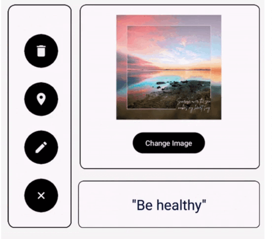
ImageRenderEffect
In Jetpack Compose, we continue our exploration of RenderEffect, this time focusing on the fascinating ImageRenderEffect. This composable item takes image rendering to the next level by introducing dynamic image transitions and captivating rendering effects. Let’s take a closer look at how it’s constructed and how it enhances the visual experience.
Dynamic image transition
The core of ImageRenderEffect is its ability to transition between images in a visually appealing way. To demonstrate this, we will set up a basic scenario where two images ic_first and ic_second will be displayed alternately during a click event.
var image by remember {<!-- -->
    mutableIntStateOf(R.drawable.ic_first)
}
The image state variable holds the currently displayed image, and the user can switch between the two with a simple click of a button.
Create engaging effects
Blur Effect: Just like our previous example, we apply a blur effect to the image. Animating the blur value from 0 to 100 and back to 0 creates mesmerizing visual effects and enhances image transitions.
val blur = remember {<!-- --> Animatable(0f) }
LaunchedEffect(image) {<!-- -->
    blur.animateTo(100f, tween(easing = LinearEasing))
    blur.animateTo(0f, tween(easing = LinearEasing))
}
Image transition: The core of image transition is theAnimatedContentcomposable item. It handles smooth transitions between images, combining thefadeInandscaleIneffects for images entering the scene, as well asfadeOutandscaleOuteffect, used to exit the scene image.
AnimatedContent(
    targetState = image,
    modifier = Modifier.fillMaxWidth(),
    transitionSpec = {<!-- -->
        (fadeIn(tween(easing = LinearEasing)) + scaleIn(
            tween(1_000, easing = LinearEasing)
        )).togetherWith(
            fadeOut(
                tween(1_000, easing = LinearEasing)
            ) + scaleOut(
                tween(1_000, easing = LinearEasing)
            )
        )
    }, label = ""
) {<!-- --> image ->
    Image(
        painter = painterResource(id = image),
        modifier = Modifier.size(200.dp),
        contentDescription = ""
    )
}
Perfect integration with ShaderContainer
Just like our previous example, ImageRenderEffect is also integrated into ShaderContainer. This allows us to blend image transitions and rendering effects to create engaging, immersive visual experiences.
@Composable
fun ImageRenderEffect() {<!-- -->

    var image by remember {<!-- -->
        mutableIntStateOf(R.drawable.ic_first)
    }

    val blur = remember {<!-- --> Animatable(0f) }

    LaunchedEffect(image) {<!-- -->
        blur.animateTo(100f, tween(easing = LinearEasing))
        blur.animateTo(0f, tween(easing = LinearEasing))
    }

    Column(
        modifier = Modifier
            .wrapContentSize(),
        horizontalAlignment = Alignment.CenterHorizontally,
        verticalArrangement = Arrangement.Center,
    ) {<!-- -->

        ShaderContainer(
            modifier = Modifier
                .animateContentSize()
                .clipToBounds()
                .fillMaxWidth()
        ) {<!-- -->

            BlurContainer(
                modifier = Modifier.fillMaxWidth(),
                blur = blur.value,
                component = {<!-- -->
                    AnimatedContent(
                        targetState = image,
                        modifier = Modifier
                            .fillMaxWidth(),
                        transitionSpec = {<!-- -->
                            (fadeIn(tween(easing = LinearEasing)) + scaleIn(
                                tween(
                                    1_000,
                                    easing = LinearEasing
                                )
                            )).togetherWith(
                                fadeOut(
                                    tween(
                                        1_000,
                                        easing = LinearEasing
                                    )
                                ) + scaleOut(
                                    tween(
                                        1_000,
                                        easing = LinearEasing
                                    )
                                )
                            )
                        }, label = ""
                    ) {<!-- --> image ->
                        Image(
                            painter = painterResource(id = image),
                            modifier = Modifier
                                .size(200.dp),
                            contentDescription = ""
                        )
                    }
                }) {<!-- -->}
        }

        Spacer(modifier = Modifier.height(20.dp))

        Button(
            onClick = {<!-- -->
                image =
                    if (image == R.drawable.ic_first) R.drawable.ic_second else R.drawable.ic_first
            },
            colors = ButtonDefaults.buttonColors(
                containerColor = Color.Black
            )
        ) {<!-- -->
            Text("Change Image")
        }
    }
}

Conclusion
By understanding the ShaderContainer, BlurContainer, ShaderSource, and customBlur modifiers, you have the tools to create Tools for stunning rendering effects. These elements provide a foundation for exploring and experimenting with various visual effects and custom shaders, opening up a world of creative possibilities for your UI design.
Github
https://github.com/cp-megh-l/render-effect-jetpack-compose