
Third generation software development-simple video player-custom Slider (2)
Article directory
- Third generation software development-simple video player-customized Slider (2)
-
- Project Introduction
- Simple video player
- Custom Slider (2)
-
- Horizontal
- portrait
Keywords:
Qt、
Qml、
Keyword 3,
Keyword 4,
Keyword 5
Project introduction
Welcome to our QML & C++ project! This project combines the power of QML (Qt Meta-Object Language) and C++ to develop excellent user interfaces and high-performance backend logic.
In the project, we leveraged QML’s declarative syntax and visual design capabilities to create a modern user interface. Through intuitive coding and reusable components, we can quickly develop rich and diverse interface effects and animation effects. At the same time, we use QML’s powerful integration capabilities to easily integrate the underlying logic and data model of C++ into the front-end interface.
On the backend side, we use C++ to write high-performance algorithms, data processing, and computational logic. C++ is a powerful programming language that offers excellent performance and scalability. Our team is committed to optimizing code and reducing resource consumption to ensure that our projects run efficiently on a variety of platforms and devices.
Whether you’re interested in QML and C++ development or need us to build complex user interfaces and backend logic for you, we’re ready to support you. Please feel free to contact us and let’s build a modern, high-performance QML & C++ project together!
Important?
?The price of this column will increase after the third generation soft development update.
Simple video player
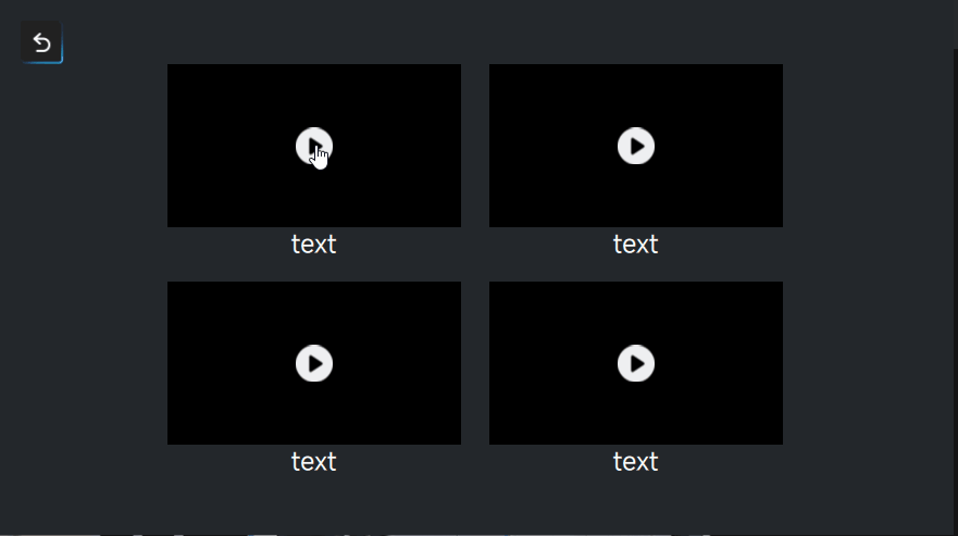
In fact, we have already played the video file in the previous screen saver, but there is no progress bar, no timeline, and we cannot control the playback and pause. Today we will add these. As shown in the picture below, because the original recorded Gif was too large to be uploaded, the frame was reduced and it looked a bit laggy.
Let’s just jump into the code here;
import QtQuick 2.15
import QtMultimedia 5.15
import QtQuick.Layouts 1.15 // layout required
import QtQuick.Controls 2.15
Rectangle
{
    property string videoSource: "file"
    property bool fullScreen: false
    id:root
    color: "#000000"
    anchors.centerIn: parent
    width: 720
    height: 480
    visible: false
    SoundEffect {
        id: playSound
        source: "qrc:/Audio/T_Resource/T_Audio/T_Base/buttonTach.wav"
    }
    // Video
    // {
    // id:video_show
    // anchors.fill: parent
    // loops: MediaPlayer.Infinite
    // source: root.videoSource
    // }


    MediaPlayer
    {
        id:media_video
        source: videoSource // absolute path
        loops: MediaPlayer.Infinite
        volume: 0.5
    }
    VideoOutput
    {
        id:out_put
        anchors.fill: parent
        source: media_video
    }


    RowLayout
    {
        id:layout_menu
        anchors.left: parent.left
        anchors.right: parent.right
        anchors.bottom: parent.bottom
        height: 26
        spacing: 20
        Item
        {
            width: 26
            height: 20
            Image {
                anchors.centerIn: parent
                height: 26
                fillMode: Image.PreserveAspectFit
                source: (media_video.playbackState === MediaPlayer.PlayingState ) ? "qrc:/Video/T_Resource/T_Image/Vidoe/zt.png" : "qrc:/Video/T_Resource/T_Image/Vidoe/bf.png"
            }
            MouseArea
            {
                anchors.fill: parent
                onClicked: (media_video.playbackState === MediaPlayer.PlayingState ) ? media_video.pause() : media_video.play();
            }

        }

        Item {
            implicitWidth: 50
            Text {
                anchors.centerIn: parent
                font.pixelSize: 20
                color: "#FFFFFF"
                text: {
                    //Create a variable to obtain the current playback position in time, in milliseconds
                    var milliseconds = media_video.position
                    // Create a variable, convert the milliseconds of the current playback position into minutes, and round down
                    var minutes = Math.floor(milliseconds / 60000)
                    // Get the number of milliseconds less than 60 seconds
                    milliseconds -= minutes * 60000
                    //Create a variable to convert milliseconds less than 60 seconds into seconds
                    var seconds = milliseconds / 1000
                    // perform rounding
                    seconds = Math.round(seconds)
                    // Determine whether the number of seconds is less than 10 seconds to output the time format. The final format is: mm:ss
                    if(seconds < 10)
                        return minutes + ":0" + seconds
                    else
                        return minutes + ":" + seconds
                }
            }
        }

        Slider
        {
            id:durationTimeSlider
            Layout.fillWidth: true
            value: media_video.position / media_video.duration
            background: Rectangle{
                x: durationTimeSlider.leftPadding
                y: durationTimeSlider.topPadding + durationTimeSlider.availableHeight / 2 - height / 2
                implicitHeight: 4
                implicitWidth: 200
                width: durationTimeSlider.availableWidth
                height: implicitHeight
                radius: 2
                color: "#F0F0F0" // Progress bar background color
                //The area where the video has been played
                Rectangle{
                    width: durationTimeSlider.visualPosition * parent.width
                    height: parent.height
                    color: "#36ABDF" // The color of the progress bar that has been completed
                    radius: 2
                }
            }
            // Slider style
            handle: Rectangle{
                antialiasing: true
                x: durationTimeSlider.leftPadding + durationTimeSlider.visualPosition
                   * (durationTimeSlider.availableWidth - width)
                y: durationTimeSlider.topPadding + durationTimeSlider.availableHeight / 2 - height / 2
                implicitWidth: 20
                implicitHeight: 20
                radius: 10
                border.color: "#bdbebf" // Slider border color
                // Determine the pressing state of the slider and set different colors
                color: durationTimeSlider.pressed ? "#B0C4DE" : "#F0F0F0"
                //The area in the center of the slider, I set transparency here
                Rectangle{
                    width: 4
                    height: 4
                    radius: 2
                    color: "transparent"
                    anchors.centerIn: parent
                }
            }

            property real index: 0
            property bool changed: false
            // When the slider moves, set index to the current position of the slider
            onMoved: {
                if(pressed){
                    index = position
                }
            }

            onPressedChanged: {
                if(pressed === true){
                    changed = true
                }else if (changed === true){
                    media_video.seek(index * media_video.duration)
                    changed = false
                }
            }
        }
        Item {
            implicitWidth: 50
            Text {
                anchors.centerIn: parent
                font.pixelSize: 20
                color: "#FFFFFF"
                text: {
                    var millseconds = media_video.duration.valueOf()
                    var minutes = Math.floor(millseconds / 60000)
                    millseconds -= minutes * 6000
                    var seconds = millseconds / 1000
                    secounds = Math.round(secounds)
                    // Return mm : ss format time
                    if(secounds < 10)
                        return minutes + ":0" + seconds
                    else
                        return minutes + ":" + seconds
                }
            }
        }
        Item
        {
            id:item_volume
            width: 26
            height: 20
            Image {
                anchors.centerIn: parent
                height: 26
                fillMode: Image.PreserveAspectFit
                source: "qrc:/Video/T_Resource/T_Image/Vidoe/yl_z.png"
            }
            MouseArea
            {
                anchors.fill: parent
                onClicked: item_volum.visible = !item_volum.visible
            }

        }

        Item
        {
            width: 26
            height: 20
            Image {
                anchors.centerIn: parent
                height: 26
                fillMode: Image.PreserveAspectFit
                source: fullScreen ? "qrc:/Video/T_Resource/T_Image/Vidoe/sx.png" :"qrc:/Video/T_Resource/T_Image/Vidoe/qp.png"
            }
            MouseArea
            {
                anchors.fill: parent
                onClicked: root.fullScreen = !root.fullScreen
            }

        }
    }
    Item {
        id:item_volum
        width: 42
        height: 235
        visible: false
        anchors.bottom: layout_menu.top
        anchors.right: layout_menu.right
        anchors.rightMargin: 36
        Text {
            anchors.top: parent.top
            anchors.horizontalCenter: parent.horizontalCenter
            font.pixelSize: 20
            color: "#36ABDF"
            text: (volumeSlider.value * 100).toFixed(0)
        }
        Slider
        {
            id:volumeSlider
            width: 42
            height: 220
            from:0.0
            to:1.0
            stepSize: 0.01
            value: media_video.volume
            anchors.bottom: parent.bottom
            anchors.horizontalCenter: parent.horizontalCenter
            orientation:Qt.Vertical
            background: Rectangle{
                anchors.horizontalCenter: parent.horizontalCenter
                y: volumeSlider.topPadding + volumeSlider.availableHeight / 2 - height / 2
                implicitHeight: 200
                implicitWidth: 4
                width: 4
                height: volumeSlider.availableHeight
                radius: 2
                color: "#F0F0F0" // Progress bar background color
                //The area where the video has been played
                Rectangle{
                    anchors.bottom: parent.bottom
                    width: parent.width
                    height: parent.height - volumeSlider.visualPosition * parent.height
                    color: "#36ABDF" // The color of the progress bar that has been completed
                    radius: 2
                }
            }
            // Slider style
            handle: Rectangle{
                antialiasing: true
                anchors.horizontalCenter: parent.horizontalCenter
                y: volumeSlider.topPadding + volumeSlider.visualPosition
                   * (volumeSlider.availableHeight - height)

                implicitWidth: 20
                implicitHeight: 20
                radius: 10
                border.color: "#bdbebf" // Slider border color
                // Determine the pressing state of the slider and set different colors
                color: volumeSlider.pressed ? "#B0C4DE" : "#F0F0F0"
                //The area in the center of the slider, I set transparency here
                Rectangle{
                    width: 4
                    height: 4
                    radius: 2
                    color: "transparent"
                    anchors.centerIn: parent
                }
            }
            onValueChanged: media_video.volume = value

        }

    }


    function play()
    {
        media_video.play();
    }
    function stop(){
        if((media_video.playbackState === MediaPlayer.PlayingState || media_video.playbackState === MediaPlayer.PausedState))
            media_video.stop();
    }
}
Customized Slider (2)
Landscape
 Slider
        {
            id:durationTimeSlider
            Layout.fillWidth: true
            value: media_video.position / media_video.duration
            background: Rectangle{
                x: durationTimeSlider.leftPadding
                y: durationTimeSlider.topPadding + durationTimeSlider.availableHeight / 2 - height / 2
                implicitHeight: 4
                implicitWidth: 200
                width: durationTimeSlider.availableWidth
                height: implicitHeight
                radius: 2
                color: "#F0F0F0" // Progress bar background color
                //The area where the video has been played
                Rectangle{
                    width: durationTimeSlider.visualPosition * parent.width
                    height: parent.height
                    color: "#36ABDF" // The color of the progress bar that has been completed
                    radius: 2
                }
            }
            // Slider style
            handle: Rectangle{
                antialiasing: true
                x: durationTimeSlider.leftPadding + durationTimeSlider.visualPosition
                   * (durationTimeSlider.availableWidth - width)
                y: durationTimeSlider.topPadding + durationTimeSlider.availableHeight / 2 - height / 2
                implicitWidth: 20
                implicitHeight: 20
                radius: 10
                border.color: "#bdbebf" // Slider border color
                // Determine the pressing state of the slider and set different colors
                color: durationTimeSlider.pressed ? "#B0C4DE" : "#F0F0F0"
                //The area in the center of the slider, I set transparency here
                Rectangle{
                    width: 4
                    height: 4
                    radius: 2
                    color: "transparent"
                    anchors.centerIn: parent
                }
            }

            property real index: 0
            property bool changed: false
            // When the slider moves, set index to the current position of the slider
            onMoved: {
                if(pressed){
                    index = position
                }
            }

            onPressedChanged: {
                if(pressed === true){
                    changed = true
                }else if (changed === true){
                    media_video.seek(index * media_video.duration)
                    changed = false
                }
            }
        }
Portrait
 Slider
        {
            id:volumeSlider
            width: 42
            height: 220
            from:0.0
            to:1.0
            stepSize: 0.01
            value: media_video.volume
            anchors.bottom: parent.bottom
            anchors.horizontalCenter: parent.horizontalCenter
            orientation:Qt.Vertical
            background: Rectangle{
                anchors.horizontalCenter: parent.horizontalCenter
                y: volumeSlider.topPadding + volumeSlider.availableHeight / 2 - height / 2
                implicitHeight: 200
                implicitWidth: 4
                width: 4
                height: volumeSlider.availableHeight
                radius: 2
                color: "#F0F0F0" // Progress bar background color
                //The area where the video has been played
                Rectangle{
                    anchors.bottom: parent.bottom
                    width: parent.width
                    height: parent.height - volumeSlider.visualPosition * parent.height
                    color: "#36ABDF" // The color of the progress bar that has been completed
                    radius: 2
                }
            }
            // Slider style
            handle: Rectangle{
                antialiasing: true
                anchors.horizontalCenter: parent.horizontalCenter
                y: volumeSlider.topPadding + volumeSlider.visualPosition
                   * (volumeSlider.availableHeight - height)

                implicitWidth: 20
                implicitHeight: 20
                radius: 10
                border.color: "#bdbebf" // Slider border color
                // Determine the pressing state of the slider and set different colors
                color: volumeSlider.pressed ? "#B0C4DE" : "#F0F0F0"
                //The area in the center of the slider, I set transparency here
                Rectangle{
                    width: 4
                    height: 4
                    radius: 2
                    color: "transparent"
                    anchors.centerIn: parent
                }
            }
            onValueChanged: media_video.volume = value

        }
This part of the qml code is easy to understand. There is nothing to pay attention to. What needs to be paid attention to here is just one part.
MediaPlayer
    {
        id:media_video
        source: videoSource // absolute path
        loops: MediaPlayer.Infinite
        volume: 0.5
    }
    VideoOutput
    {
        id:out_put
        anchors.fill: parent
        source: media_video
    }
In fact, I used the Video component at first, but when I went to full screen, I encountered a problem, that is, the picture would not follow the full screen. I could just change it where it should be, but I didn’t have time to deal with it. This function is to play the missionary video and Promotional video, so not much focus will be put on it at the moment.
