Background
I did a week of big screen development, and it was all completed in the near future. Take this to record the overall adaptation processing of the large screen and the processing and realization of the automatic loop scrolling animation of the list. The rest of the business-related maps and content are not displayed here

Layout
When choosing an adaptation solution, considering the effect of retaining the design ratio of the design draft, here is the method of transform: scale(). Dynamically adjust the zoom ratio according to the container width. Since scale is used for zooming, the page layout can be realized by px plus absolute positioning, and all elements follow the style attributes of the design draft, which can be regarded as no mental burden. But scaling also has certain disadvantages, that is, when the aspect ratio is not the ratio of the design draft (1920×1080), there will be scroll bars or blank space at the bottom.
Below is the layout code
<div class="bs-page" ref="pageRef">
    <div class="bs-page-content">
      <div class="bs-page-box">
      </div>
    </div>
</div>

const pageRef = ref<HTMLElement>();
/** scaling ratio */
const scale = ref(1);
/** Update the scaling factor */
const updateScale = () => {
  const dom = pageRef. value;
  if (!dom) {
    scale. value = 1;
    return;
  }

  const width = dom. offsetWidth;
  const height = dom.offsetHeight;

  scale.value = width / 1920;

  /** Is there a scroll bar */
  const isSroll = width / height > 1920 / 1080;
  if (isSroll) {
    nextTick(() => {
      const cWidth = dom. clientWidth;
      scale.value = cWidth / 1920;
    });
  }
};

/** content width */
const contentWidth = computed(() => `${scale. value * 1920}px`);
/** content height */
const contentHeight = computed(() => `${scale. value * 1080}px`);
onMounted(() => {
  updateScale();
  window.addEventListener('resize', updateScale, false);
});
onUnmounted(() => {
  window. removeEventListener('resize', updateScale, false);
});

.bs-page {
  position: absolute;
  top: 0;
  left: 0;
  right: 0;
  bottom: 0;
  background: #020b40;
  overflow: auto;
}

.bs-page-content {
  width: v-bind(contentWidth);
  height: v-bind(contentHeight);
  overflow: hidden;
}

.bs-page-box {
  width: 1920px;
  height: 1080px;
  transform-origin: 0 0;
  transform: scale(v-bind(scale));
  background: url(./img/bg.png);
  background-size: 1920px 1080px;
}
Scrolling effects
The circular scrolling effect is one of the more interesting places here. Connect end to end for circular scrolling. The function is not too complicated, and there are many ways to implement it. The following are my several implementation methods and my analysis and evaluation of these several implementation methods.
setInterval or setTimeout
The first thing I thought of during development was to use the timer to achieve the scrolling effect. At a specific time interval, cooperate with absolute positioning + transform:translateY() to change 1px each time to achieve the scrolling effect. Scrolling is realized, but how to connect end to end?
To achieve end-to-end connection, the best and easiest way is to copy an extra copy of the data. If the component is encapsulated, add an additional component. I add an extra component. The second one only needs to add a marginTop to maintain the spacing, as follows:
<RankList ref="RankListRef" :data="dataList" class="rank-one"></RankList>
<!-- Used for scrolling, not displayed when not scrolling -->
<RankList v-if="isNeedScroll" :data="dataList" class="rank-two"></RankList>
If the data does not exceed the container, there is definitely no need to scroll, and if the data exceeds the container, scrolling is required. At this time, my idea is to place the next div after the previous one when the previous div is about to roll, increase the judgment, and cycle in turn.
Here’s how I do it:
/** Whether the list needs to be automatically scrolled, more than ten data will start to scroll */
const isNeedScroll = ref(false);
/** End-to-end scrolling - previous scrolling distance */
const scrollTopOne = ref(0);
const scrollTopOneTrans = computed(() => `translateY(${scrollTopOne. value}px)`);
/** Next scroll distance */
const scrollTopTwo = ref(0);
/** Whether to start scrolling next */
const twoStart = ref(false);
const scrollTopTwoTrans = computed(() => `translateY(${scrollTopTwo.value}px)`);
const RankListRef = ref();
const timer = ref<number | null>(null);
/** set scrolling */
const setScroll = () => {
  scrollTopOne. value = 0;
  scrollTopTwo. value = 0;
  twoStart. value = false;
  if (timer. value !== null) {
    clearInterval(timer. value);
    timer. value = null;
  }
  timer. value = setInterval(() => {
    // when scrolling above to bottom
    if (-scrollTopOne.value + 385 === (RankListRef.value?.$el.clientHeight)) {
      twoStart. value = true;
      // Reset the scroll position below, start scrolling below
      scrollTopTwo. value = 0;
    }
    // When the bottom scrolls to the bottom, make the top start scrolling at the bottom position
    if (-scrollTopTwo.value === RankListRef.value?.$el.clientHeight) {
      scrollTopOne. value = 428;
    }
    scrollTopOne. value -= 1;
    if (twoStart. value) {
      // Start scrolling at the bottom
      scrollTopTwo. value -= 1;
    }
  }, 50);
};


.rank-one {
  position: absolute;
  top: 0;
  right: 0;
  width: 100%;
  transform: v-bind(scrollTopOneTrans);
}
.rank-two {
  margin-top: 23px;
  position: absolute;
  right: 0;
  top: 385px;
  width: 100%;
  transform: v-bind(scrollTopTwoTrans);
}
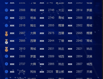
The writing method at this time is still relatively complicated, but the effect is basically realized. It may be that the screen used for development is relatively large, so I haven’t found it yet. However, when my colleagues opened the notebook later, they found that the scrolling was a wave effect, as follows:

It looked magical, so I tried to narrow down the browser, and it really was.
Looking back at the implementation method, I probably understand why this happens. setInterval and setTimeout are actually macro tasks. When they are pushed into the queue, the ideal state is to take them out and execute them every 50ms. But in practice, the interval cannot be guaranteed to be 50ms. The effect at this time will be as shown in the figure, showing a wave shape. Later, I tried setTimeout, which had the same effect. But this effect is definitely not acceptable.
requestAnimationFrame
Since it is an animation, of course this function will also come to mind. This function is
window.requestAnimationFrame() tells the browser - you want to perform an animation, and ask the browser to call the specified callback function before the next redraw
Update animation. This method needs to pass in a callback function as a parameter, which will be executed before the browser redraws next time
const fn = () => {
    // when scrolling above to bottom
    if (-scrollTopOne.value + 385 === (RankListRef.value?.$el.clientHeight)) {
      twoStart. value = true;
      // Reset the scroll position below, start scrolling below
      scrollTopTwo. value = 0;
    }
    // When the bottom scrolls to the bottom, make the top start scrolling at the bottom position
    if (-scrollTopTwo.value === RankListRef.value?.$el.clientHeight) {
      scrollTopOne. value = 428;
    }
    scrollTopOne. value -= 1;
    if (twoStart. value) {
      // Start scrolling at the bottom
      scrollTopTwo. value -= 1;
    }
    requestAnimationFrame(fn);
  };
requestAnimationFrame(fn);
The frequency of function execution is roughly the same as the number of browser refreshes. Google Chrome refreshes 60 times per second, so the time for function execution is 1000/60, and this time is fixed and cannot be changed, but this scrolling time is for the current The scene is too fast, and the final effect will still be a little jittery. So this plan was also passed
css3 animation
Going around or going back to use css to deal with, in fact, the best way to deal with animation is to use css to deal with it, whether it is performance or animation. The specific animation usage is not described here, you can see the animation here
To use animation, two problems need to be solved:
- animation
- duration
At the beginning, I followed the previous method and planned to control the scrolling of two divs, but I found it difficult to control. You need to wait for the previous one to scroll to the specified position before controlling the next one to start scrolling. This is equivalent to passing js To control, lose the advantage of animation.
To change the angle, we don’t control the two, wrap a div outside, and only need to control the outer div to scroll. This div wraps two identical contents and arranges them up and down. If I cycle transform: translateY(-50%), can circular scrolling be realized. Another thing that needs to be solved is the duration. We used to process 50ms to move 1px, now we only need to get the height of one of the divs and multiply it by 50ms to calculate the duration! ! !
Let’s start, the code is as follows:
<div :class="{scroll_box: isNeedScroll}">
    <RankList ref="RankListRef" :data="dataList"></RankList>
    <!-- Used for scrolling, not displayed when not scrolling -->
    <RankList v-if="isNeedScroll" :data="dataList" class="rank-two"></RankList>
</div>

const scrollTime = ref(10);
const animationValue = computed(() => `${scrollTime. value}ms`);
const RankListRef = ref();

/** set scrolling */
const setScroll = () => {
    // Calculate scrolling duration
    const height = RankListRef.value.$el.clientHeight;
    scrollTime. value = (height * 50);
};

.scroll_box {
  position: absolute;
  top: 0;
  right: 0;
  width: 100%;
  animation: scrolltop v-bind(animationValue) linear infinite;
}
@keyframes scrolltop {
  0% { transform: translateY(0) }
  100% { transform: translateY(-50%) }
}
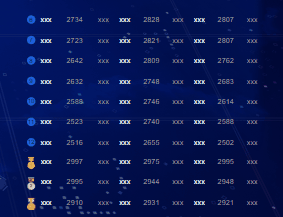
It can be seen that using this method not only reduces the amount of code but also makes the logic simpler. You only need to control the duration of the animation without considering how much distance you move, which is good. The following is an overall effect
So far, the optimization of this effect has come to an end.
Conclusion
In fact, the content is not complicated. This article is more of a record of my own project, and I will share some interesting points. If you have other processing methods or want to communicate, please leave a message.