As China’s various strengths improve, we often see comparisons of various indicator data between China and various countries over the years in various media. In order to more clearly display the development trends over the years, some even make animated graphics. Seeing China’s continuous counterattacks in various indicator data in recent years, I feel proud in my heart. Today, we use Python to implement matplotlib’s dynamic drawing, compare the GDP of China and the United States in recent years, and show China’s GPD catching up with the United States. I believe that China’s GDP data will steadily surpass the United States in the near future.
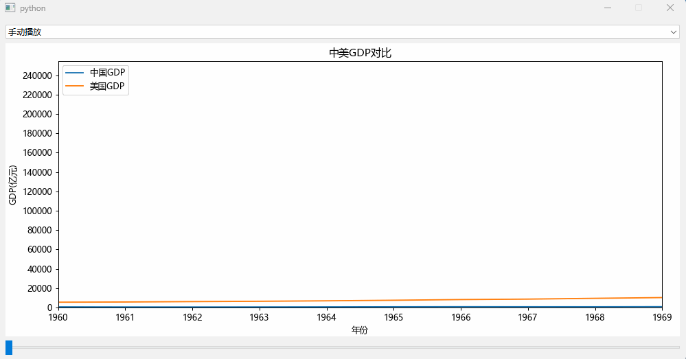
The effect is as follows:

To achieve the above dynamic drawing effect, pandas data collection, data sorting, matplotlib drawing, dynamic definition of coordinate axes and data, timers and other knowledge are comprehensively used. Finally, it is displayed through Python’s GUI library PySide to form a GUI executable program.
1. Data collection and preparation
A lot of GDP data from China and the United States over the years can be searched online through Baidu. I found the data from https://www.kylc.com/stats/global/yearly_per_country/g_gdp/chn-usa.html. Organize the data into EXCEL and save it to data\China VS United States.xlsx.

There is data on the GDP of China and the United States from 1966 to 2022.
First, sort out the data. Because the GDP data obtained is of string type such as 17.96 trillion (17,963,170,521,079), we need to extract the GDP data from the text, that is, take the data in brackets.
Here, the GDP data in brackets are extracted through regular expressions and converted into units of 100 million yuan.
import re
import pandas as pd
import locale
import matplotlib.pyplot as plt

pattern = re.compile('\((\S*)\)')

def getgdpvalue(gdpstr):
    re_obj=pattern.search(gdpstr)
    gdp_value=locale.atof(re_obj.group(1))/100000000
    return gdp_value

df_data = pd.read_excel('data\China VS United States.xlsx')
df_data = df_data.loc[1:len(df_data)]
df_data['china_gdp_value'] = df_data['China'].map(getgdpvalue)
df_data['us_gdp_value'] = df_data['United States'].map(getgdpvalue)
df_data = df_data.sort_values('Year')
Once you have the data, you can draw data.
2. matplotlib drawing
First, let’s plot the data with matplotlib to see the effect of the data.
import matplotlib.pyplot as plt
plt.figure()
plt.plot(df_data['year'],df_data['china_gdp_value'])
plt.plot(df_data['year'],df_data['us_gdp_value'])
plt.title('Comparison of GDP between China and the United States')
plt.xlabel('Year')
plt.ylim('GDP (billion)')
plt.show()

It can be seen that China’s GDP data was relatively stable from 1960 to 1990. After 1990, China began an explosive catch-up mode.
We want to display this trend in a dynamic way.
3. Data display and dynamic update
First define the QWidget component through QMainWindw, and add the FigureCanvasQTAgg component to QWidget to load matplotlib drawing through canvas.
class ApplicationWindow(QMainWindow):

    def __init__(self, parent=None,org_data=None):
        QMainWindow.__init__(self, parent)
        self.axes = None
        self.axis_china=None
        self.axis_us=None
        self.datacount=10
        self.org_data = org_data
        self.auto_offset = 0
        # Central widget
        self._main = QWidget()
        self.setCentralWidget(self._main)
        # Figure
        self.canvas = FigureCanvasQTAgg(figure)
        if len(self.org_data) > 0:
            show_data = self.org_data[0:self.datacount]
            self.axes = self.canvas.figure.subplots()
            self.axes.set_title('Comparison of GDP between China and the United States')
            self.axis_china = self.axes.plot(show_data['Year'], show_data['china_gdp_value'], label='China GDP')
            self.axis_us = self.axes.plot(show_data['Year'], show_data['us_gdp_value'], label='US GDP')
            y_max = max(self.org_data['us_gdp_value'].max(), self.org_data['china_gdp_value'].max())
            self.axes.set_ylabel('GDP(100 million yuan)')
            self.axes.set_xlabel('Year')
            self.axes.set_ylim(0, y_max)
            self.axes.set_xlim(show_data['Year'].min(), show_data['Year'].max())
            self.axes.legend(loc="upper left")
            self.axes.yaxis.set_major_locator(mticker.MultipleLocator(20000))
            self.axes.xaxis.set_major_locator(mticker.MultipleLocator(1))
            figure.tight_layout() # Automatically adjust the subfigure parameters to fill the entire image area
        # Drop-down box, select mode # ComboBox (combo_type)
        self.combo_type = QComboBox()
        self.combo_type.addItems(['Automatic play', 'Manual play'])
        #Sliders
        min_value = 0
        self.max_value = len(self.org_data)-cur_data_len
        self.slider_update = QSlider(minimum=min_value, maximum=self.max_value, orientation=Qt.Horizontal) # Slider
        layout1 = QHBoxLayout()
        layout1.addWidget(self.combo_type)
        # layout
        layout2 = QVBoxLayout()
        layout2.addWidget(self.canvas, 88)
        layout2.addWidget(self.slider_update)
        # Main layout
        layout = QVBoxLayout(self._main)
        layout.addLayout(layout1)
        layout.addLayout(layout2, 100)
        self.canvas.draw()
        # Signal and Slots connections
        self.combo_type.currentTextChanged.connect(self.selecttype)
        self.slider_update.valueChanged.connect(self.update_frequency)
        self.autoslider()
One way is to use the QSlider component to manually pull the slider component to change the data, and the other way is to use the QTimer component to automatically change the data.
1. QSlider component, manually implement dynamic drawing
@Slot()
def update_frequency(self, new_val):
    # The offset is offset by 1 each time
    f = int(new_val)
    offset = f + cur_data_len # Offset scale
    show_data = self.org_data[f: offset]
    x = show_data['Year']
    y_china = show_data['china_gdp_value']
    y_us = show_data['us_gdp_value']
    self.axes.set_xlim(x.min(), x.max())
    self.axis_china[0].set_data(x, y_china)
    self.axis_us[0].set_data(x, y_us)
    self.canvas.draw()
Manually pull the slider component to achieve the data change effect:
2. QTimer component, automatic dynamic drawing
 self.autoslider()

def autoslider(self):
    self.timer = QTimer()
    self.timer.setInterval(100) #Update data every 100 milliseconds
    self.timer.timeout.connect(self.autoupdate) #Automatically update data, each time the offset is updated, add 1, that is, jump one year of data
    self.timer.start()

def autoupdate(self):
    self.update_frequency(self.auto_offset)
    self.slider_update.setSliderPosition(self.auto_offset)
    if self.auto_offset < self.max_value:
        self.auto_offset = self.auto_offset + 1
    else:
        self.auto_offset = 0
The effect is shown at the top of the article.
4. Complete code
import re
importsys
import pandas as pd
import locale
import matplotlib.ticker as mticker
from PySide6.QtCore import Qt, Slot, QTimer
from PySide6.QtWidgets import QMainWindow, QApplication, QVBoxLayout, QHBoxLayout, QWidget, QSlider, QComboBox
from matplotlib.backends.backend_qtagg import FigureCanvasQTAgg
from matplotlib.figure import Figure

figure = Figure(figsize=(12, 6), dpi=90)

global cur_data_len, cur_major_locator
cur_data_len = 10 # The amount of data currently displayed (displays 10 years of data)
cur_major_locator = 10 # Locator of the current scale (major scale)

pattern = re.compile('\((\S*)\)')

def getgdpvalue(gdpstr):
    re_obj=pattern.search(gdpstr)
    gdp_value=locale.atof(re_obj.group(1))/100000000
    return gdp_value

class ApplicationWindow(QMainWindow):

    def __init__(self, parent=None,org_data=None):
        QMainWindow.__init__(self, parent)
        self.axes = None
        self.axis_china=None
        self.axis_us=None
        self.datacount=10
        self.org_data = org_data
        self.auto_offset = 0
        # Central widget
        self._main = QWidget()
        self.setCentralWidget(self._main)
        # Figure
        self.canvas = FigureCanvasQTAgg(figure)
        if len(self.org_data) > 0:
            show_data = self.org_data[0:self.datacount]
            self.axes = self.canvas.figure.subplots()
            self.axes.set_title('Comparison of GDP between China and the United States')
            self.axis_china = self.axes.plot(show_data['Year'], show_data['china_gdp_value'], label='China GDP')
            self.axis_us = self.axes.plot(show_data['Year'], show_data['us_gdp_value'], label='US GDP')
            y_max = max(self.org_data['us_gdp_value'].max(), self.org_data['china_gdp_value'].max())
            self.axes.set_ylabel('GDP(100 million yuan)')
            self.axes.set_xlabel('Year')
            self.axes.set_ylim(0, y_max)
            self.axes.set_xlim(show_data['Year'].min(), show_data['Year'].max())
            self.axes.legend(loc="upper left")
            self.axes.yaxis.set_major_locator(mticker.MultipleLocator(20000))
            self.axes.xaxis.set_major_locator(mticker.MultipleLocator(1))
            figure.tight_layout() # Automatically adjust the subfigure parameters to fill the entire image area
        # Drop-down box, select mode # ComboBox (combo_type)
        self.combo_type = QComboBox()
        self.combo_type.addItems(['Automatic play', 'Manual play'])
        #Sliders
        min_value = 0
        self.max_value = len(self.org_data)-cur_data_len
        self.slider_update = QSlider(minimum=min_value, maximum=self.max_value, orientation=Qt.Horizontal) # Slider
        layout1 = QHBoxLayout()
        layout1.addWidget(self.combo_type)
        # layout
        layout2 = QVBoxLayout()
        layout2.addWidget(self.canvas, 88)
        layout2.addWidget(self.slider_update)
        # Main layout
        layout = QVBoxLayout(self._main)
        layout.addLayout(layout1)
        layout.addLayout(layout2, 100)
        self.canvas.draw()
        # Signal and Slots connections
        self.combo_type.currentTextChanged.connect(self.selecttype)
        self.slider_update.valueChanged.connect(self.update_frequency)
        self.autoslider()

    def autoslider(self):
        self.timer = QTimer()
        self.timer.setInterval(100) #Update data every 100 milliseconds
        self.timer.timeout.connect(self.autoupdate) #Automatically update data, each time the offset is updated, add 1, that is, jump one year of data
        self.timer.start()

    def autoupdate(self):
        self.update_frequency(self.auto_offset)
        self.slider_update.setSliderPosition(self.auto_offset)
        if self.auto_offset < self.max_value:
            self.auto_offset = self.auto_offset + 1
        else:
            self.auto_offset = 0

    @Slot()
    def selecttype(self, text):
        if 'Autoplay' == text:
            self.autoslider()
        elif 'Manual play' == text:
            self.timer.stop()

    @Slot()
    def update_frequency(self, new_val):
        # The offset is offset by 1 each time
        f = int(new_val)
        offset = f + cur_data_len # Offset scale
        show_data = self.org_data[f: offset]
        x = show_data['Year']
        y_china = show_data['china_gdp_value']
        y_us = show_data['us_gdp_value']
        self.axes.set_xlim(x.min(), x.max())
        self.axis_china[0].set_data(x, y_china)
        self.axis_us[0].set_data(x, y_us)
        self.canvas.draw()


if __name__ == "__main__":
    app = QApplication(sys.argv)
    locale.setlocale(locale.LC_ALL, 'en_US.UTF-8')
    df_data = pd.read_excel('data\China VS United States.xlsx')
    df_data = df_data.loc[1:len(df_data)]
    df_data['china_gdp_value'] = df_data['China'].map(getgdpvalue)
    df_data['us_gdp_value'] = df_data['United States'].map(getgdpvalue)
    df_data = df_data.sort_values('Year')
    w = ApplicationWindow(org_data=df_data)
    w.setFixedSize(1000, 500)
    w.show()
    app.exec()
6. Summary
It is very simple and easy to implement matplotlib dynamic drawing in Python. In fact, the key lies in the organization of the data, that is, to prepare the x data and y data of the coordinate axes to be drawn, and dynamically update them through set_data(x, y) Data, it should be noted that the display of the X-axis or Y-axis will change after changing the data. This can be dynamically set through the set_xlim() or set_ylim() method of the axis. The scale can also be specified through set_major_locator().
The complete code and data set can be found at http://xiejava.ishareread.com/
Author's blog: http://xiejava.ishareread.com/